Another week and this week I feel I have done a bit more and been more productive, Even with some saddening family news this week. I am glad I have been keeping busy, because I think it does help when life happens - having things to do. Stops you reveling in your own sadness.
But anyhow, Let's look at what I have gotten done this week.
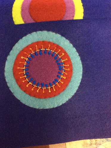
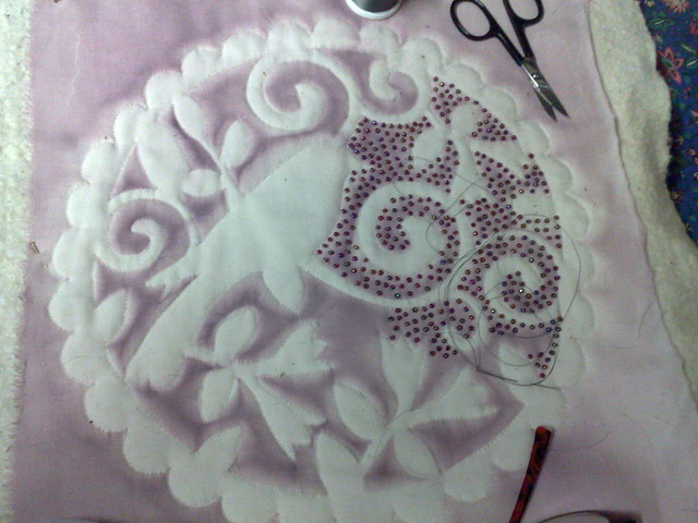
This is my first bit of embroidery on my Sue Spargo sampler with craftsy. It has taken me a while to get started, but hopefully I will get some done on Tuesdays at Quilt group which begins again this week.
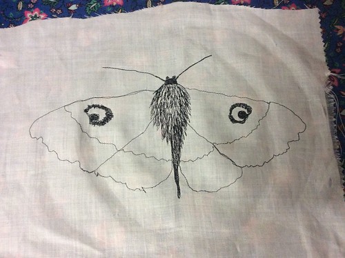
This is a Thread painted moth I finished during the week. Not sure what I am going to do with it yet, perhaps it will become a fabric page.
I finished unpicking this piece of printing on chiffon, which had some free motion I didn't like
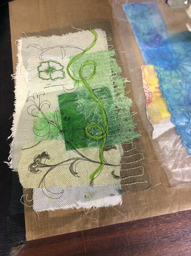
Another of the fabric and paper collages I am making for Fabric books.
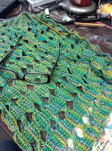
Getting along with my crochet!
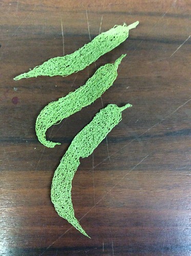
Some thread lace leaves.
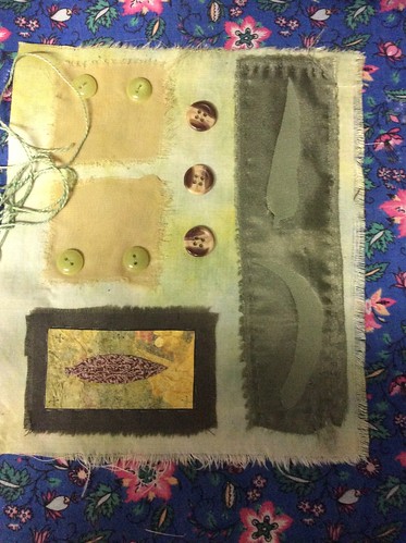
A teeny tiny embellishment - again for fabric pages.
A page in my doodle book I am working on. The red leaves are a deli paper page that has been cut - over the top of the green and purple page.
This is a page from week two of Lisa Congdon's Sketchbook Explorations on creativebug.
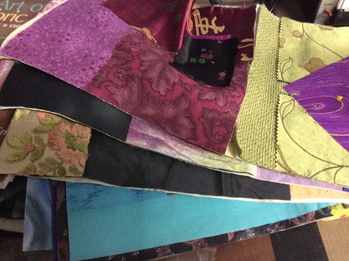
If you have known me for a while, you might recognise this pile of fabric pages ready to embellish. I have used my collage background challenges from last year.
And here is one of the pages, with a free motion sketch which has been painted. Quite happy with this page, but still needs a little more work.
Another fabric page in process.
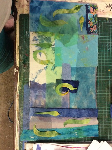
And finally another fabric page, a two page spread ready to free motion stitch. It might seem that I am a bit obsessed with fabric books at present and I probably am. I have been interested for a few years and never yet completed one! So this year is the year.
My pinterest page has lots of inspiration if you want to look, but the main artists who are inspiring me are Frances Pickering, Ro Bruhn, Jill Taylor, and Annette Bolton and of course Cas Holmes. As usual quite a few UK artist in that group!
Happy Creating!
Showing posts with label printing on fabric. Show all posts
Showing posts with label printing on fabric. Show all posts
Sunday, January 25, 2015
Sunday, October 5, 2014
Inspiration and discipline
When I went for my daily walk today, I was listening to old episodes of Adventures in Arting by Julie Balzer. She was talking to Roben Marie Smith and Samantha Kira Harding about Inspiration and discipline. What they all said and I agree is that there is no use waiting for inspiration to strike. There is no perfect time or perfect technique or perfect supplies, the only perfect time is now.
This is something I have had to deal with repeatedly over the years and which I continue to struggle with, being a natural procrastinator.
My work today is a perfect example of this struggle. Instead of putting it off, I just sat down at my desk and did what was necessary.
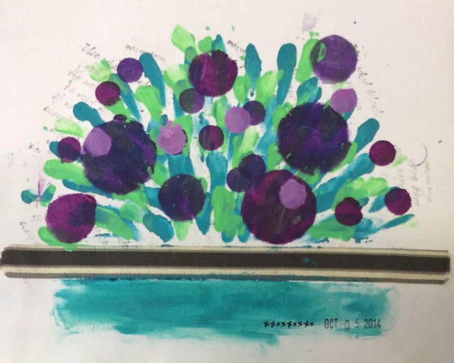
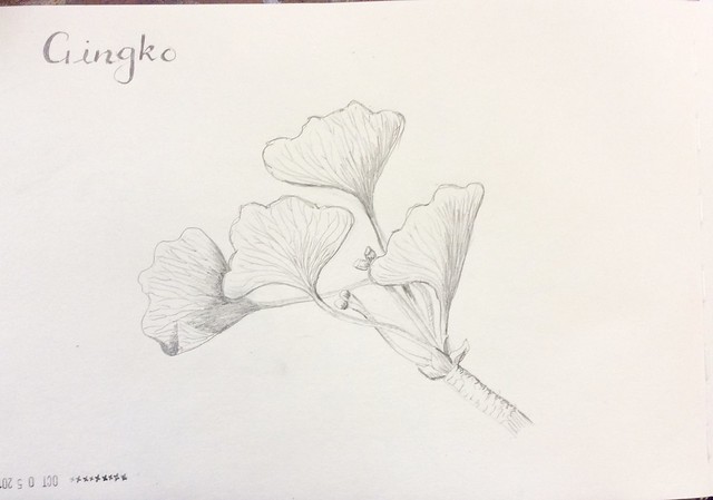
First I did my warm ups (remember 5 to 10 mins)
For the left hand one I use prompt cards and the right one just the junk on my table.
Then I did my daily drawing
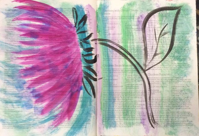
And as I was working, I put my excess paint onto my journal page.
It is not finished, but here is where it is at.
I left it like this because I thought it might be a great beginning on one of those days when I am stuck (As I said, I still have to work at it)
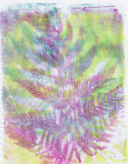
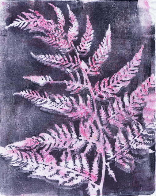
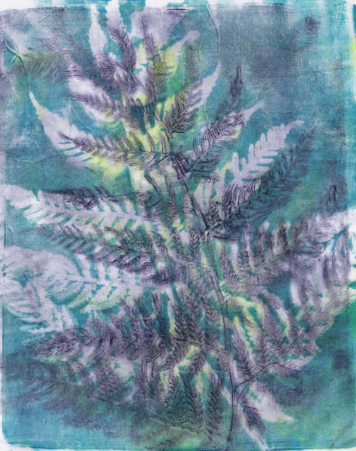
My hubby asked when I was going to play with my new gelli plate, so, since I had finished the bits and pieces, I had a go and after a few prints, I switched to fabric and came up with these
This is something I have had to deal with repeatedly over the years and which I continue to struggle with, being a natural procrastinator.
My work today is a perfect example of this struggle. Instead of putting it off, I just sat down at my desk and did what was necessary.
First I did my warm ups (remember 5 to 10 mins)
For the left hand one I use prompt cards and the right one just the junk on my table.
Then I did my daily drawing
It is not finished, but here is where it is at.
I left it like this because I thought it might be a great beginning on one of those days when I am stuck (As I said, I still have to work at it)
My hubby asked when I was going to play with my new gelli plate, so, since I had finished the bits and pieces, I had a go and after a few prints, I switched to fabric and came up with these
I am quite pleased with these and can't decide whether they should be put together for a wall hanging, or framed separately. Either way my brain is buzzing with free motion embroidery ideas!
I know that when I just sit down and relax into my work, inspiration will come. Not everything is something I love, sometimes it is something I hate, but I learn from the stuff I don't love and in many ways that is more important than producing a masterpiece.
I also did some work for my online classes, but you don't need to see all that.
Be Happy Creating!
Monday, January 13, 2014
My latest Tangled Textiles piece was a bit of a shamozzle, and didn't turn out the way I wanted, but that's what art is about, experimenting. Have a look at the other participant's work, which is amazing!
I had fun doing it and didn't let myself stress over the things that didn't quite work. It's a learning experience and this certainly was, for me.
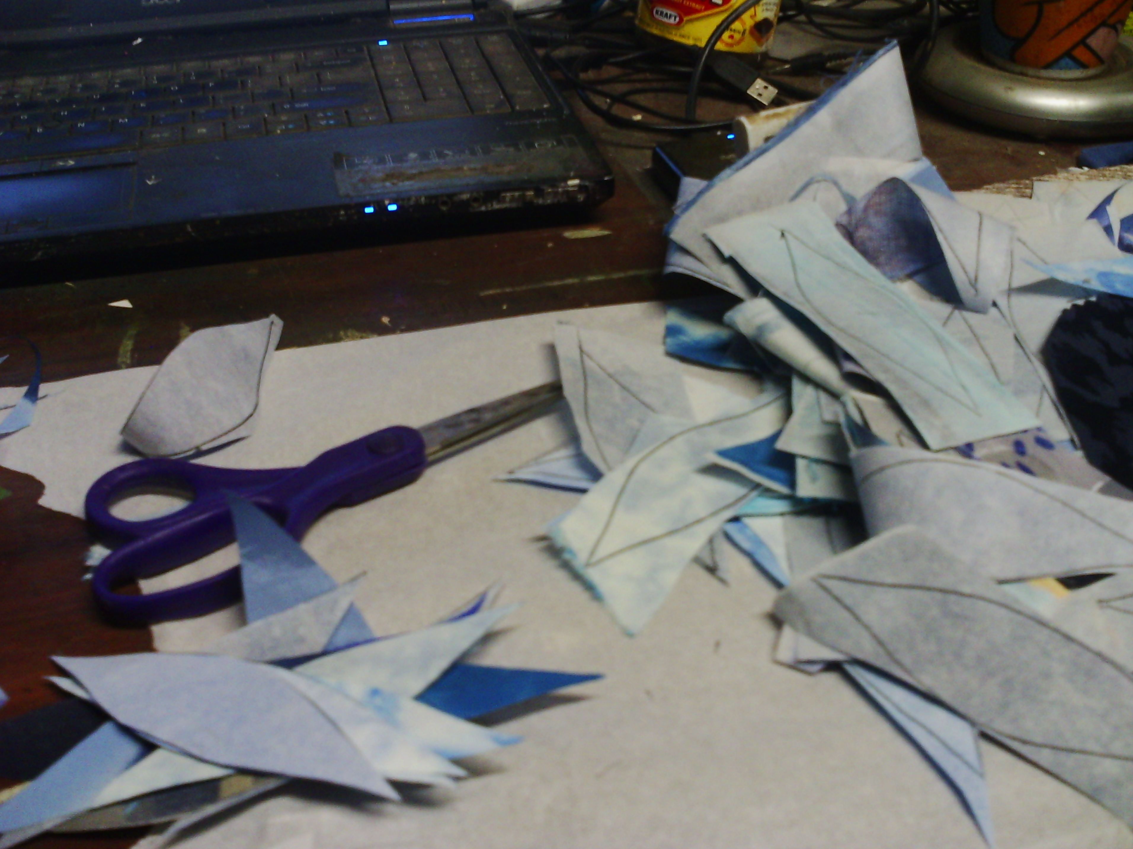
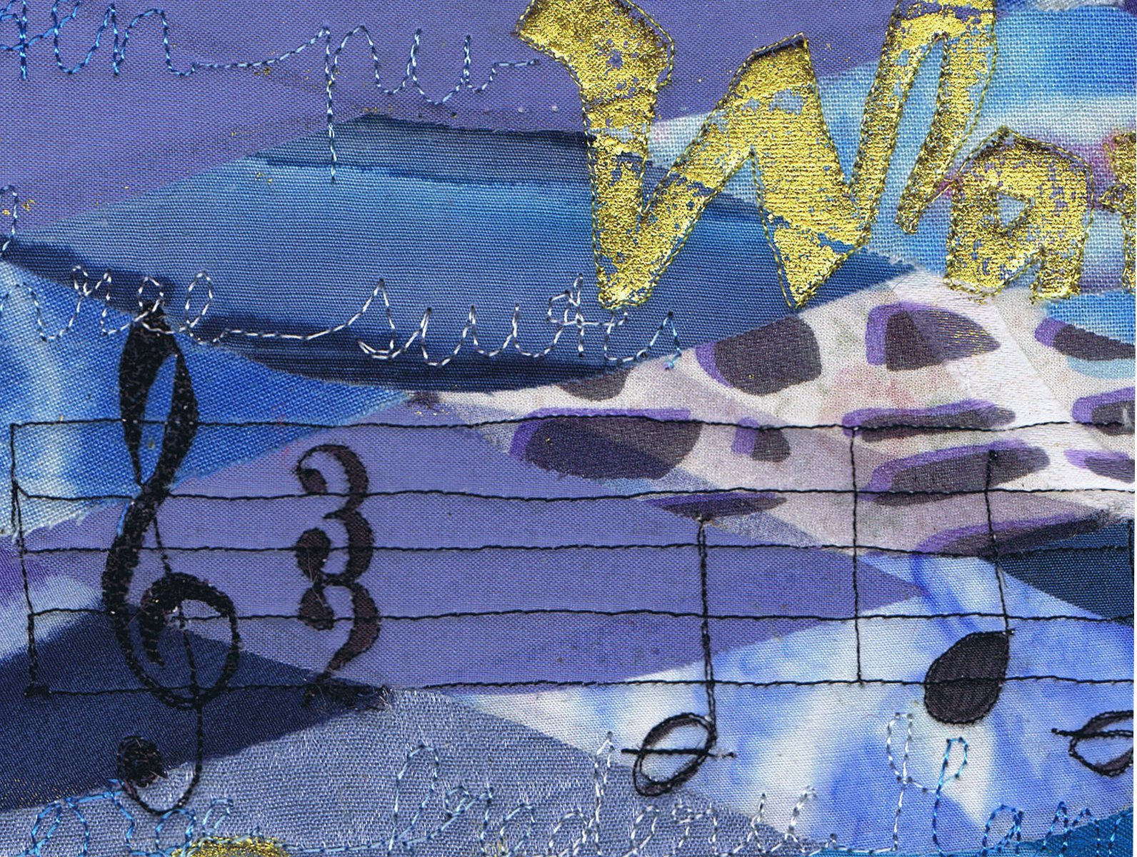
I cut lots of tesselating shapes that suggested water to me, with fusible on the back.
Then I arranged them and fused them for my background
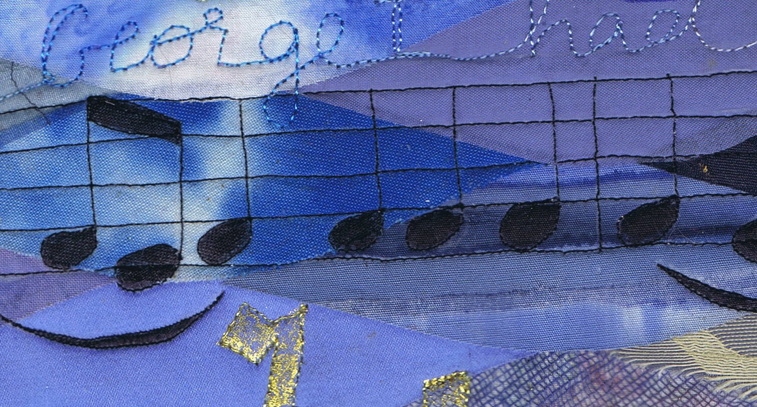
I free motioned some music. It is the opening bars of George frederic handel's "Water Music".
There is also some handwriting in free motion with variegated thread - very messy.
I also added some foiled text - which was one of the things I was really quite happy with and will do again.
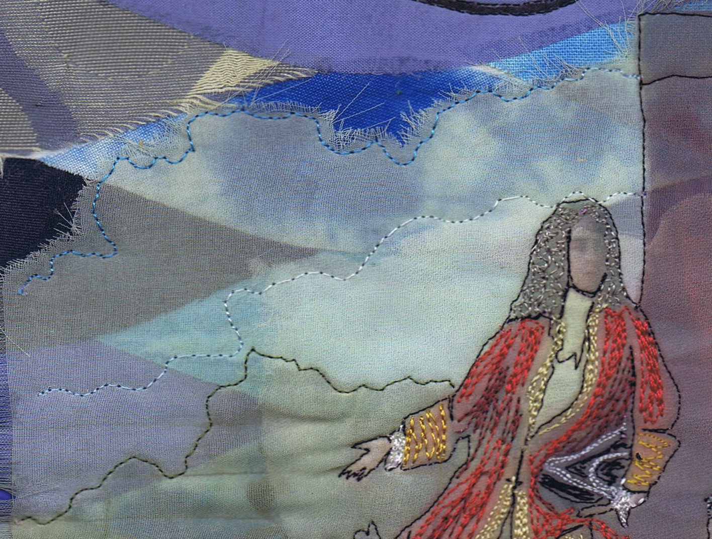
I also added a print on chiffon, which worked well but the contrast was not good, so I outlined some parts. I didn't like it, so I added a bit of scribbled free motion colour to the main characters. It was a bit rough, but I just went with it.
You can see my original idea of the water shapes in the background created major problems with contrast. The shapes are all fused to the background. Probably, I should have kept it simple and left the picture off, but it was the picture that inspired me in the first place.
"Water Music" does exist, but the premiere as depicted in the picture is only hearsay, as the painting was painted a hundred years after the supposed day. But supposedly the music was played for King george 1 on a trip up the Thames River on 17 July 1717. This story is written in the background with free motion.
Also, my picture is a bit hard to read, and this, I think is due to the shiny gold affecting the other colours in the picture, like glare.
So that is my piece! As I said, it was quite an experiment.
Happy Creating!
I had fun doing it and didn't let myself stress over the things that didn't quite work. It's a learning experience and this certainly was, for me.
I cut lots of tesselating shapes that suggested water to me, with fusible on the back.
Then I arranged them and fused them for my background
I free motioned some music. It is the opening bars of George frederic handel's "Water Music".
There is also some handwriting in free motion with variegated thread - very messy.
I also added some foiled text - which was one of the things I was really quite happy with and will do again.
I also added a print on chiffon, which worked well but the contrast was not good, so I outlined some parts. I didn't like it, so I added a bit of scribbled free motion colour to the main characters. It was a bit rough, but I just went with it.
"Water Music" does exist, but the premiere as depicted in the picture is only hearsay, as the painting was painted a hundred years after the supposed day. But supposedly the music was played for King george 1 on a trip up the Thames River on 17 July 1717. This story is written in the background with free motion.
Also, my picture is a bit hard to read, and this, I think is due to the shiny gold affecting the other colours in the picture, like glare.
So that is my piece! As I said, it was quite an experiment.
Happy Creating!
Sunday, May 12, 2013
Scarf workshop
Yesterday I taught a painted scarf workshop at the community house. Unfortunately for me, I had a few technical issues in the beginning, but we got on well and made lots. We used fabric paint diluted in spray bottles to spray around masks and also stamped with the sprayed masks. The fabric was a variety of chiffons, organzas and voiles, very transparent fabrics, which makes the pictures a little difficult to see, but the colour is glorious in reality.
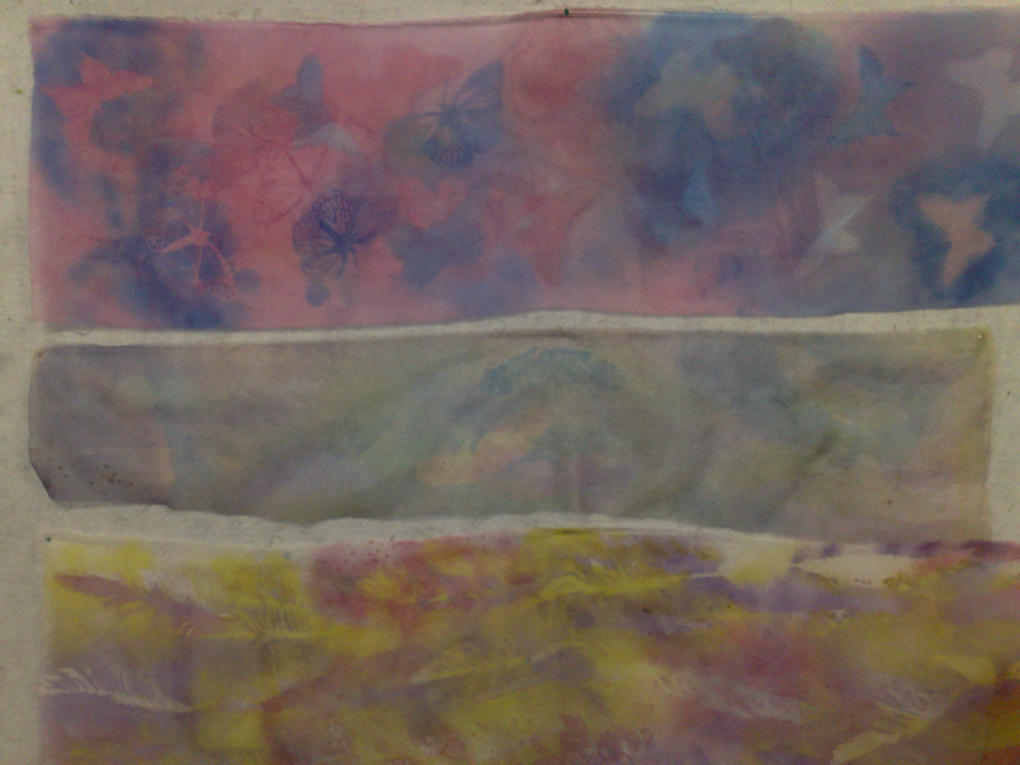
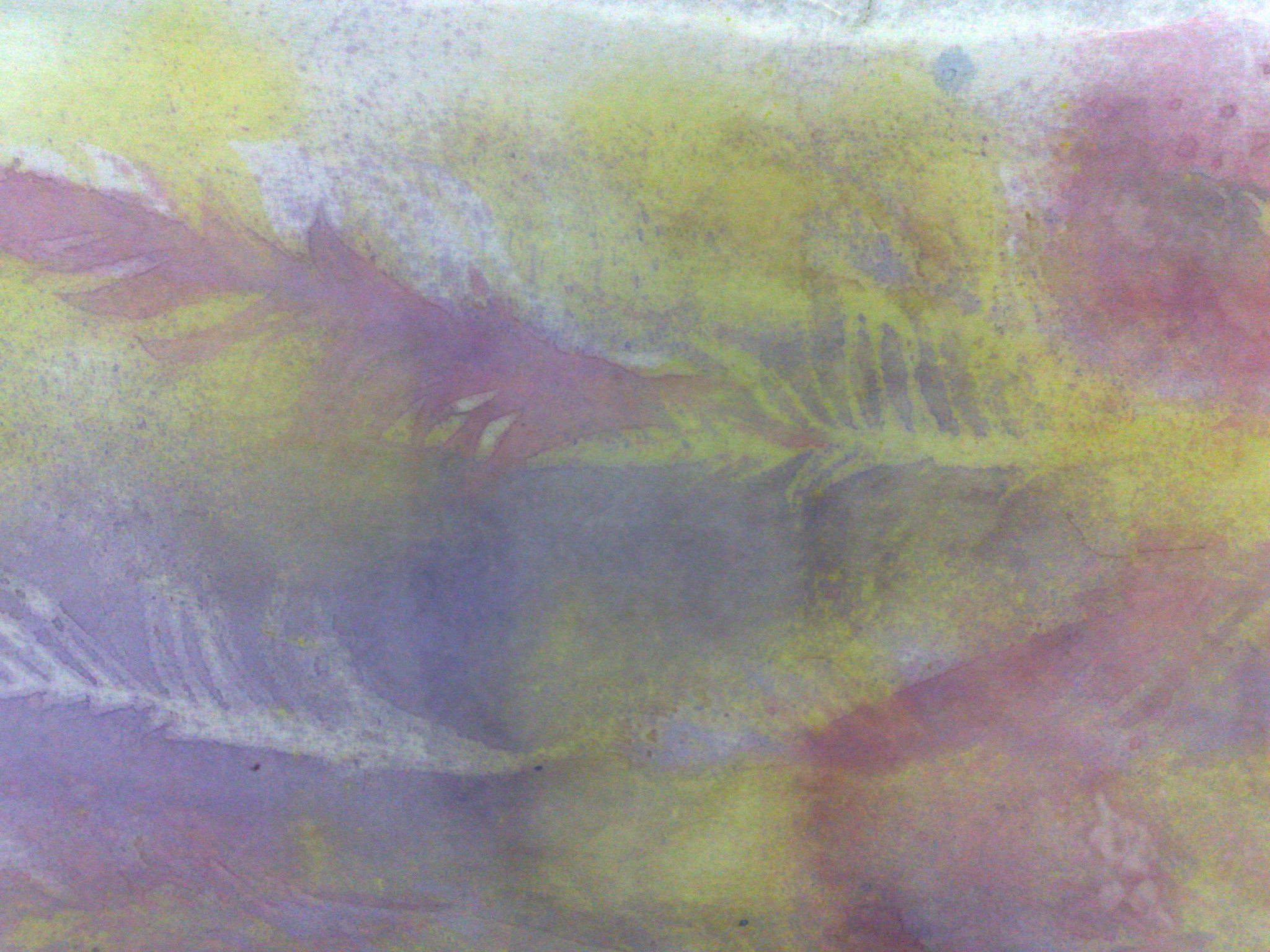
Here are two I made during the class. The top one uses feathers (cut from card and coated with resin) and the bottom one uses leaves from the gorgeous autumn maples just out in the courtyard.
The top one here is a student's work, using acetate butterfly masks, she got lots of depth, but we discussed why she didn't like it and came to the conclusion that the first yellow layer is very important, although you can't see it until the end, as it modifies all the colours and gives more depth. The middle one is a piece of organza, and although it is colourful, and looks very pearlescent in the sunlight, it did not hold the stamps and masks well due to the open weave and thinness of the fabric. The bottom one was mt class sample, which I did with an airbrush, a real feather and diluted acrylics. It is much more vibrant, due to the paint, but the hand of the fabric is altered, so it's a choice to make. Also the fabric used is also an important thing. It doesn't matter whether it is cotton, silk, or synthetic, but the density of the weave makes a big difference.
Here's a close up of the butterflies on the top/student's scarf. On the left is a mask, where the butterfly is the background colour with blue around it and on the right is a stamp of the same mask. It was simply turned over and stamped using the paint which was on the top. I love the delicacy of this mask.
Here's a close up of the middle/organza piece. As you can see, the edges are not clear. They actually are clear, but because most of the paint goes through the fabric, the contrast is not high enough. You would get a better effect with a slightly thicker paint, however the nozzle of the spray would clog, and the hand of the fabric would alter.
Here i8s a close up of the bottom/sample piece. as you can see, it has great colour and the definition of the edges with masking and stamping is great, but the hand of the fabric is a little stiff.
These are a couple of the cloths we used to blot the masks dry. Gorgeous, aren't they?
And now the piece de resistance!
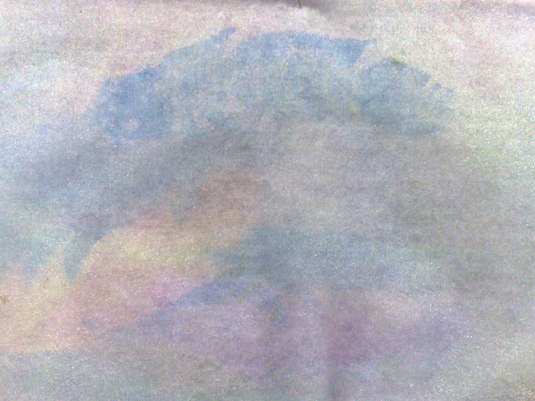
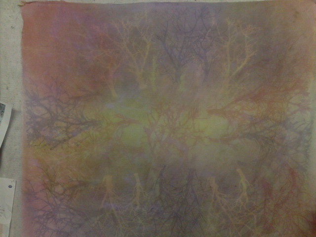
This is a large piece that I did at the end of the class using a tree mask (from crafter's workshop). The colours look a bit muted here, but it is the most glorious colours in the sun.
This one is without the flash.
A couple of photos showing the layering and the use of masks and stamping. This scarf/shawl is very appealing to me and I think it will end up on the wall somewhere (if I can ever find the space!).
And lastly-
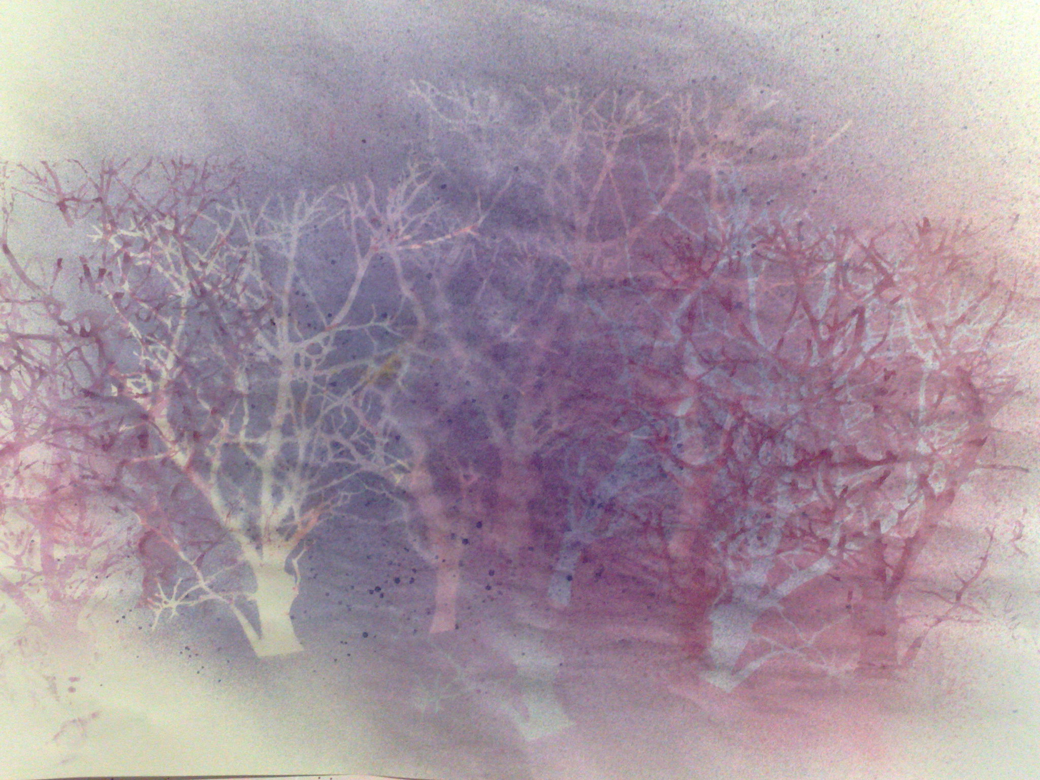
.This gorgeous piece of paper started as my blotting sheet whilst I was making the large piece, but towards the end, I wanted to work on it. It will certainly be framed! (or I might redo it on some thicker paper, or fabric, or canvas)
You know me, I always love the rubbish at the end of a project and can't throw it out!
Happy creating!
Sunday, March 10, 2013
At least summer is handy for sunprinting
I have been very unproductive of late. I find as I get older, that I tolerate the heat less and less and this year is still a hot one. A lot of my large quilting projects have been put on hold until I can work in my smaller sewing room without raising a sweat. I have a smaller machine for quilting and thread painting out in my studio, where I can regulate the temperature somewhat, so back to small projects.
Last week, I did some sun printing (like I said at least the sun is good for something!).
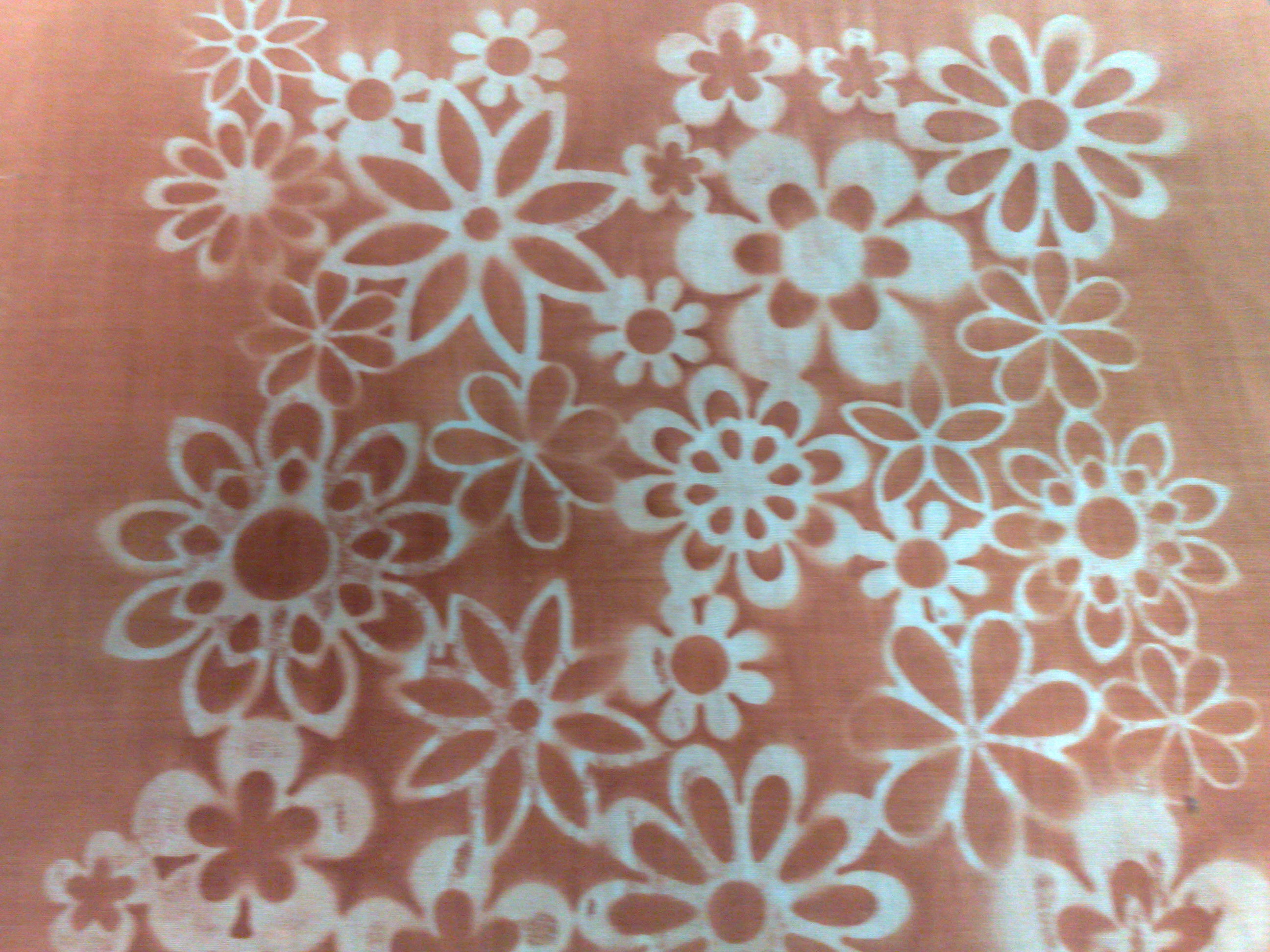
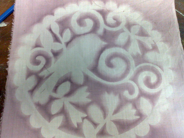
This one was done using setacolour soleil sunpaint. I dampened the fabric, then pressed it flat onto a laminex board that I just happened to have. The water allows the fabric to stick.
Then I painted the whole piece with the paint and a large brush. I placed a stencil from my huge collection over the top and left it to dry. The piece above is the result.
It's a bit of a miracle, really. My hubby says it is not possible and doesn't make sense, but I have seen lots of paint effects related to this, like making fabric for water ripples by gently pleating as it dries.
With this one I used an ordinary setacolour metallic. In some places, where the stencil did not sit flat, there is not a very defined line, but I liked this one and immediately had to play with it.
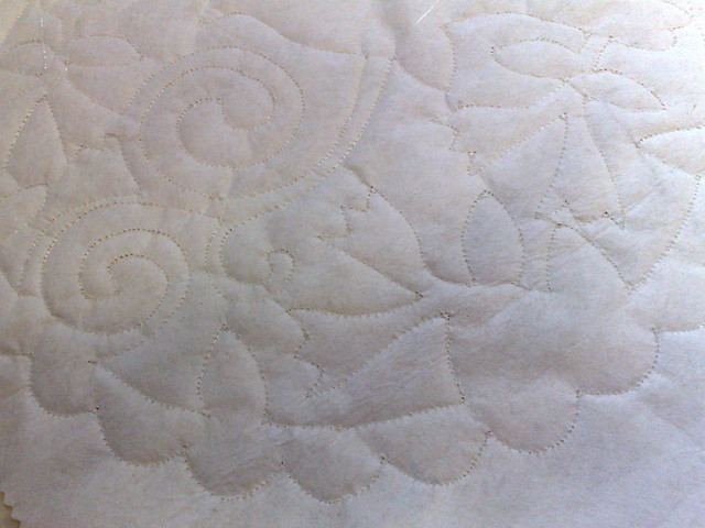
I sandwiched the fabric with batting and stabiliser, then quilted around the edges of the design with white thread.
Here is the back. The quilting is more obvious here.
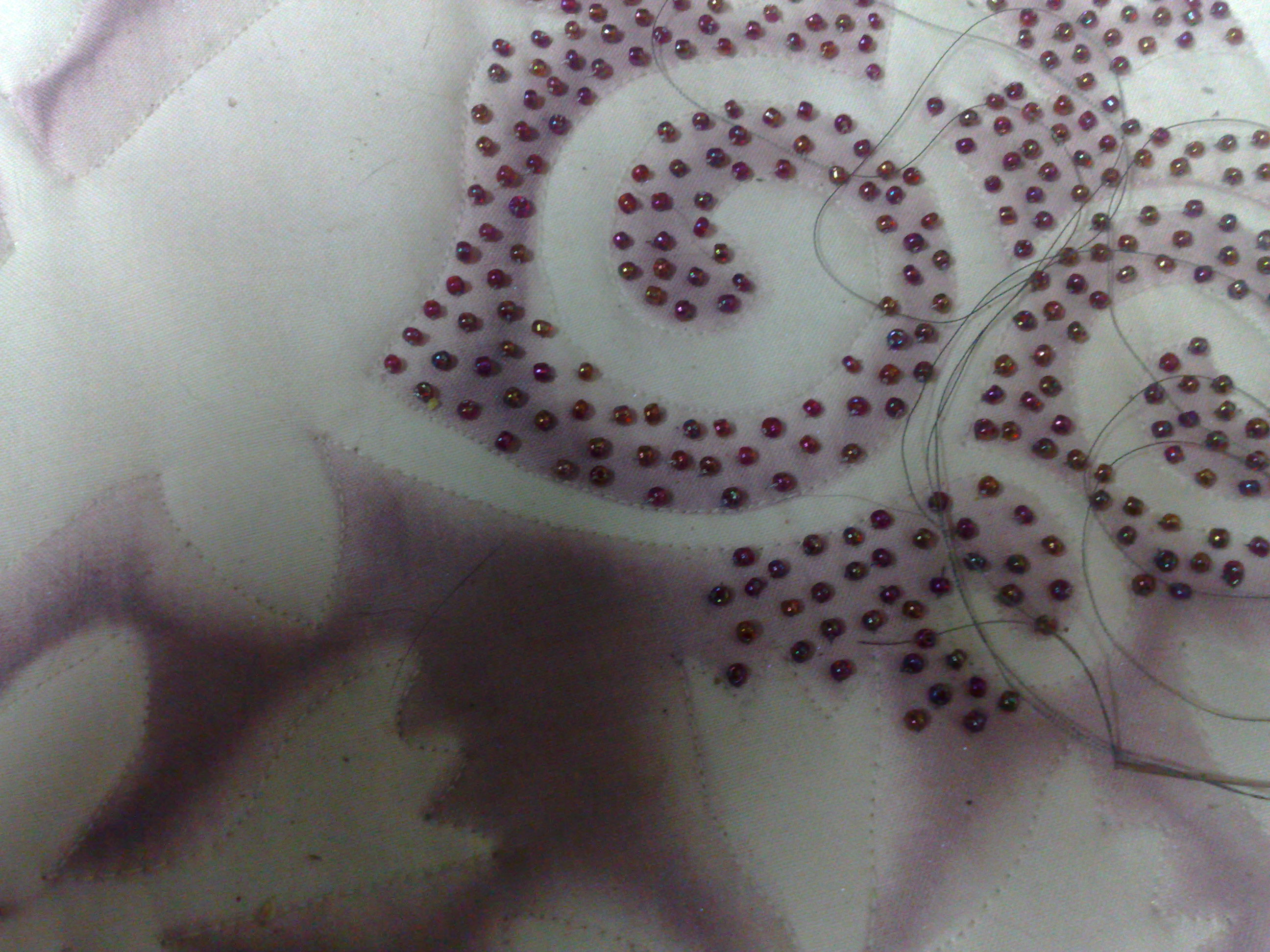
I am now in the process of beading over all the painted areas, which will take me a while!
Here's where I am up to at present. I have already had an expression of interest in purchasing this one! How great is that!
Anyhow, that's how things are going at present. I will try and keep my blog more up to date from now on.
Thursday, January 19, 2012
a bit of tulle and Transfers
today's ATC is HOT
Abstract cotton fabric on heavy stabiliser. Decorative yarn trapped under tulle with free motion scribbling. yarn couched on the edge
Now, an update on the fabric transfers I was doing last week.
This transfer (of a dover copyright free image) was done on very high count cotton using an acetate overhead transparency (not a printer transparency) When you print this way, the ink does not soak into the transparency, but just sits on top of the sheet.
My fabric had been moistened thoroughly, but was not dripping. I made sure there was no water sitting on top by wiping it.
I carefully placed the transparency face down onto the damp fabric and without moving it, pressed all over with a brayer (I used the brayer, but I have found that it is not as good as using your hands)
If you look carefully, you can see down the centre of the picture, there is a pale streak. The brayer did not make good contact here, so that is why I find using your hands is more successful.
another point to make here is that there was a little bleeding with just water. If you look carefully at the edges, you will see that they are a bit wobbly. Also, if the fabric is too wet, this will happen, so there isis a bit of balance to it.
This transfer was done using an Alum solution to wet the fabric. (I use a saturated solution, which means no more alum will dissolve in it. It is available at chemists, but you might have to order it.)
As you can see, I was still using the brayer here, but the edges are much clearer and the image is much more defined.
Imagine my surprise, when searching on the internet, to find this method being used by a printmaker!
This is a very complicated image, so these results are pretty good. The main points are:
One of the main advantages of this method is that it is very cheap.
Abstract cotton fabric on heavy stabiliser. Decorative yarn trapped under tulle with free motion scribbling. yarn couched on the edge
Now, an update on the fabric transfers I was doing last week.
This transfer (of a dover copyright free image) was done on very high count cotton using an acetate overhead transparency (not a printer transparency) When you print this way, the ink does not soak into the transparency, but just sits on top of the sheet.
My fabric had been moistened thoroughly, but was not dripping. I made sure there was no water sitting on top by wiping it.
I carefully placed the transparency face down onto the damp fabric and without moving it, pressed all over with a brayer (I used the brayer, but I have found that it is not as good as using your hands)
If you look carefully, you can see down the centre of the picture, there is a pale streak. The brayer did not make good contact here, so that is why I find using your hands is more successful.
another point to make here is that there was a little bleeding with just water. If you look carefully at the edges, you will see that they are a bit wobbly. Also, if the fabric is too wet, this will happen, so there isis a bit of balance to it.
This transfer was done using an Alum solution to wet the fabric. (I use a saturated solution, which means no more alum will dissolve in it. It is available at chemists, but you might have to order it.)
As you can see, I was still using the brayer here, but the edges are much clearer and the image is much more defined.
Imagine my surprise, when searching on the internet, to find this method being used by a printmaker!
This is a very complicated image, so these results are pretty good. The main points are:
- use an overhead transparency, or a thin piece of acetate (the flexible sort, not stiff) cut to size for your printer.
- prepare your fabric (damp, but not wet) before printing, I find placing an absorbent piece of paper under it helps with this)
- Don't disturb the ink on the acetate before transferring it
- use an alum solution for slightly clearer prints
- I heat fixed my prints when still wet, but I actually found that they did not bleed if left to dry and appeared sharper
- use your hands to smooth the transparency and transfer the print
One of the main advantages of this method is that it is very cheap.
- after transfer, simply wipe the acetate clean and reuse
- you can get a reasonable print with water
Subscribe to:
Posts (Atom)

