I have been hiding for a few days, trying to keep cool, but today the weather is a bit cooler.
Something I love to do is free motion embroidery, and I love making things out of just thread. A bit like stumpwork, but with the sewing machine. Most of these little things will end up on my crazy quilt, but they are so lovely, I keep making them.
This little butterfly is about 2 inches square. Basically, I just scribbled to create this one. But it is done with some gorgeous new metallic threads I got recently - a bit of a test run.
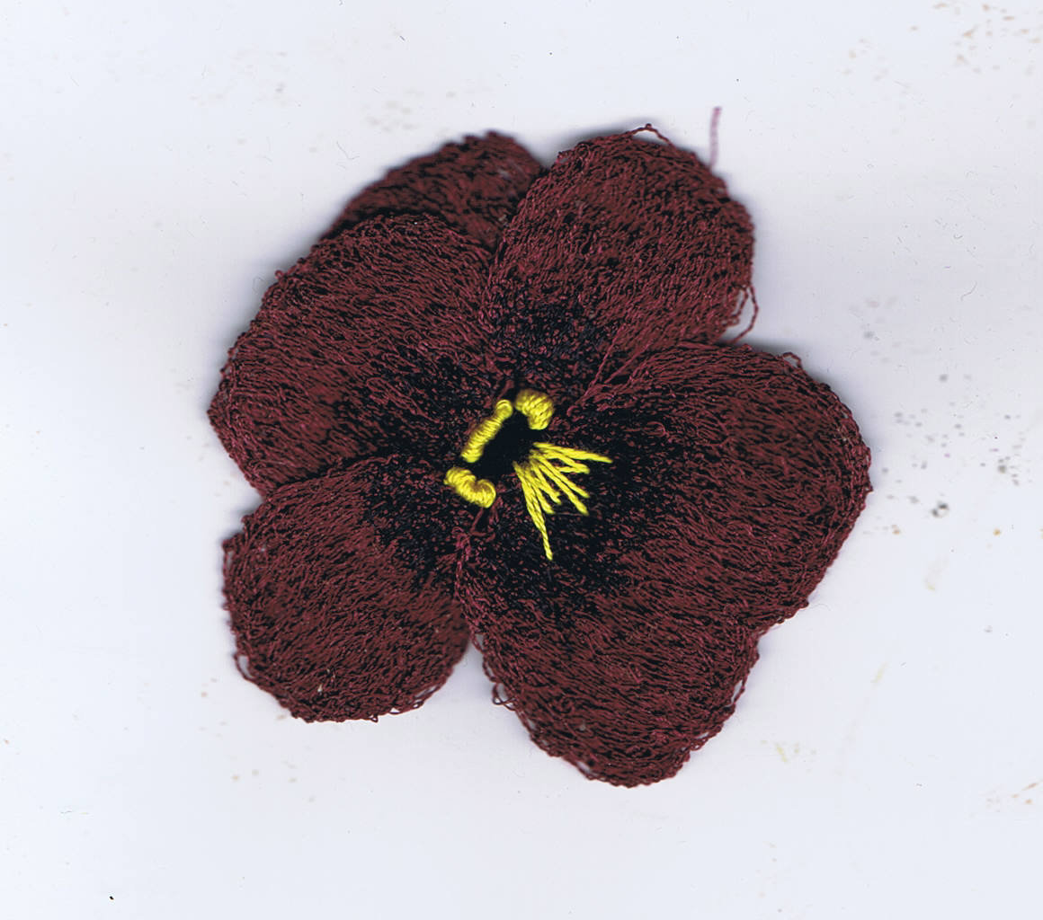
This pansy is about the same size, perhaps a little smaller. With this one, I made all the petals separately the sewed them together and added the yellow by hand. This one has already been pinned into place on one of my crazy quilt blocks.
If you have followed me for a while you will know that I have a crazy quilt in process, but I put it aside so I could participate in CQJP2014, so I will have my January block finished soon.
Happy Creating!
Saturday, January 18, 2014
Wednesday, January 15, 2014
Some Drawing in the cool
I spent most of today hiding from the heat in the main house, drawing and playing with my sketchbooks.
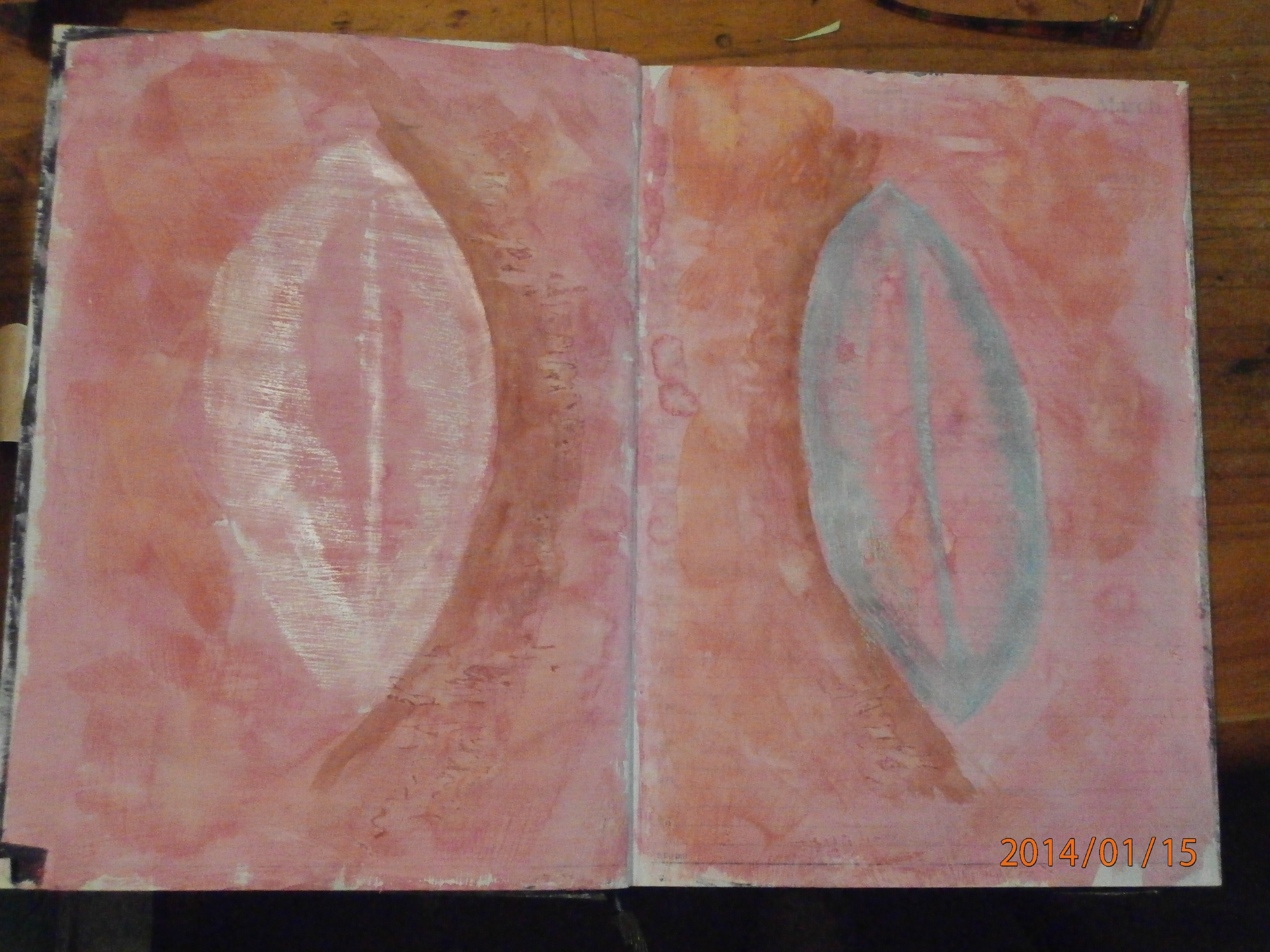
here are a few pages
This one was my favourite, and as usually happens, it just made itself.
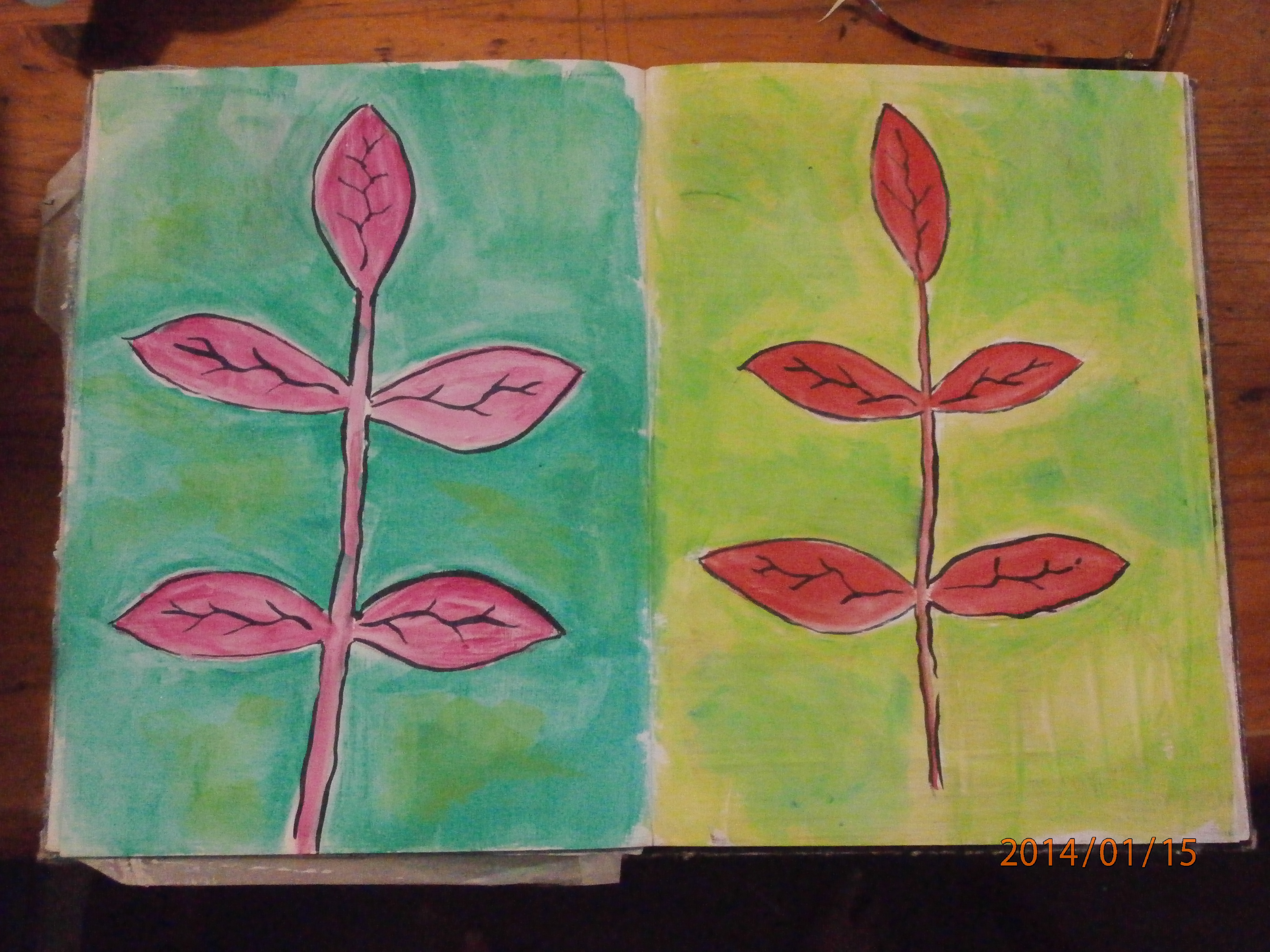
This one was just some simple leaves, but I used metallic oil pastels and it is very shiny and nice.
Another simple one, playing with colour
I tend to draw leaves, when I can't think of anything special.
Happy creating!
here are a few pages
This one was my favourite, and as usually happens, it just made itself.
This one was just some simple leaves, but I used metallic oil pastels and it is very shiny and nice.
Another simple one, playing with colour
I tend to draw leaves, when I can't think of anything special.
Happy creating!
Tuesday, January 14, 2014
T for tuesday
Here is my contribution for T for tuesday. I must comment for Elizabeth's benefit, that this was a lovely cup of tea, of course served by ME.
This is a pastel drawing in my sketchbook. I have always avoided using soft (chalk) pastels in my books, because of the smudging, but I have found I can smother them with hairspray. It alters the colours a bit, making them darker, but really I am finding I am enjoying getting messy with pastels again.
I am also NOT working very hard this week as we are having quite a heatwave and my studio is not bearable, being just a converted verandah. Of course I am also keeping up to date often with what is happening on the fire front, not much activity yet, but I am watching!
Happy Creating!
This is a pastel drawing in my sketchbook. I have always avoided using soft (chalk) pastels in my books, because of the smudging, but I have found I can smother them with hairspray. It alters the colours a bit, making them darker, but really I am finding I am enjoying getting messy with pastels again.
I am also NOT working very hard this week as we are having quite a heatwave and my studio is not bearable, being just a converted verandah. Of course I am also keeping up to date often with what is happening on the fire front, not much activity yet, but I am watching!
Happy Creating!
Monday, January 13, 2014
My latest Tangled Textiles piece was a bit of a shamozzle, and didn't turn out the way I wanted, but that's what art is about, experimenting. Have a look at the other participant's work, which is amazing!
I had fun doing it and didn't let myself stress over the things that didn't quite work. It's a learning experience and this certainly was, for me.
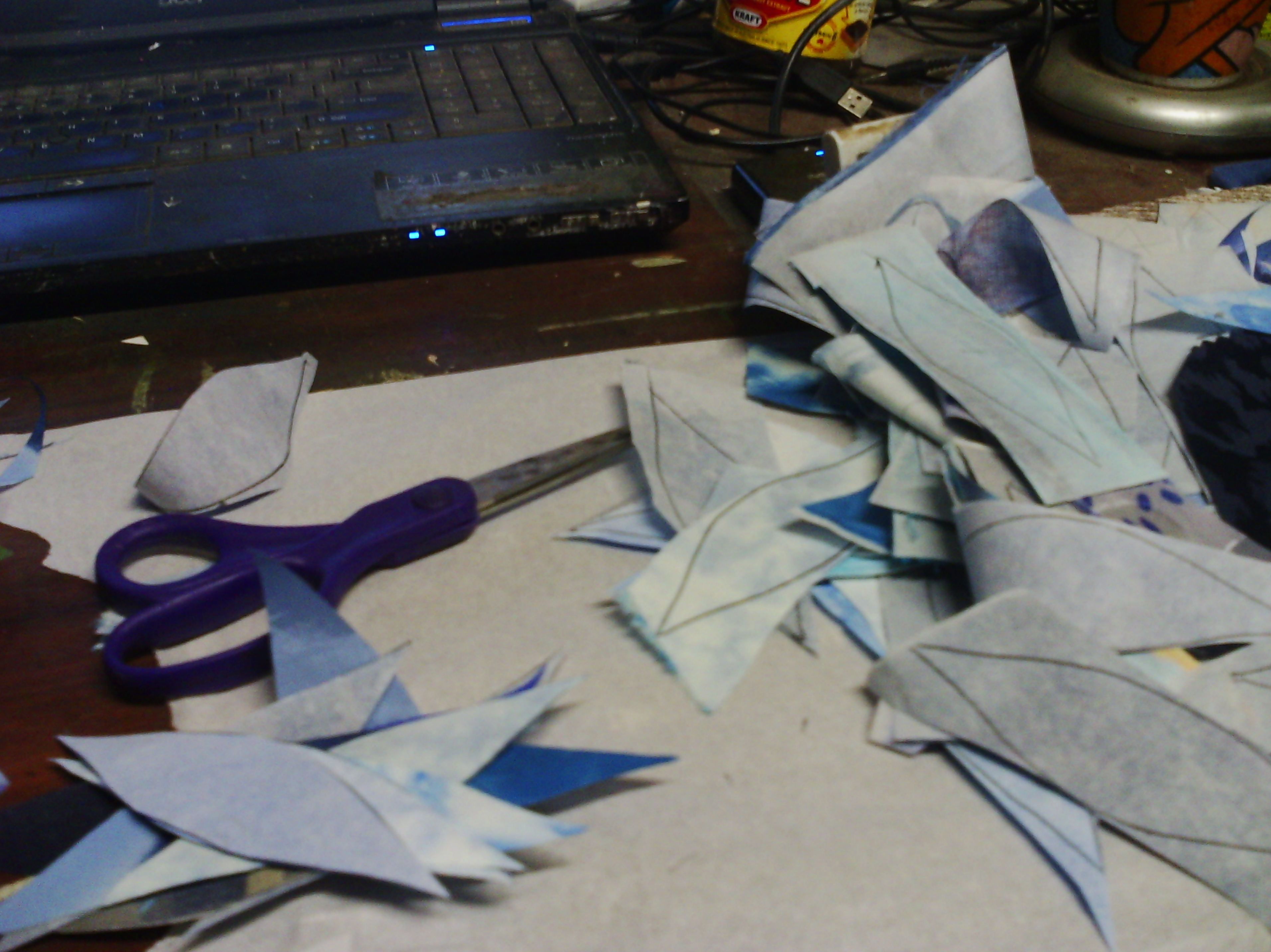
I cut lots of tesselating shapes that suggested water to me, with fusible on the back.
Then I arranged them and fused them for my background
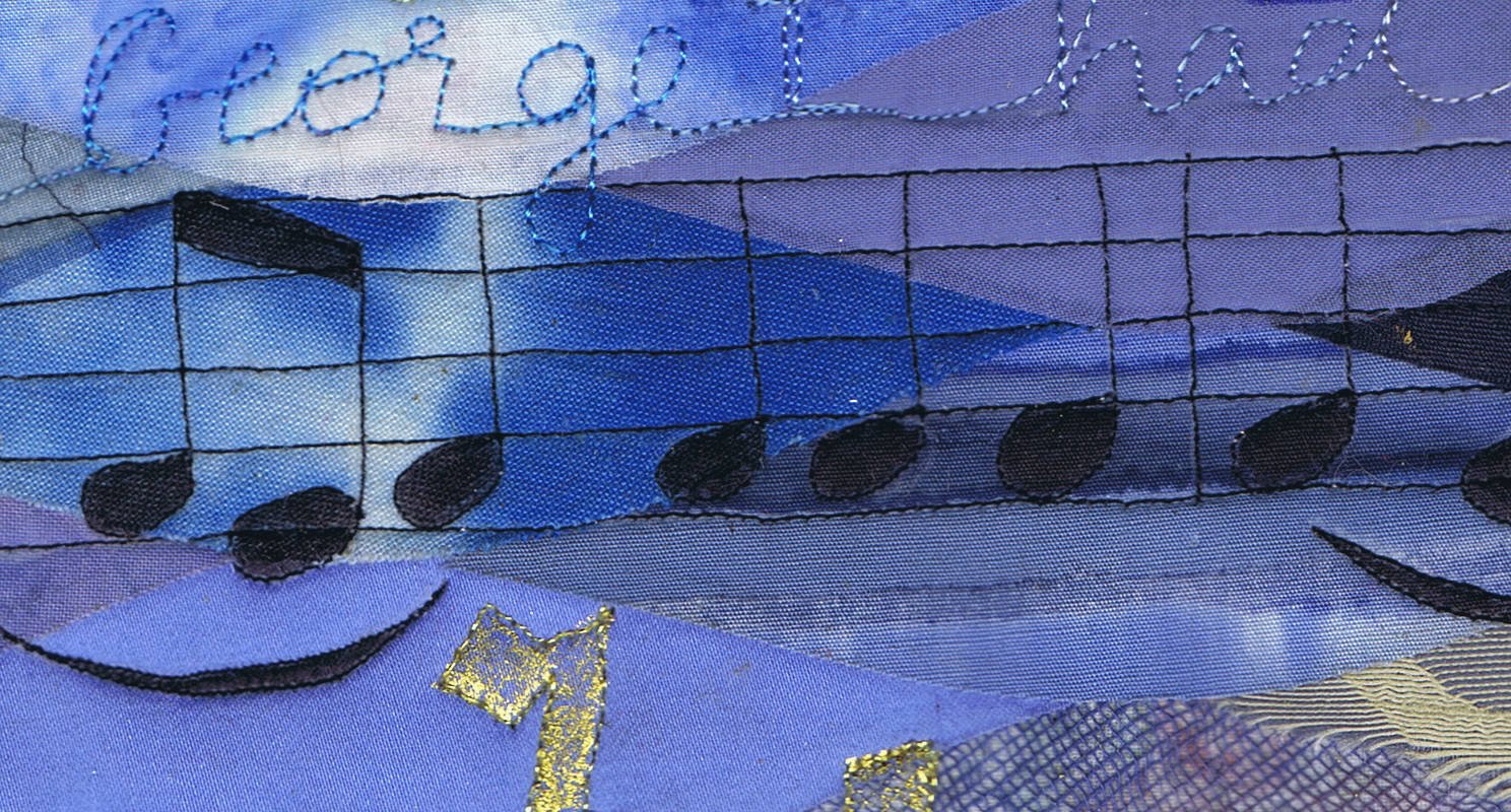
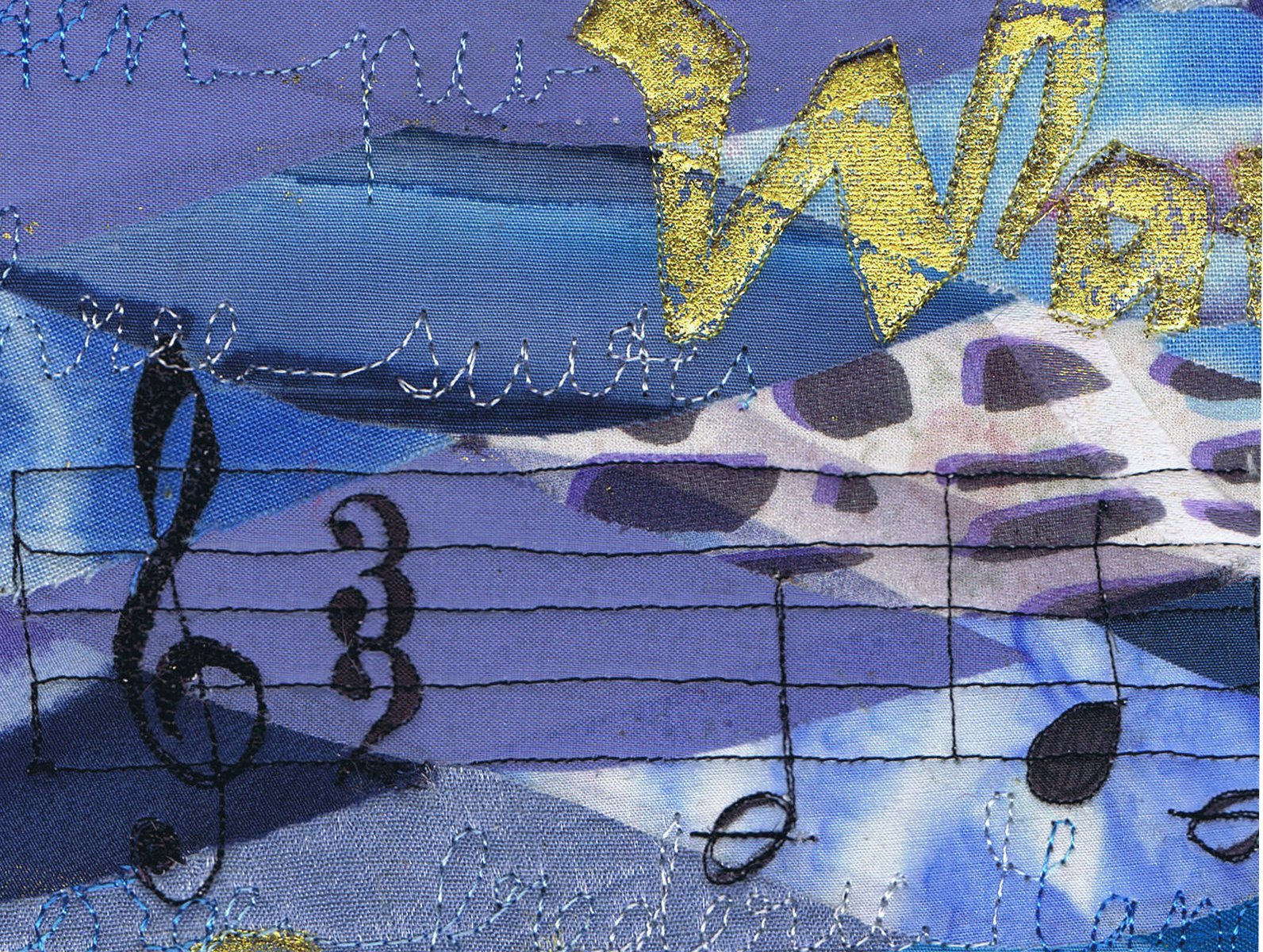
I free motioned some music. It is the opening bars of George frederic handel's "Water Music".
There is also some handwriting in free motion with variegated thread - very messy.
I also added some foiled text - which was one of the things I was really quite happy with and will do again.
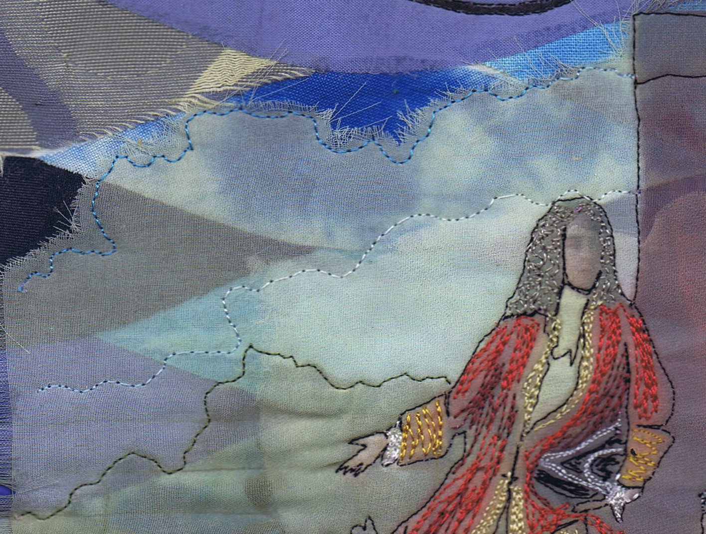
I also added a print on chiffon, which worked well but the contrast was not good, so I outlined some parts. I didn't like it, so I added a bit of scribbled free motion colour to the main characters. It was a bit rough, but I just went with it.
You can see my original idea of the water shapes in the background created major problems with contrast. The shapes are all fused to the background. Probably, I should have kept it simple and left the picture off, but it was the picture that inspired me in the first place.
"Water Music" does exist, but the premiere as depicted in the picture is only hearsay, as the painting was painted a hundred years after the supposed day. But supposedly the music was played for King george 1 on a trip up the Thames River on 17 July 1717. This story is written in the background with free motion.
Also, my picture is a bit hard to read, and this, I think is due to the shiny gold affecting the other colours in the picture, like glare.
So that is my piece! As I said, it was quite an experiment.
Happy Creating!
I had fun doing it and didn't let myself stress over the things that didn't quite work. It's a learning experience and this certainly was, for me.
I cut lots of tesselating shapes that suggested water to me, with fusible on the back.
Then I arranged them and fused them for my background
I free motioned some music. It is the opening bars of George frederic handel's "Water Music".
There is also some handwriting in free motion with variegated thread - very messy.
I also added some foiled text - which was one of the things I was really quite happy with and will do again.
I also added a print on chiffon, which worked well but the contrast was not good, so I outlined some parts. I didn't like it, so I added a bit of scribbled free motion colour to the main characters. It was a bit rough, but I just went with it.
"Water Music" does exist, but the premiere as depicted in the picture is only hearsay, as the painting was painted a hundred years after the supposed day. But supposedly the music was played for King george 1 on a trip up the Thames River on 17 July 1717. This story is written in the background with free motion.
Also, my picture is a bit hard to read, and this, I think is due to the shiny gold affecting the other colours in the picture, like glare.
So that is my piece! As I said, it was quite an experiment.
Happy Creating!
Sunday, January 12, 2014
A little magpie
The little, or not so little magpie, of course is me. anything shiny or metallic gets my attention.
I have been plating with foils and painted fusible lately. It is not something new, I have done tutorials on it in the past, but unfortunately a lot of my old, old posts have lost their photos. Perhaps that should be an aim for this year, to redo those tutorials???
Anyhow, here is my collage a day using these lovely things.
If you are not familiar with these techniques, they both use fusible web, but in different ways. This sample is on velvet, a la Angie hughes, but these techniques can be used on just about any surface that won't melt with an iron such as paper or wood.
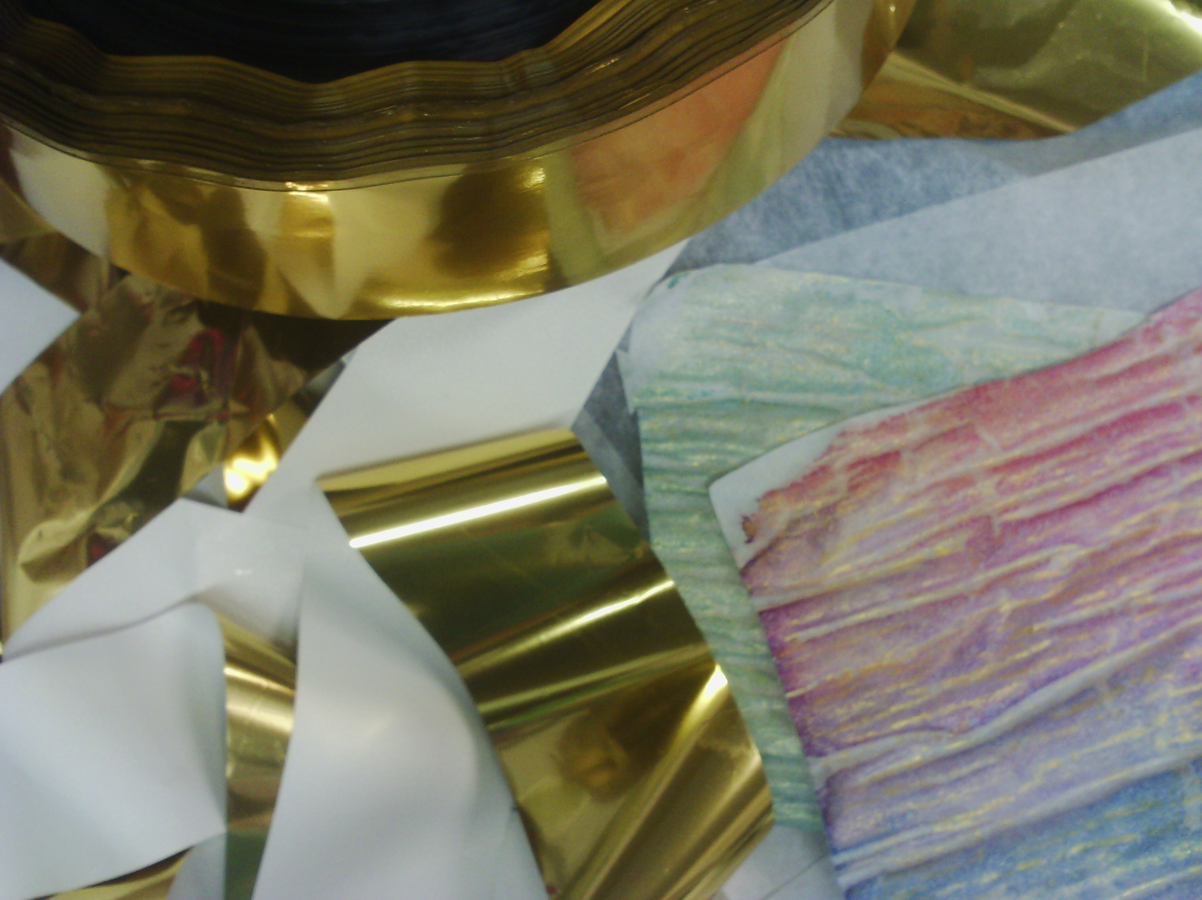
Above are the offending items. The gold strips with the white back are the foil, which I have a lot of as you can see. I have other colours as well. the wrinkly pink and pale green sheets are the painted fusible.
OK, I took some pictures and here is a tutorial
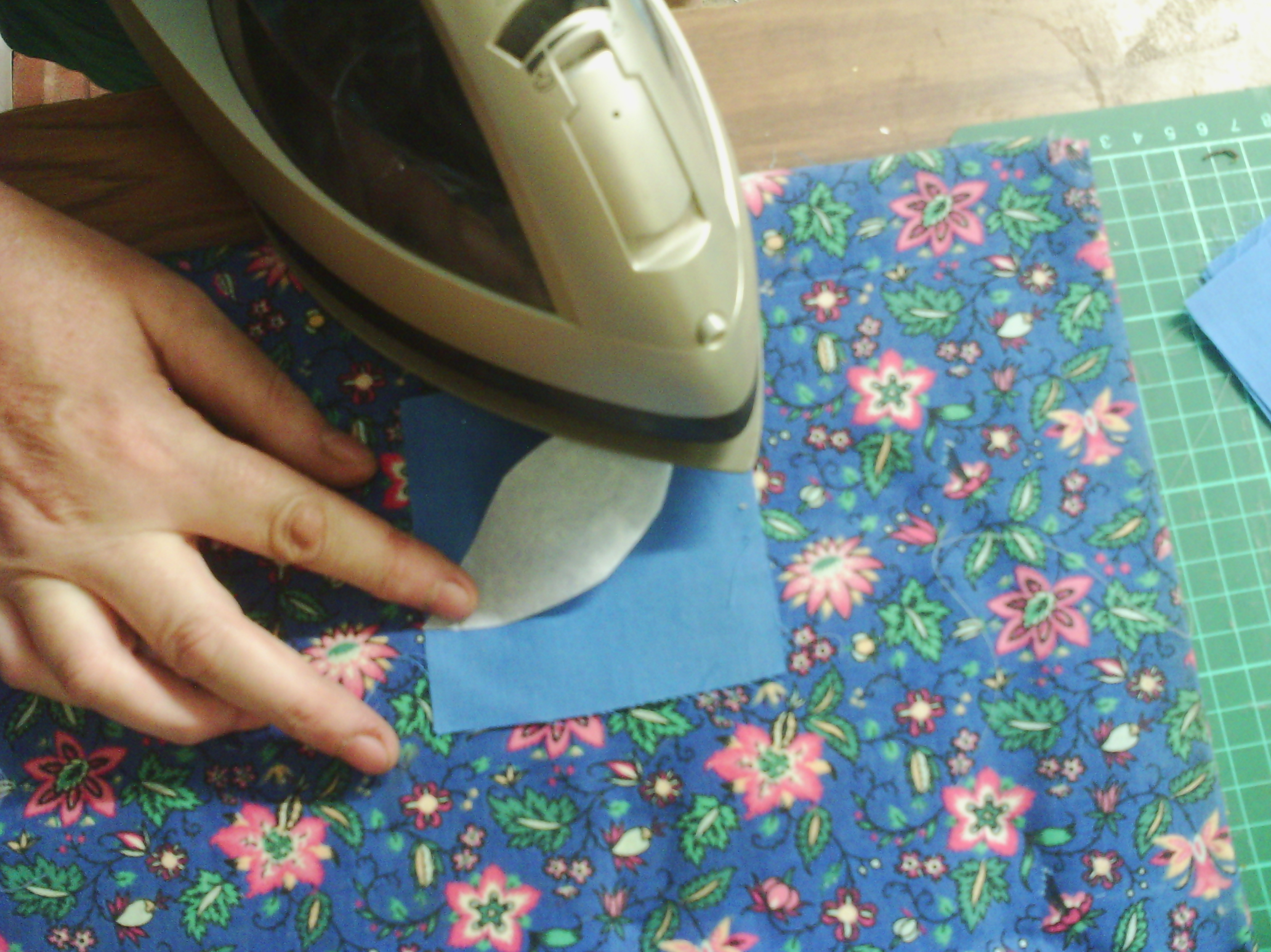
To use the foil, I cut leaf shapes out of fusible (this is a web of glue on a sheet of silicon paper which comes in rolls and sheets).
The fusible web is rough on one side and smooth on the other. The rough side is the glue and the smooth side is the paper.
You take the leaf shape and place it fusible (rough) side down and iron it onto the fabric. Use the instructions that come with the fusible to iron it on, but basically I use a heat that the fabric can cope with. I also usually use some baking parchment over the top, but I haven't here so it is easy for you to see.
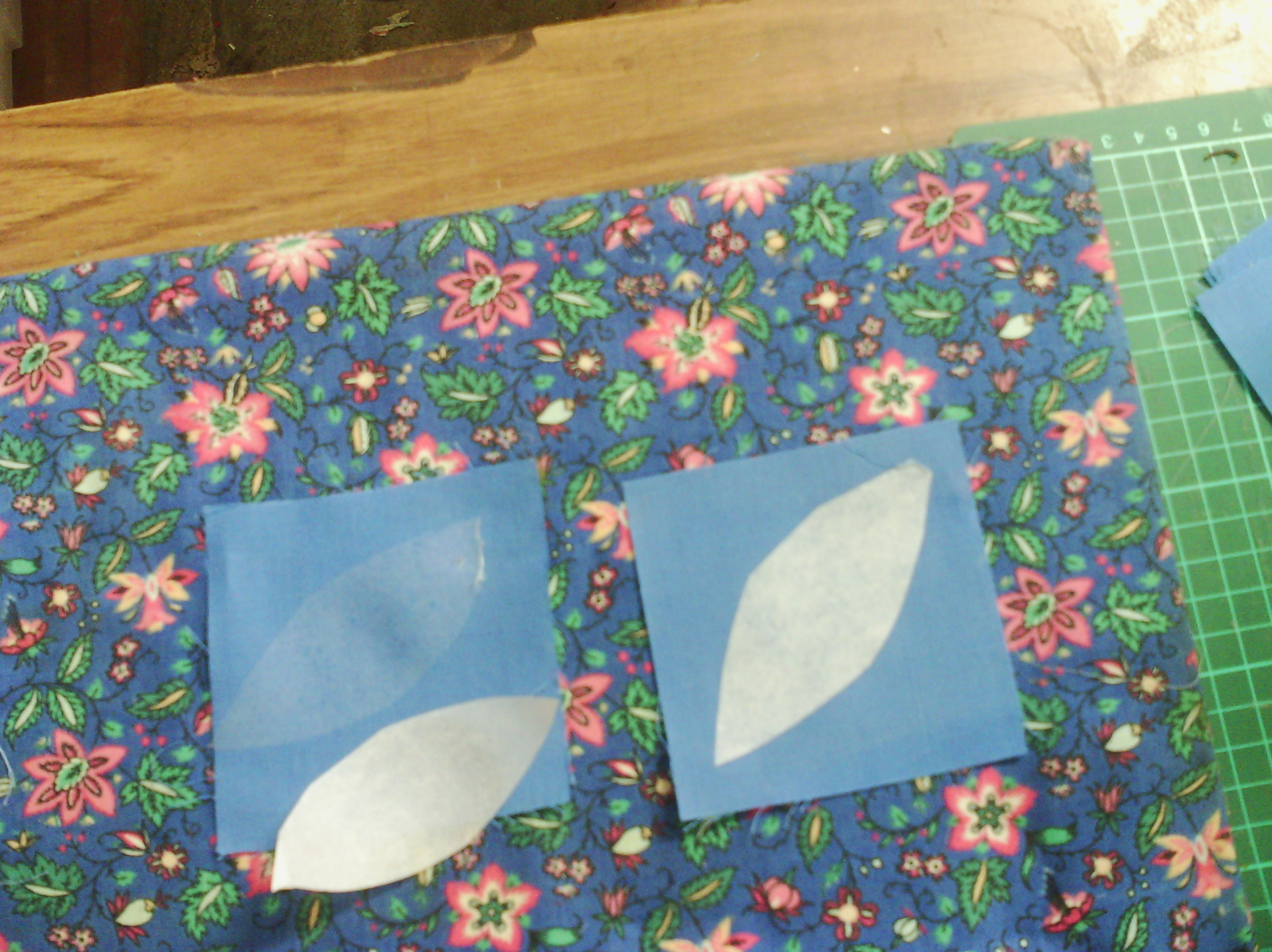
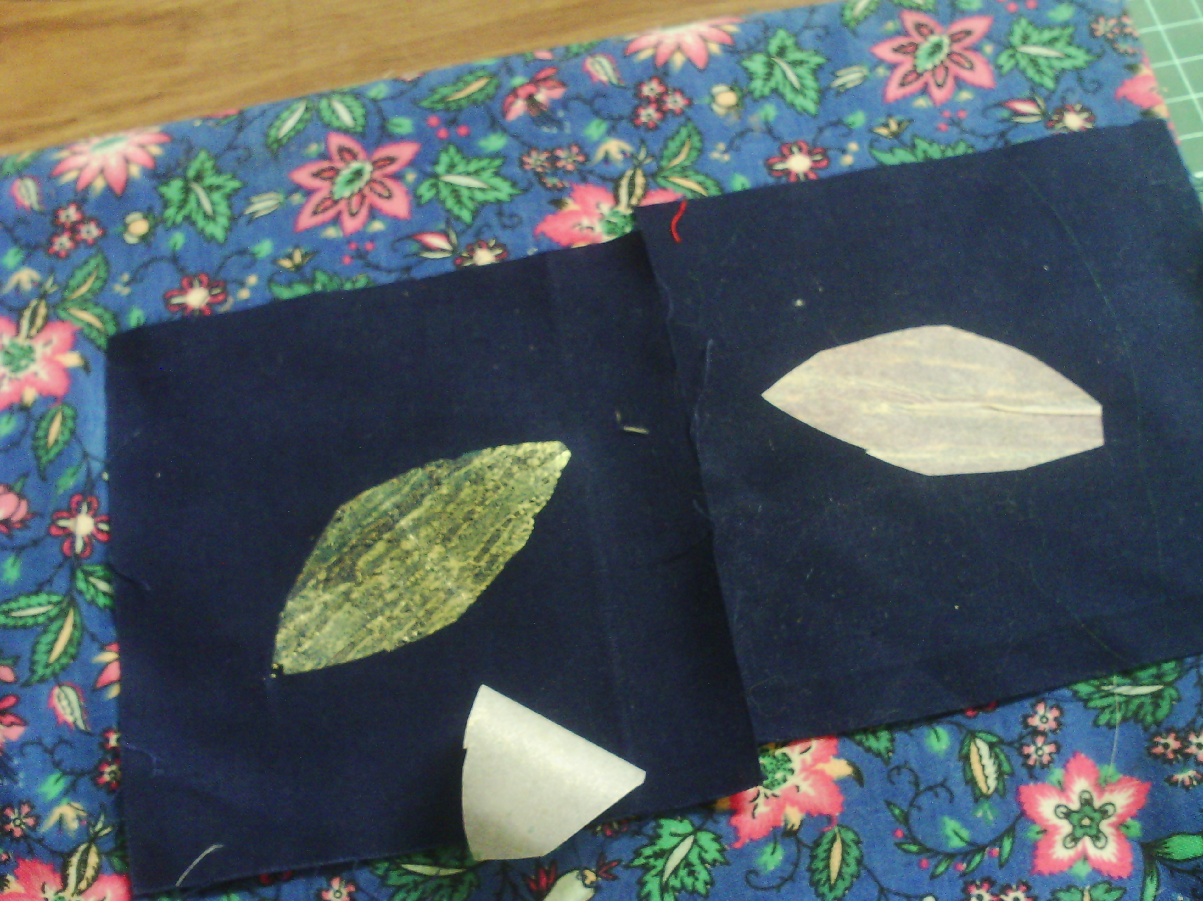
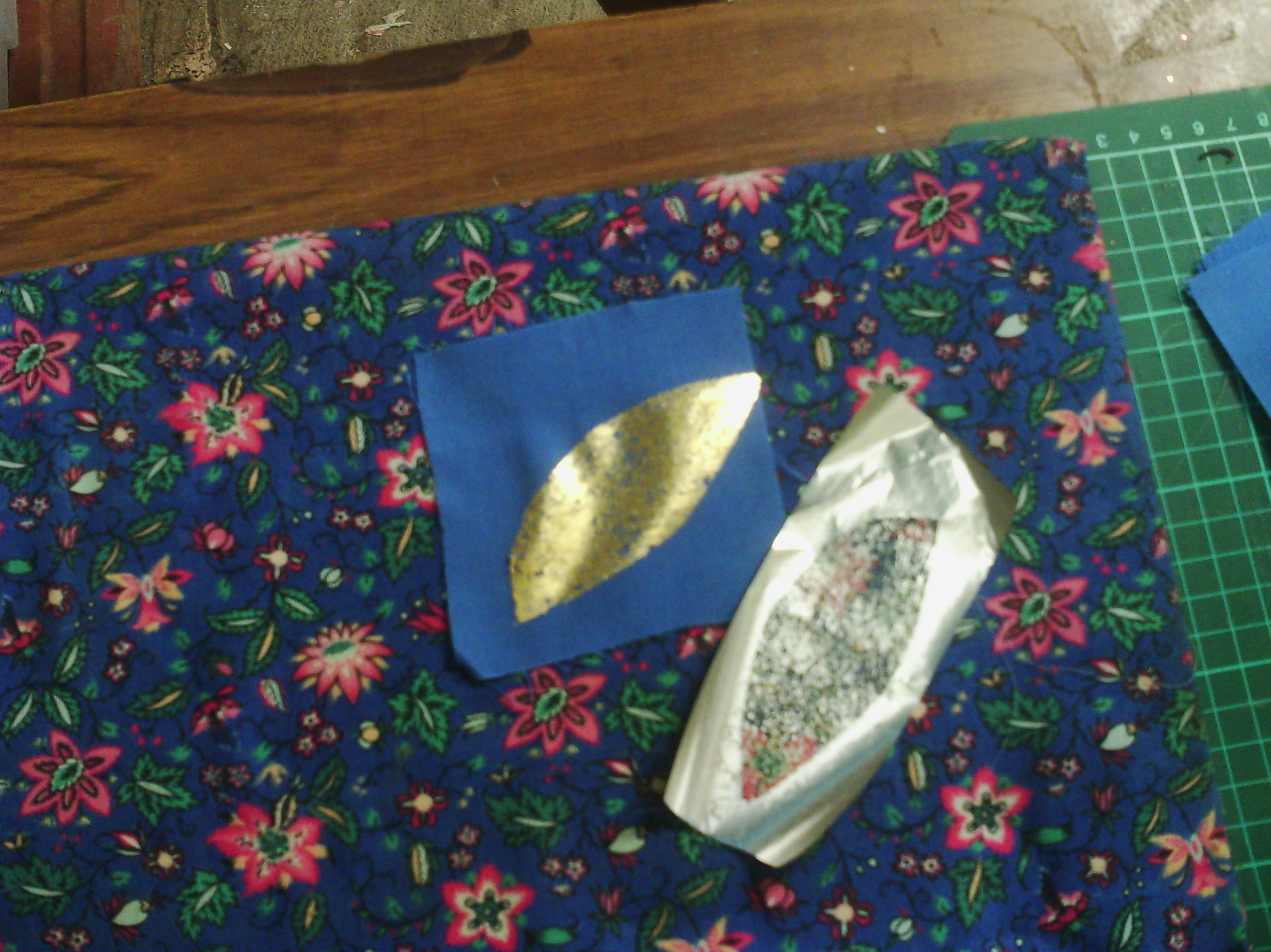
when the ironed on fusible is cool. You peel off the paper. Above you can see on the left, the paper has been peeled off leaving a thin layer of glue on the fabric.
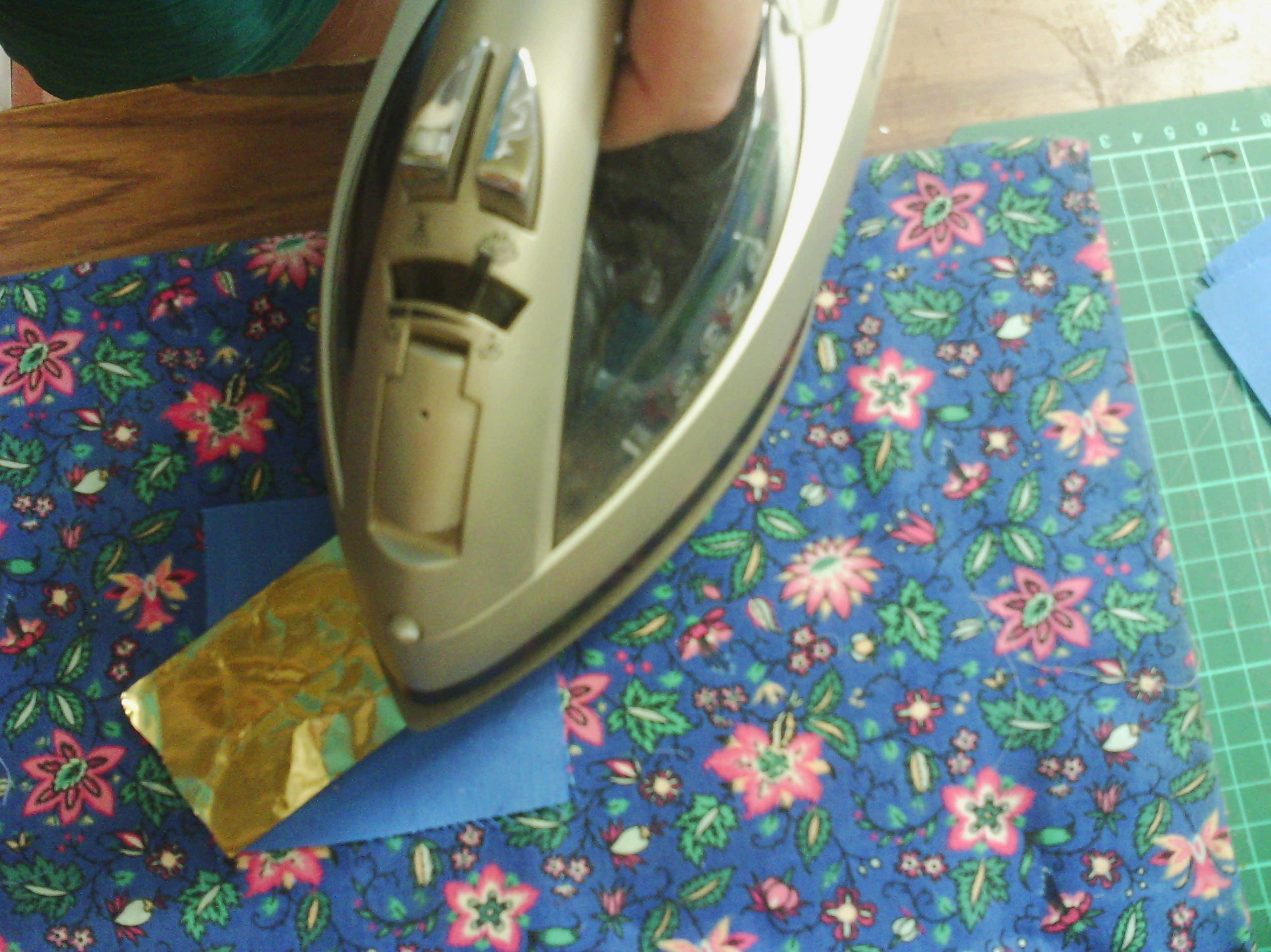
Next you get a piece of foil. This is transfer foil, not metallic wrapping paper, it is a special type of foil used by printers - and textile artists!. You can see the foil is laid coloured side up. This is important, if you use it the wrong way up, it won't work.
Iron the foil onto the glue layer. Again, it is best to use baking parchment, so your iron does not get messed up.
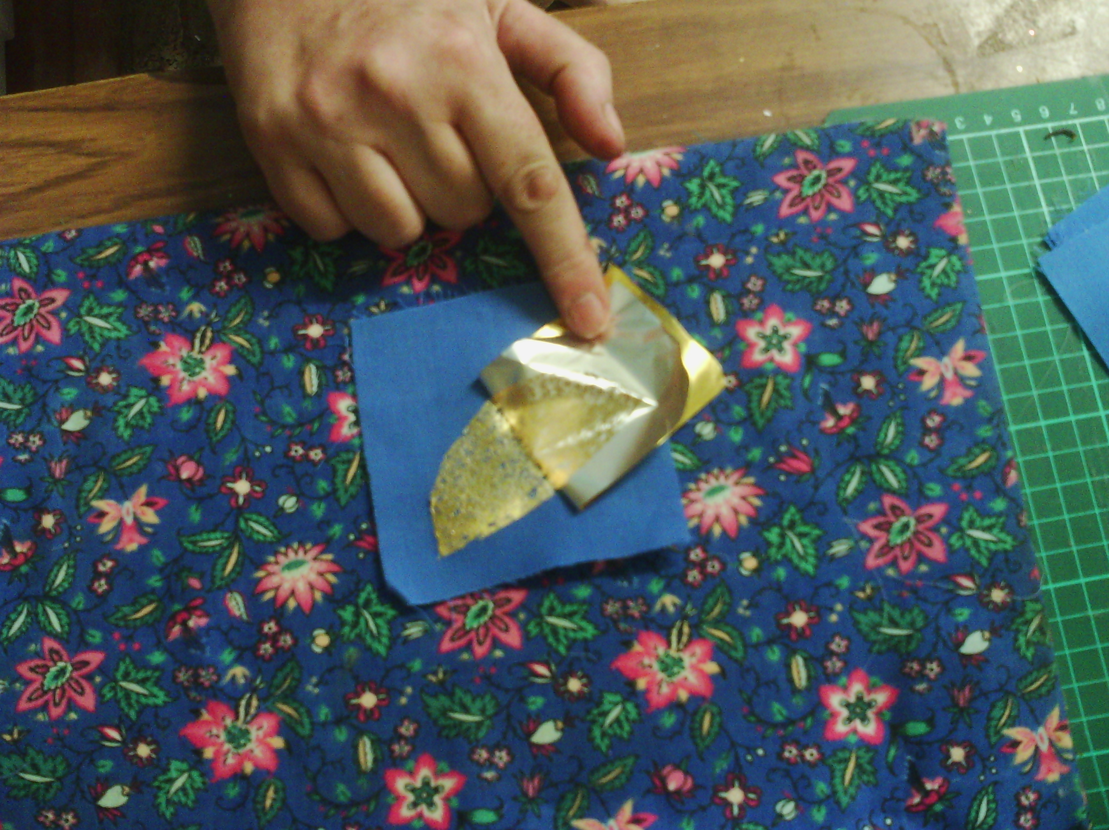
When the fabric is COOL, you can peel off the foil. You can see on the right, above, that where you ironed onto the glue, the gold has come off the foil.
So that is how you use foil. You can wash it (gently), but you must remember that every time you iron it from now on, you need to use baking parchment, or you will get a totally messed iron.
Now for painted fusible.
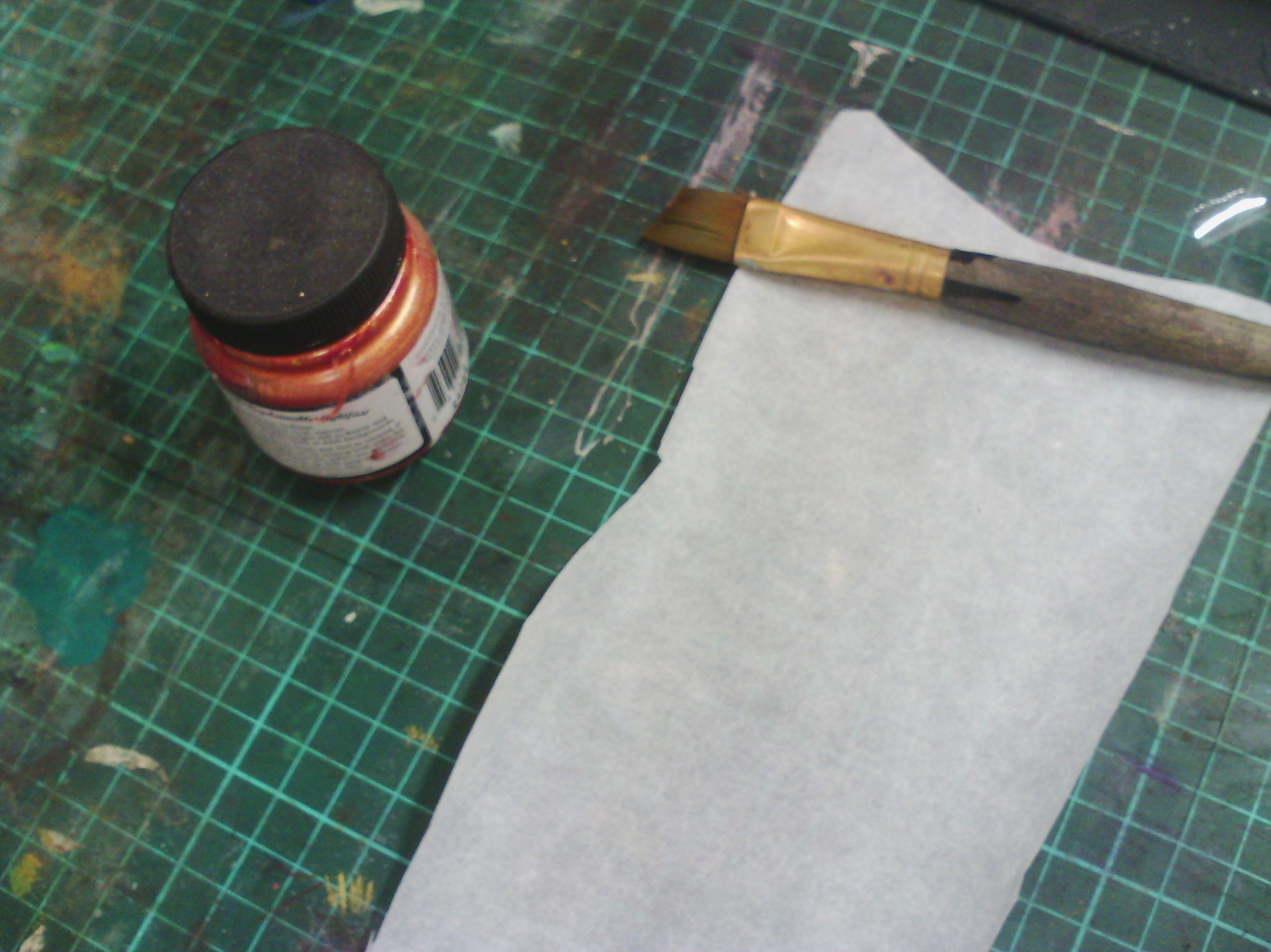
Above, I have taped a piece of fusible glue or rough side up to my painting area ( it tends to roll up). I have some acrylic paint (I like to use lumiere by jacquard as it is lovely and metallic) and a brush.
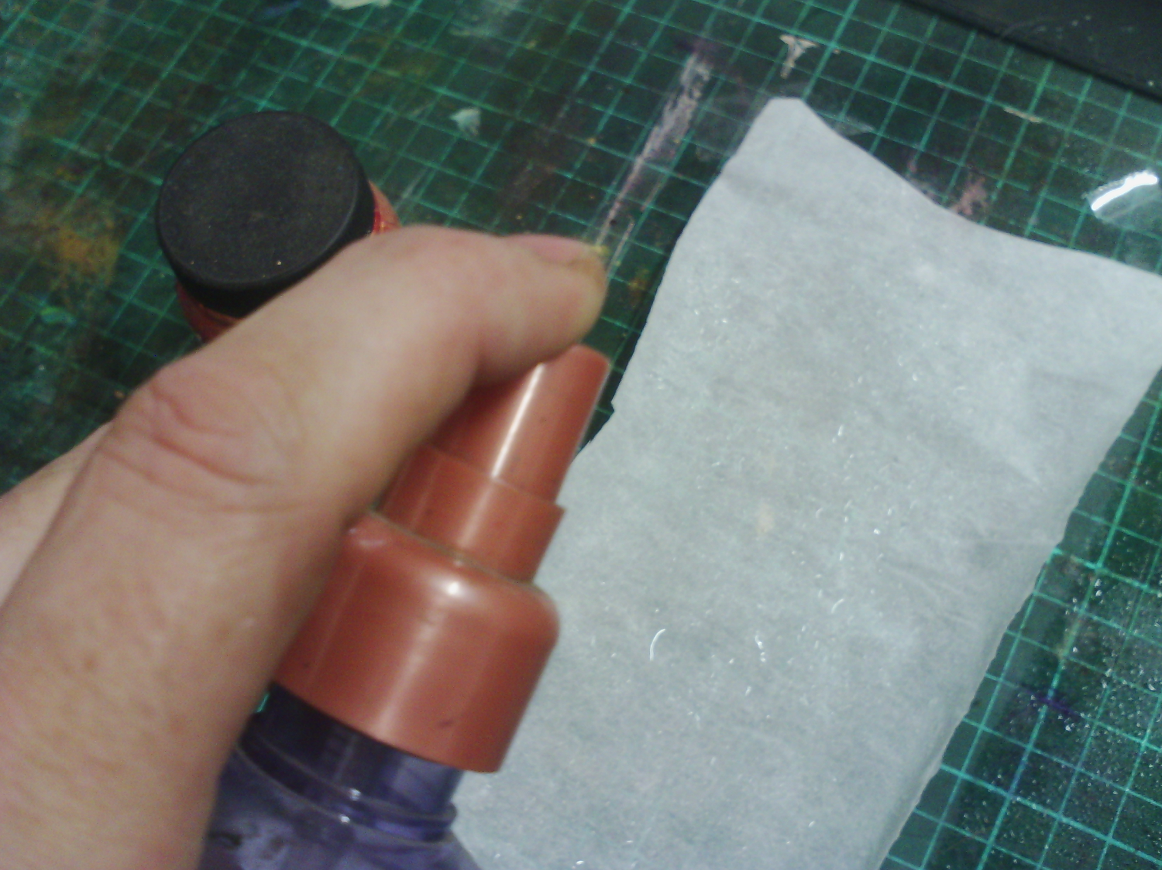
Next, I spray my fusible with water. some people dilute their paint, but i find I get the most texture by spraying with water first.
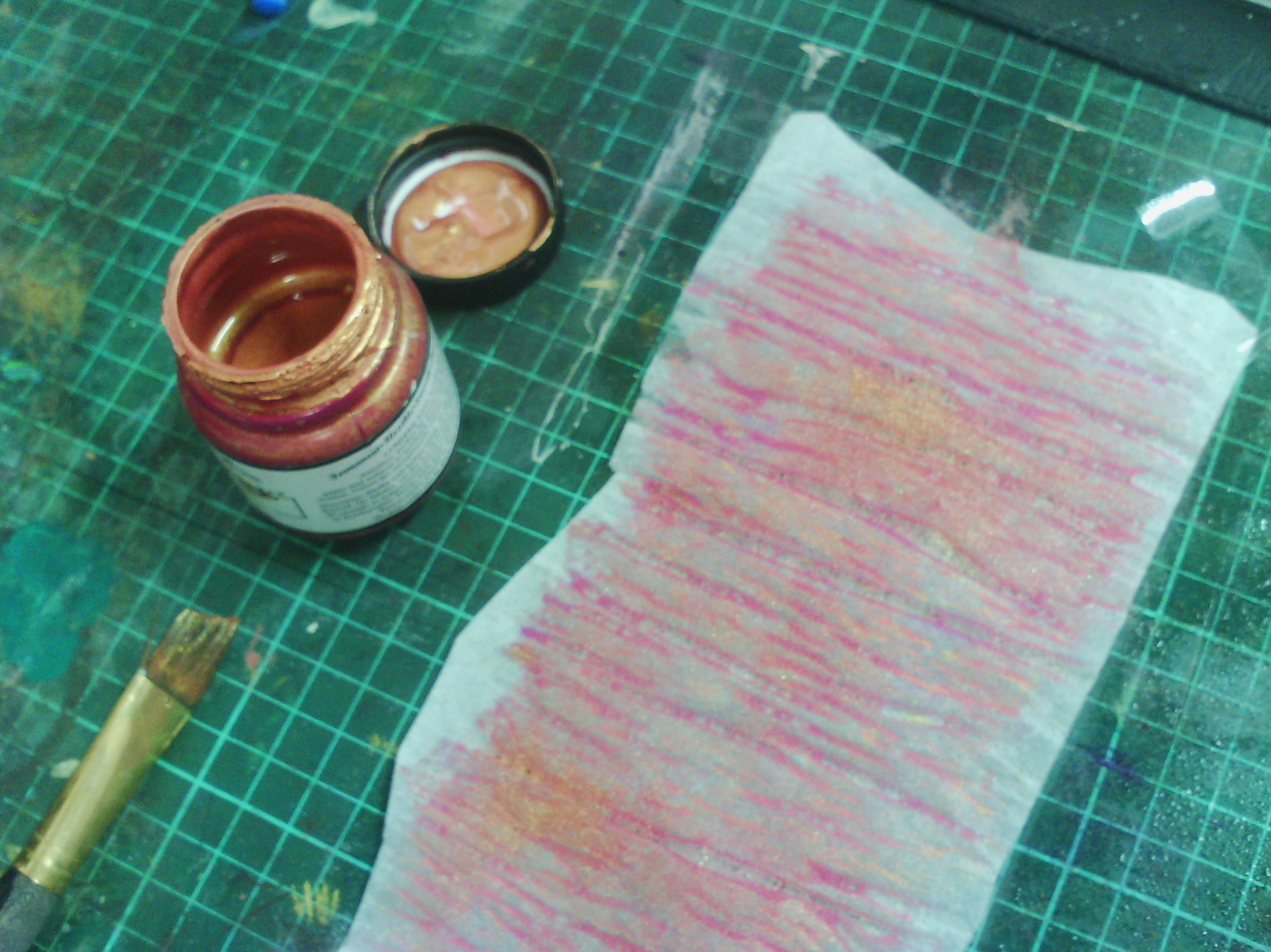
Here, you can see me painting onto the fusible and you can see how the paper backing is wrinkling up and creating texture.
Here is the fusible painted.
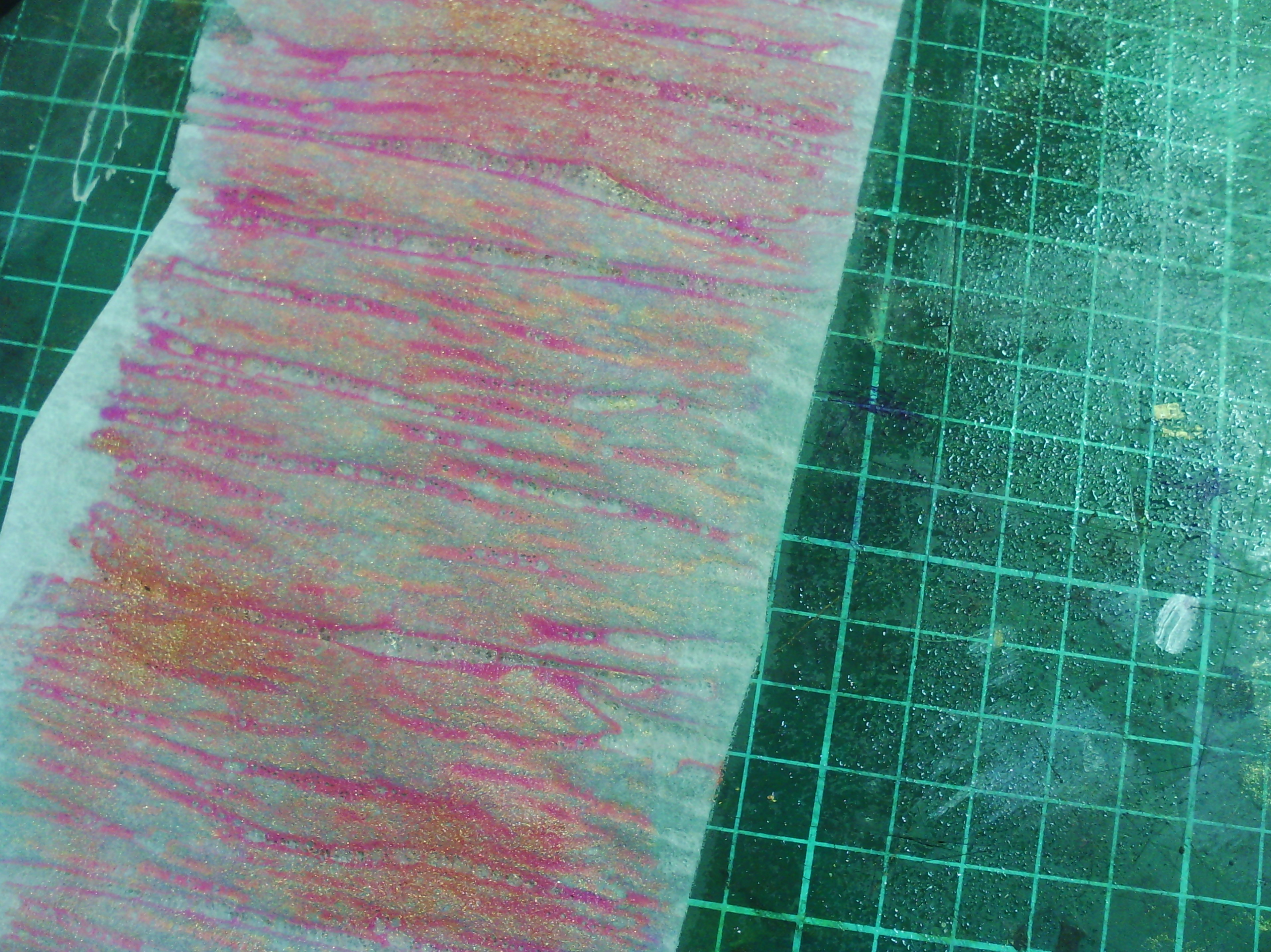
And here is a close up of the gorgeous texture. This needs to totally dry before you use it.
Now for how to use it.
Here is some dry fusible on the right. You can see how wrinkly it gets. this is the way it should be. Some fusibles don't do this and give a very flat textureless colour. On the left you can see I have cut some leaves from the fusible.
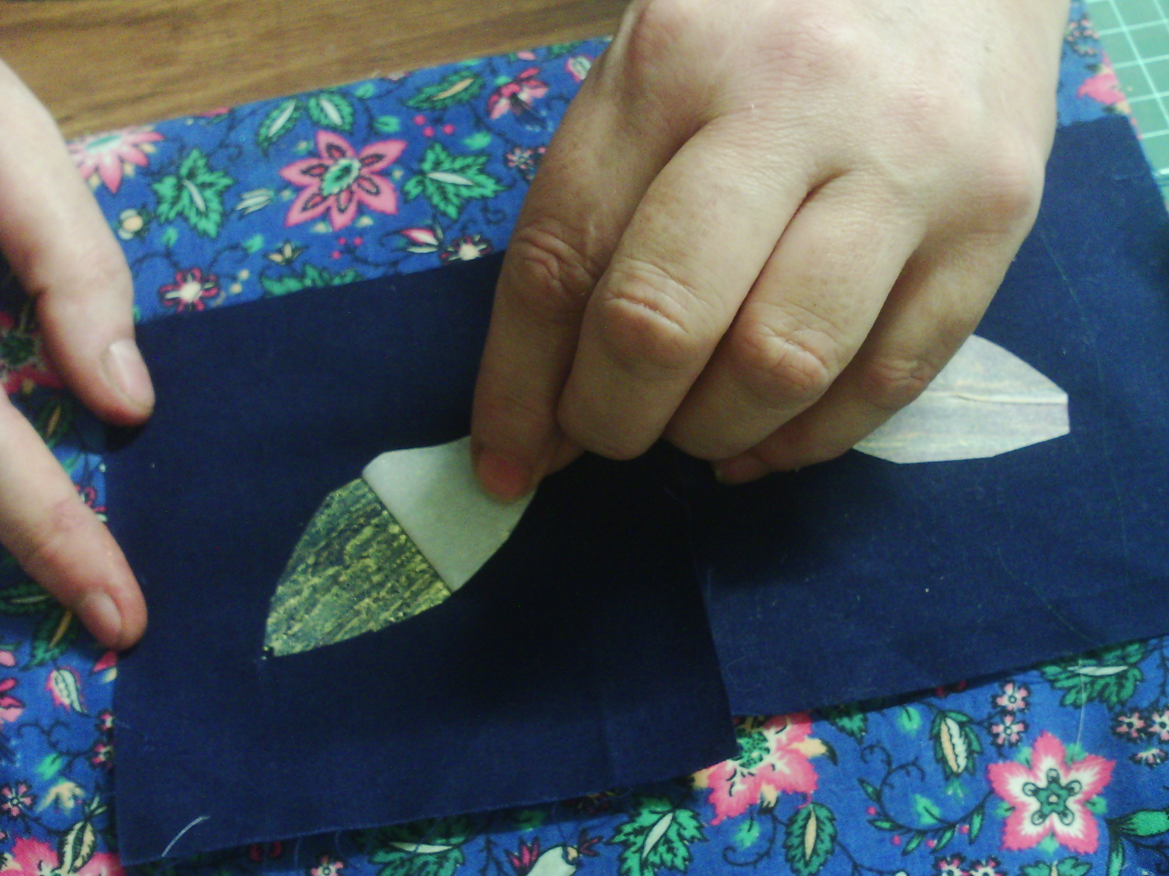
Again, you iron the leaf shapes down. Remember to iron with the paper side up, or you get a gluey mess on your iron, and use baking paper over the top as well. The one on the right has been ironed down already
When the fabric is completely cooled, peel off the paper as above.
and you get a beautiful textured metallic leaf.
This is not the only way to use the fusible. I used some torn strips of fusible on one of my collages
This is a very simple collage. I have used painted fusible as the whole background, but you can also see another feature of the painted fusible, and that is, that because it is fusible, you can still iron more on top (using baking parchment for sure) Here I have ironed on a few bits of wool fluff and a little organza sun, but you can iron sequins, glitter, loose threads and even some foil onto it ( I would be careful with the foil as too much will cover all the lovely painted texture).
I hope you enjoyed this tutorial
Happy creating!
I have been plating with foils and painted fusible lately. It is not something new, I have done tutorials on it in the past, but unfortunately a lot of my old, old posts have lost their photos. Perhaps that should be an aim for this year, to redo those tutorials???
Anyhow, here is my collage a day using these lovely things.
If you are not familiar with these techniques, they both use fusible web, but in different ways. This sample is on velvet, a la Angie hughes, but these techniques can be used on just about any surface that won't melt with an iron such as paper or wood.
Above are the offending items. The gold strips with the white back are the foil, which I have a lot of as you can see. I have other colours as well. the wrinkly pink and pale green sheets are the painted fusible.
OK, I took some pictures and here is a tutorial
To use the foil, I cut leaf shapes out of fusible (this is a web of glue on a sheet of silicon paper which comes in rolls and sheets).
The fusible web is rough on one side and smooth on the other. The rough side is the glue and the smooth side is the paper.
You take the leaf shape and place it fusible (rough) side down and iron it onto the fabric. Use the instructions that come with the fusible to iron it on, but basically I use a heat that the fabric can cope with. I also usually use some baking parchment over the top, but I haven't here so it is easy for you to see.
when the ironed on fusible is cool. You peel off the paper. Above you can see on the left, the paper has been peeled off leaving a thin layer of glue on the fabric.
Next you get a piece of foil. This is transfer foil, not metallic wrapping paper, it is a special type of foil used by printers - and textile artists!. You can see the foil is laid coloured side up. This is important, if you use it the wrong way up, it won't work.
Iron the foil onto the glue layer. Again, it is best to use baking parchment, so your iron does not get messed up.
When the fabric is COOL, you can peel off the foil. You can see on the right, above, that where you ironed onto the glue, the gold has come off the foil.
So that is how you use foil. You can wash it (gently), but you must remember that every time you iron it from now on, you need to use baking parchment, or you will get a totally messed iron.
Now for painted fusible.
Above, I have taped a piece of fusible glue or rough side up to my painting area ( it tends to roll up). I have some acrylic paint (I like to use lumiere by jacquard as it is lovely and metallic) and a brush.
Next, I spray my fusible with water. some people dilute their paint, but i find I get the most texture by spraying with water first.
Here, you can see me painting onto the fusible and you can see how the paper backing is wrinkling up and creating texture.
Here is the fusible painted.
And here is a close up of the gorgeous texture. This needs to totally dry before you use it.
Now for how to use it.
Here is some dry fusible on the right. You can see how wrinkly it gets. this is the way it should be. Some fusibles don't do this and give a very flat textureless colour. On the left you can see I have cut some leaves from the fusible.
Again, you iron the leaf shapes down. Remember to iron with the paper side up, or you get a gluey mess on your iron, and use baking paper over the top as well. The one on the right has been ironed down already
When the fabric is completely cooled, peel off the paper as above.
and you get a beautiful textured metallic leaf.
This is not the only way to use the fusible. I used some torn strips of fusible on one of my collages
This is a very simple collage. I have used painted fusible as the whole background, but you can also see another feature of the painted fusible, and that is, that because it is fusible, you can still iron more on top (using baking parchment for sure) Here I have ironed on a few bits of wool fluff and a little organza sun, but you can iron sequins, glitter, loose threads and even some foil onto it ( I would be careful with the foil as too much will cover all the lovely painted texture).
I hope you enjoyed this tutorial
Happy creating!
Saturday, January 11, 2014
Printing on synthetics
I was given some Idye poly dyes, which are for dyeing synthetics and have been wanting to try a new technique with them.
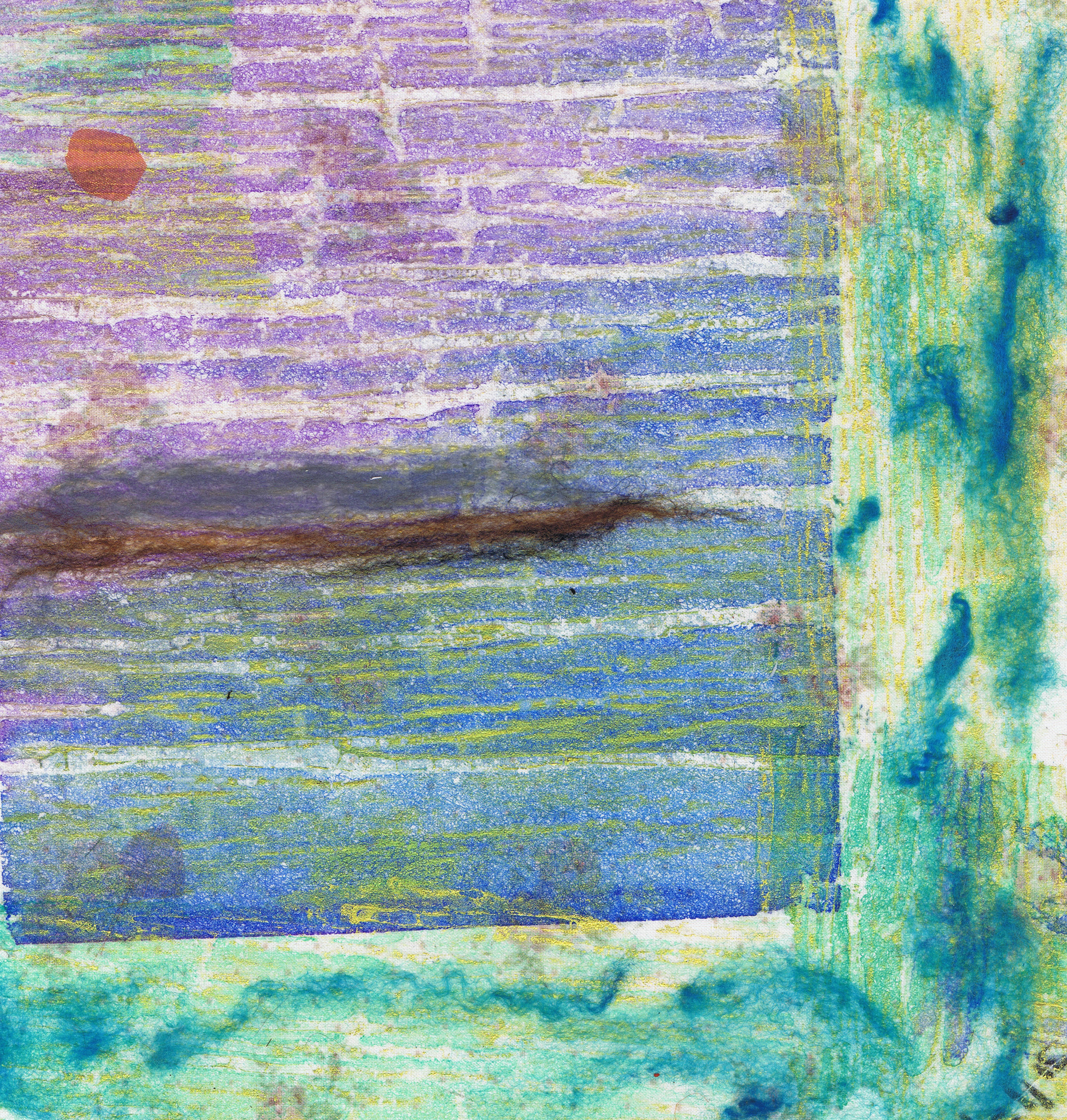
Transfer printing involves painting papers with a strong dye solution, allowing them to dry, then printing by ironing off the dye onto polyester fabric. You can cut shapes and print shapes onto the fabric as well.
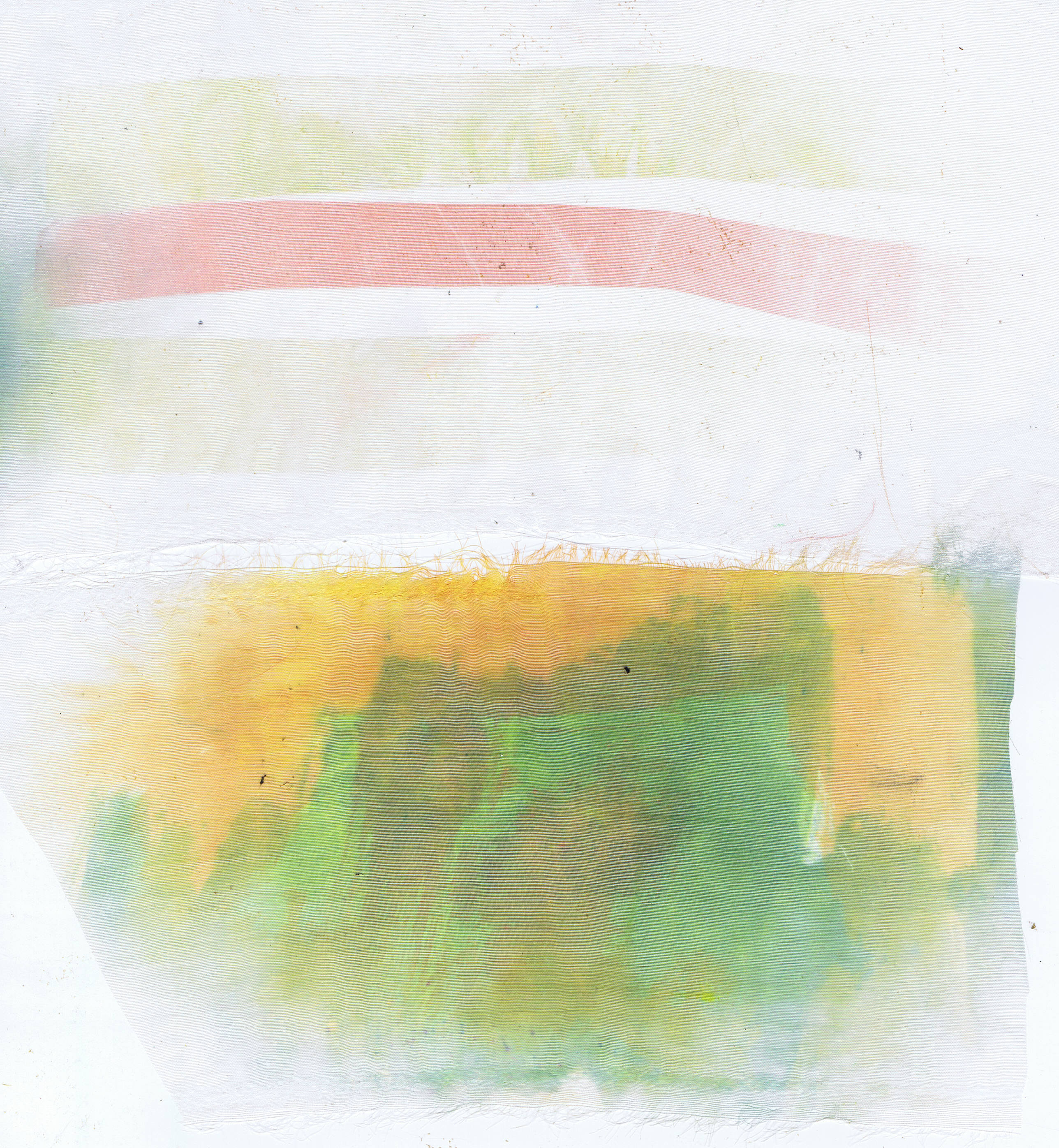
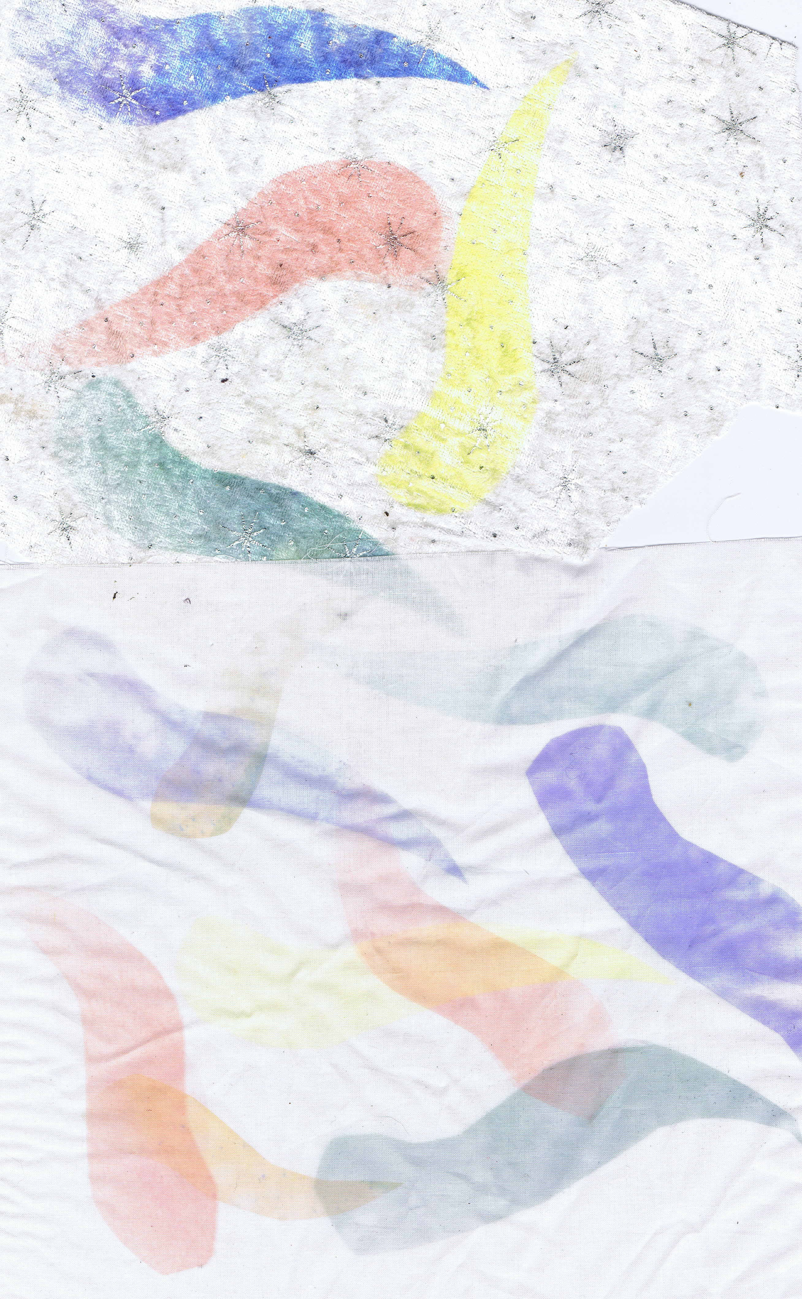
These two are both organza, which is why they look pale. On the top one, I printed some strips of the painted paper. The bottom one was printed with a paper that I cleaned my brush off on, so I got some green and yellow.
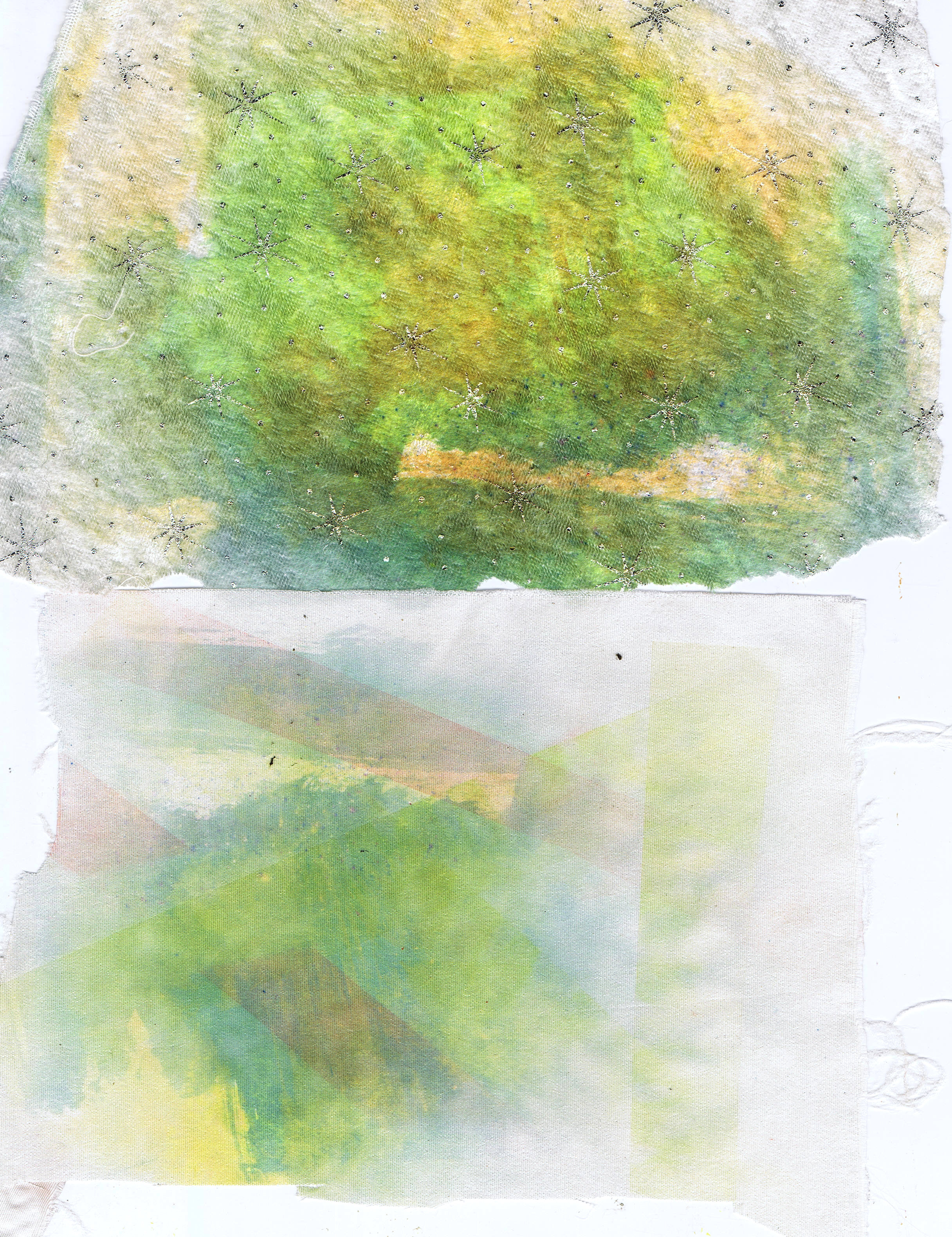
Again, with the waste paper (you can re use the paper many times), the top one is a piece of white velvet with little silver stars that I thought was ugly, but the transfer dye makes it look very gorgeous. The bottom one is a piece of satin.
After this I started using some gum leaf shapes.
The top piece here is the white velvet again and the bottom is a very fine cotton like fabric, very filmy.
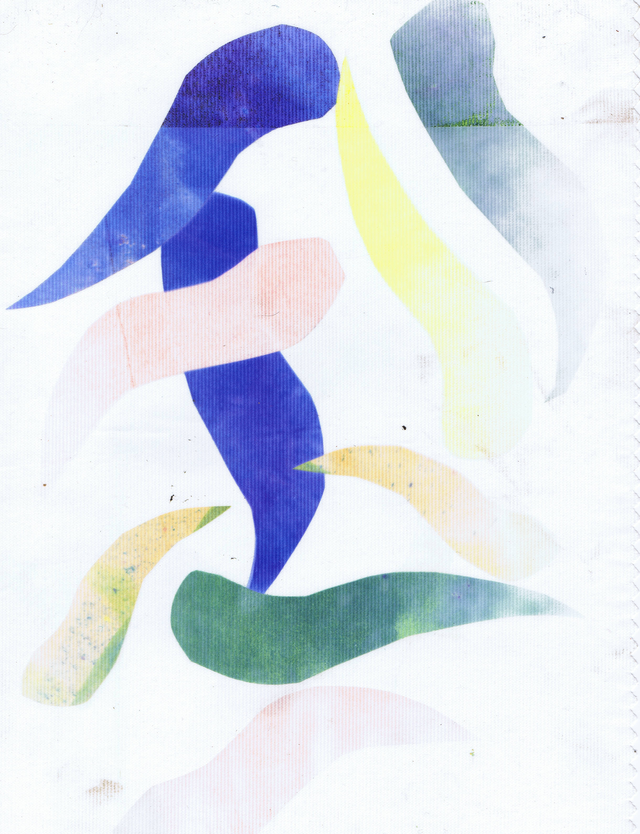
This is a piece of polyester that has textured lines on it, probably a curtain lining, but you can see it took the leaves really well.
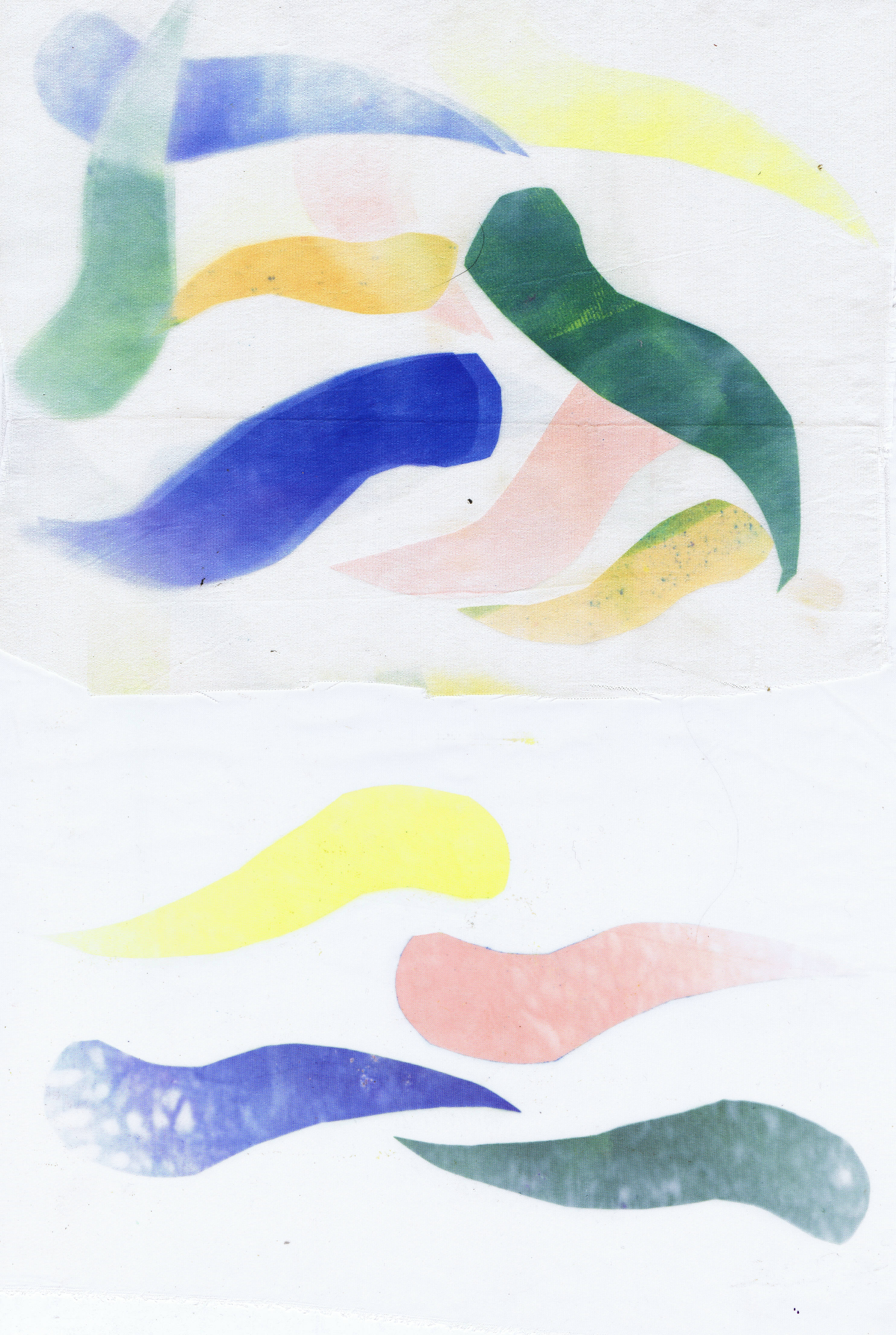
This is another piece of satin at the top and chiffon at the bottom. One thing you can see in the chiffon, is that if the paint is put on the paper with texture, it transfers that texture to the fabric. I am looking forward to trying this with some texture painting techniques to see what I get.
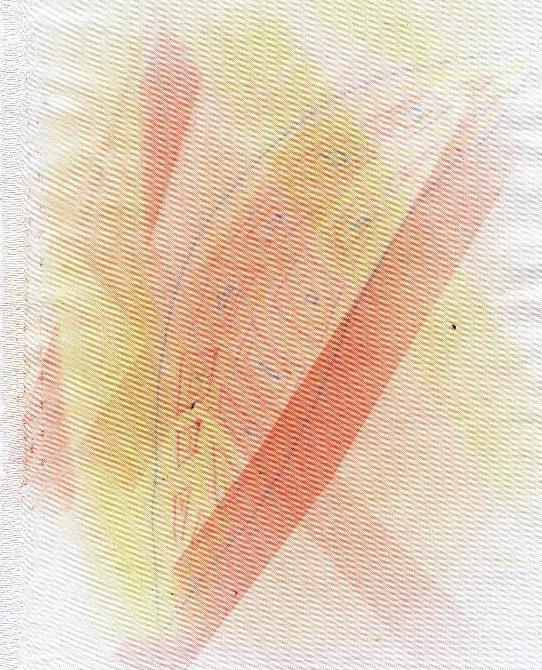
This print is on satin and used strips of the painted papers, but also a leaf drawn using sulky transfer pens. I drew this onto the shiny side of freezer paper, because I find that the pens often give a pale print on plain paper. This paper had been used several times before.
Since I love using synthetics in my work, this technique is most definitely going to find a home in my studio.
Lastly, here is one of the transfer prints I put into one of my collage a day foundations
The print was on the polyester curtain lining and I teamed it with a few commercial batiks. I like how this one turned out and I am sure I will have great fun stitching on it.
I am very busy at present setting up an Etsy store (it isn't open yet, so don't go looking) and finishing my Tangled Textiles challenge which is due in a day or so. I am always a procrastinator, so I don't usually get my challenges finished until the last possible moment, but I will show you on monday or Tuesday.
Happy Creating!
Transfer printing involves painting papers with a strong dye solution, allowing them to dry, then printing by ironing off the dye onto polyester fabric. You can cut shapes and print shapes onto the fabric as well.
These two are both organza, which is why they look pale. On the top one, I printed some strips of the painted paper. The bottom one was printed with a paper that I cleaned my brush off on, so I got some green and yellow.
Again, with the waste paper (you can re use the paper many times), the top one is a piece of white velvet with little silver stars that I thought was ugly, but the transfer dye makes it look very gorgeous. The bottom one is a piece of satin.
After this I started using some gum leaf shapes.
The top piece here is the white velvet again and the bottom is a very fine cotton like fabric, very filmy.
This is a piece of polyester that has textured lines on it, probably a curtain lining, but you can see it took the leaves really well.
This is another piece of satin at the top and chiffon at the bottom. One thing you can see in the chiffon, is that if the paint is put on the paper with texture, it transfers that texture to the fabric. I am looking forward to trying this with some texture painting techniques to see what I get.
This print is on satin and used strips of the painted papers, but also a leaf drawn using sulky transfer pens. I drew this onto the shiny side of freezer paper, because I find that the pens often give a pale print on plain paper. This paper had been used several times before.
Since I love using synthetics in my work, this technique is most definitely going to find a home in my studio.
Lastly, here is one of the transfer prints I put into one of my collage a day foundations
The print was on the polyester curtain lining and I teamed it with a few commercial batiks. I like how this one turned out and I am sure I will have great fun stitching on it.
I am very busy at present setting up an Etsy store (it isn't open yet, so don't go looking) and finishing my Tangled Textiles challenge which is due in a day or so. I am always a procrastinator, so I don't usually get my challenges finished until the last possible moment, but I will show you on monday or Tuesday.
Happy Creating!
Friday, January 10, 2014
A little bag
Last week, i was inspired to create this little bag, by Mary Gamester in this video (which is free, but you have to log in for free to see it)
If you can't work it out, it is a fuchsia. I was quite happy with it and might even male more! I do love making pretty things, but of course I never know what to do with them when i have. This is hanging up where i can see it and since I do love fuchsias it has pride of place.
Happy creating!
If you can't work it out, it is a fuchsia. I was quite happy with it and might even male more! I do love making pretty things, but of course I never know what to do with them when i have. This is hanging up where i can see it and since I do love fuchsias it has pride of place.
Happy creating!
Subscribe to:
Posts (Atom)