I was inspired by a friend's post about fabric books and this is my first page
The central leaf is free motion sketched and I have added some fabrics for the background and some leaves cut from lace. I also stamped some leaves over it. I have actually done a lot of stitching on this, but I'll show you that in a later post.
I have also been working on my sunflowers piece that I talked about here.
I started again, taking everything down and was a bit more picky about what I put up.
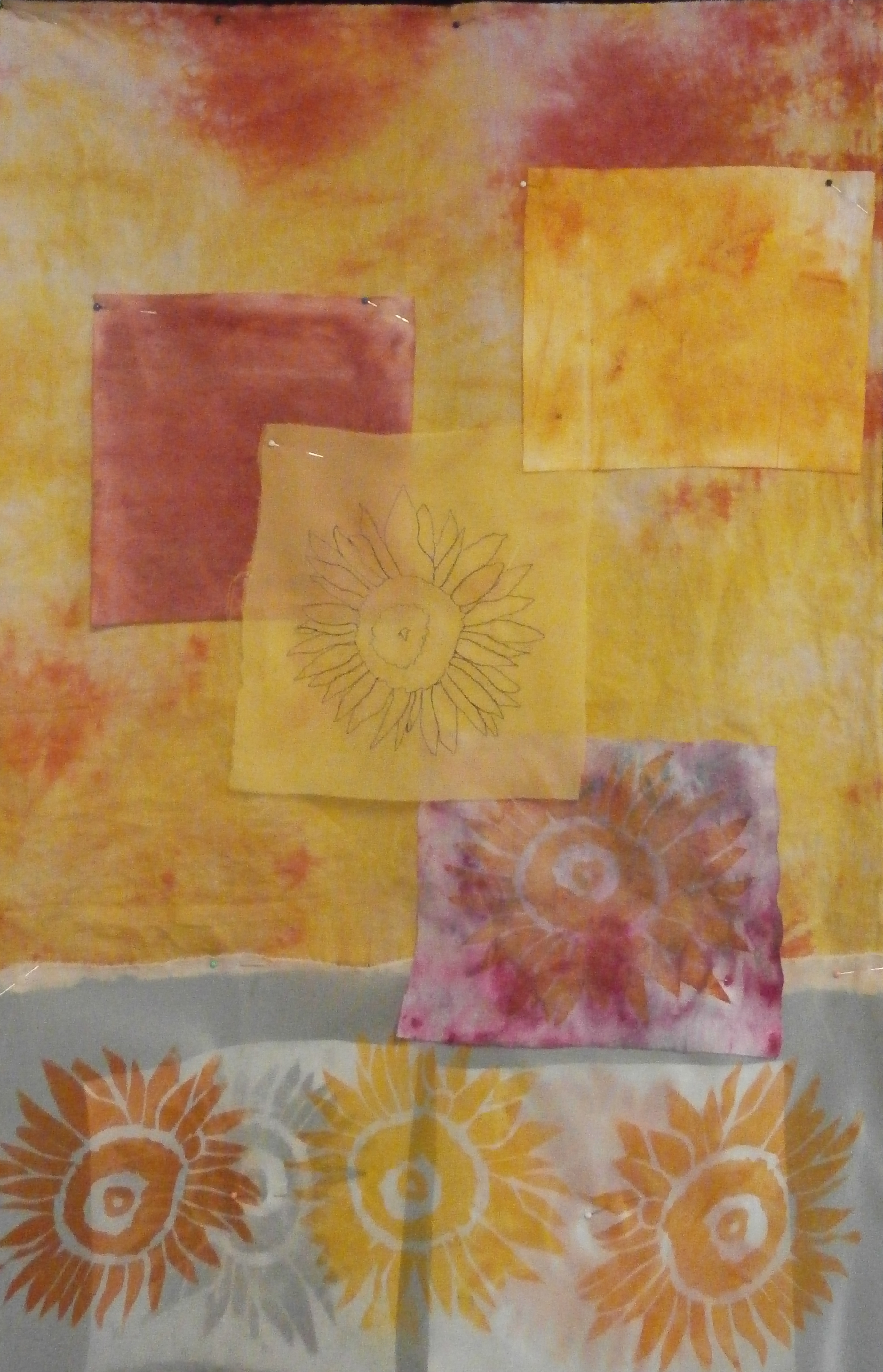
This was the arrangement I came up with. But there were some other things I wanted to add to it, so I took some off
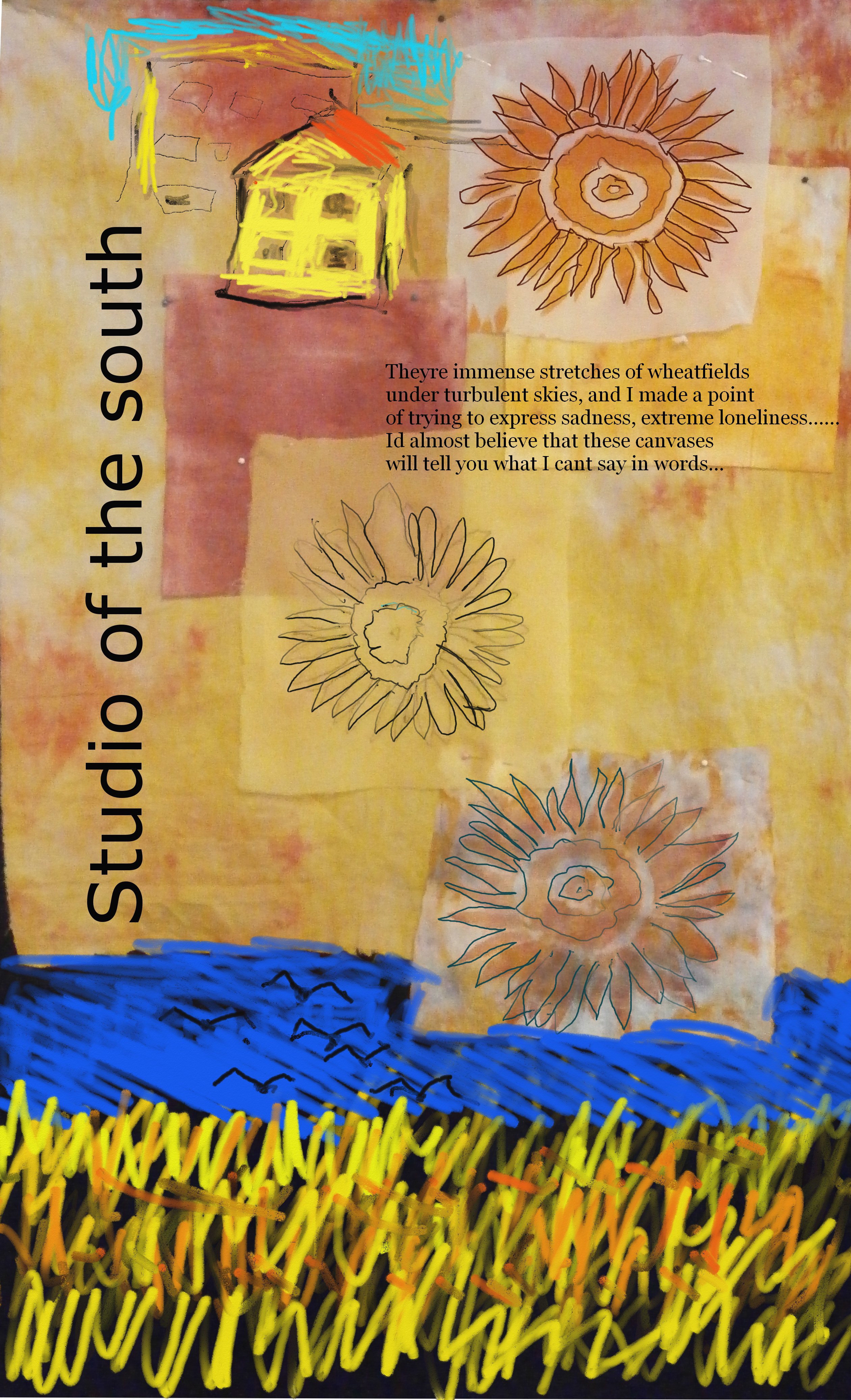
The bottom was a little bare, then (black felt), so my next step was to take this picture into my digital drawing program (artrage)
I added some text. Studio of the south was vincent van gogh's dream, which never came to fruition.
Then I got down to some drawing.
I forgot to save some process versions, but this is where I ended up. At the top is a sketch of the yellow house where Vincent lived in Arles. At the bottom is an impression of one of his last paintings and under the top sunflower is a section from one of his letters. I am quite pleased with this layout, although at present I have no idea of how I will transfer these ideas to the background. I think there might be a thermofax and maybe some needlefelting and lots more free motion embroidery. I might also add a bit of paint to the bottom sunflower, but we will see.
Oh and by the way I am a bit behind with visiting blogs, but I will catch up in the next day, sorry.
happy Creating!
Showing posts with label printing. Show all posts
Showing posts with label printing. Show all posts
Wednesday, February 19, 2014
Wednesday, January 22, 2014
Thermofax at last!
A few months ago I purchased a thermal imaging machine. I have only just found the time to play with it and can see it will become a mainstay in my work.
For those of you who don't know what a thermofax is, it is basically a machine that applies heat to a specially prepared screen and burns am image into it. The screens thus made, can be used to create prints by pushing paint through onto a surface such as paper, but also fabric.
I have only played with paper for this post, but I will be using the technique with fabric for sure.
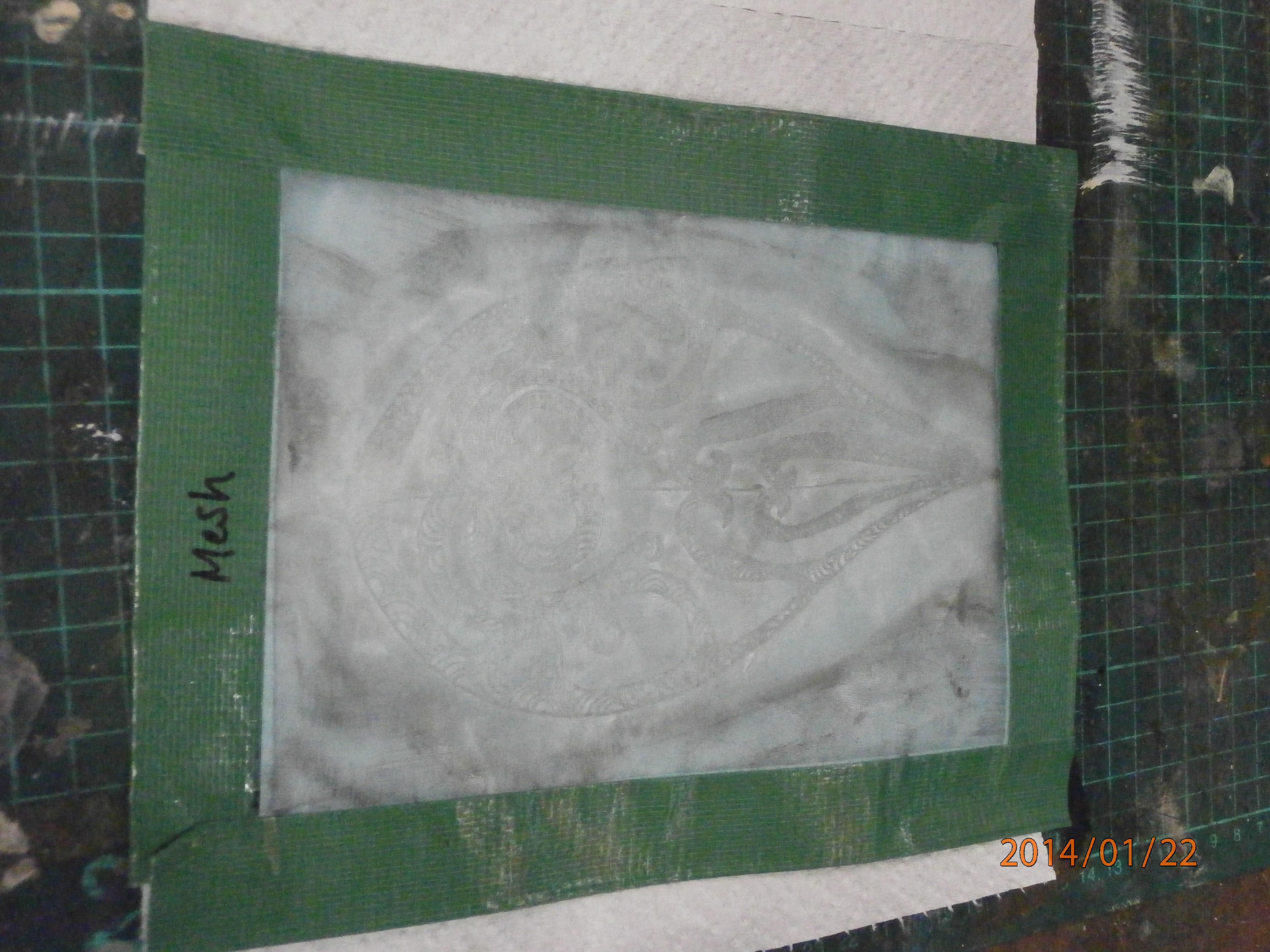
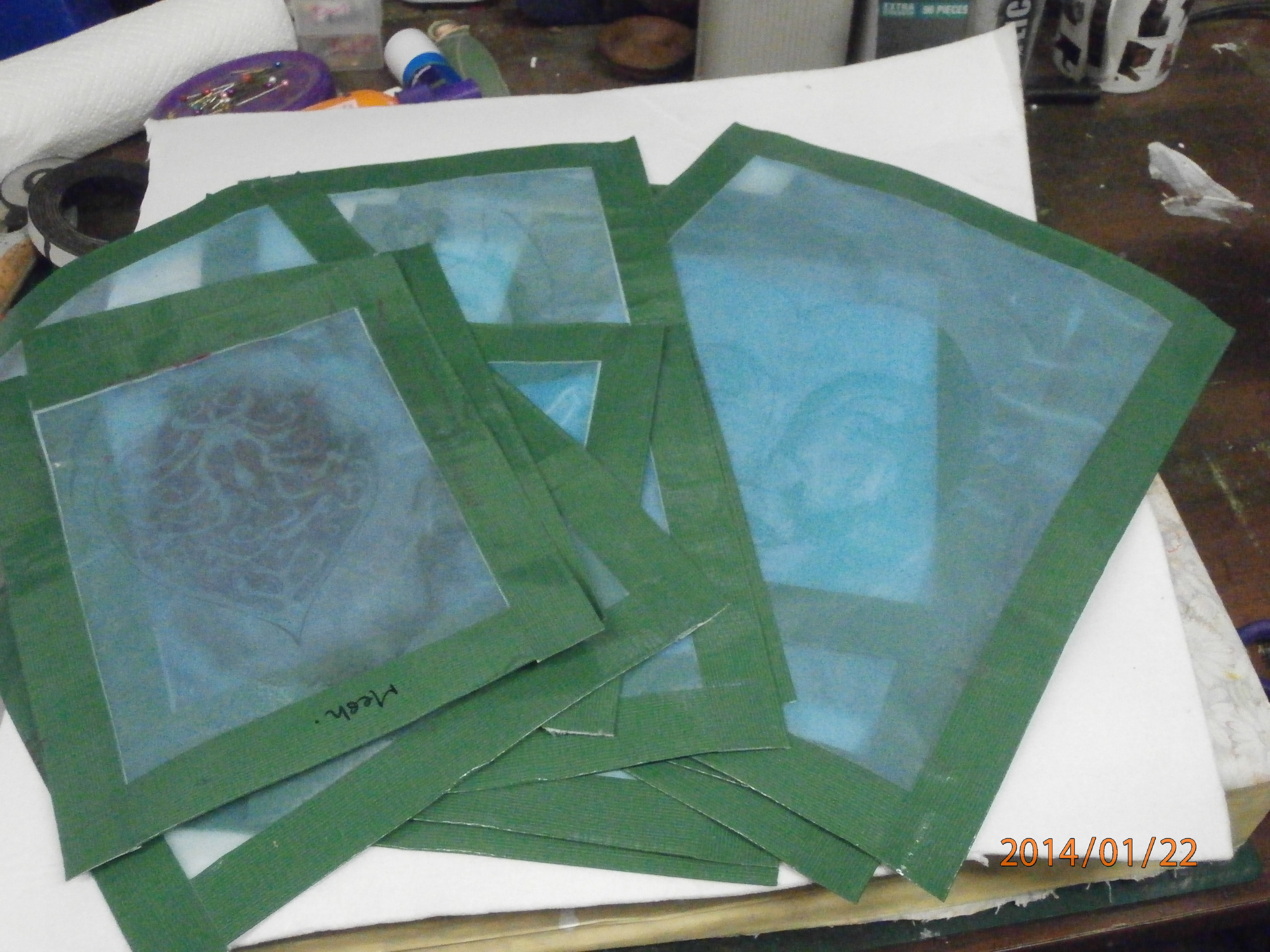
This was the first screen I made (correction: the second, because the first one didn't work as I put the screen into the machine upside down!) It is of a leaf design from my sketchbook. Of course, you can't see the design as the screen is so thin and transparent.
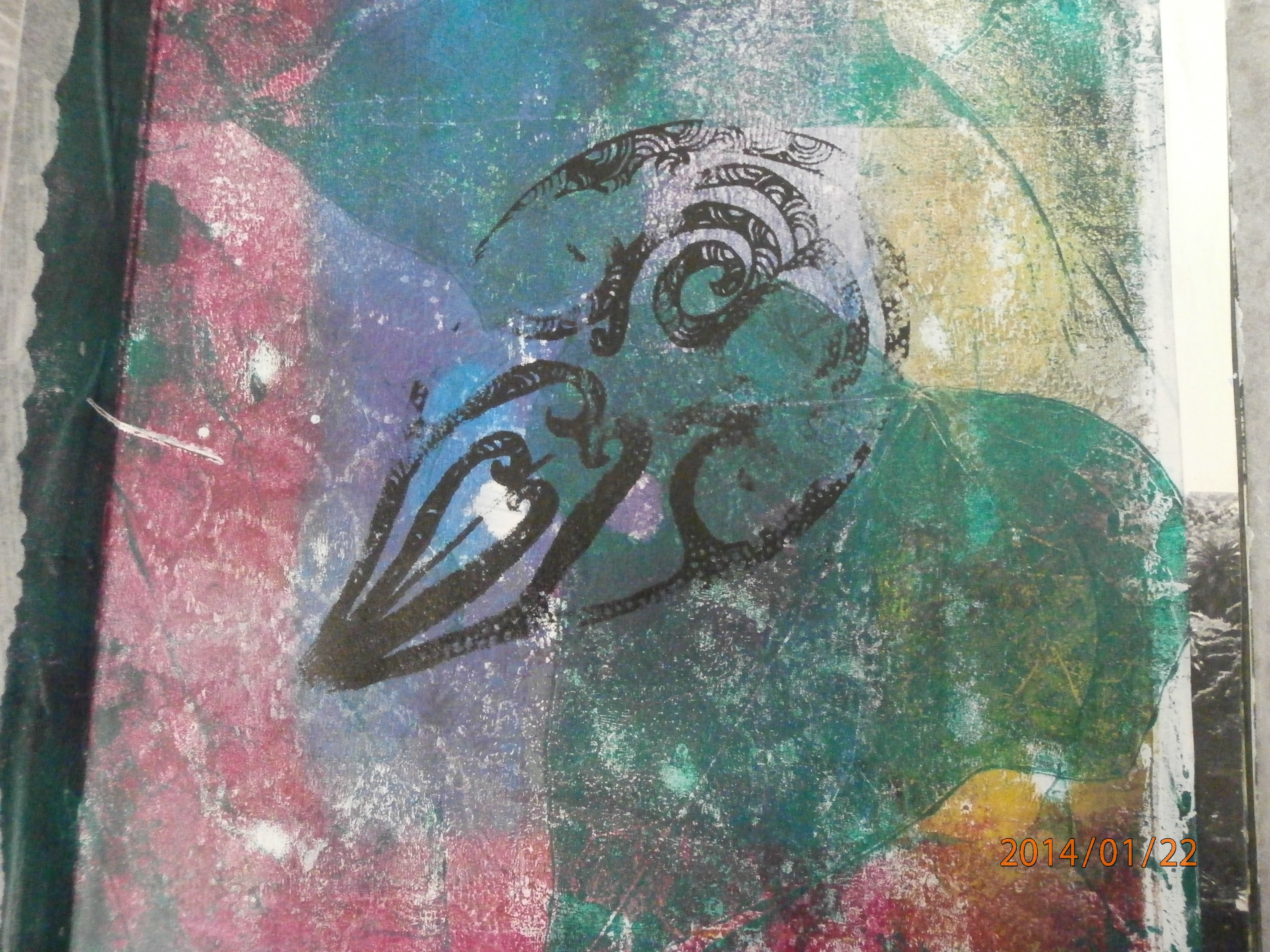
This is my first print from this screen. As you can see, I had a few problems. I was too tentative to start with and too heavy handed at the end, near the tip of the leaf. Ah well, perhaps it is a leaf on an ancient building!
As you can see in this second one, I did get the hang of it.
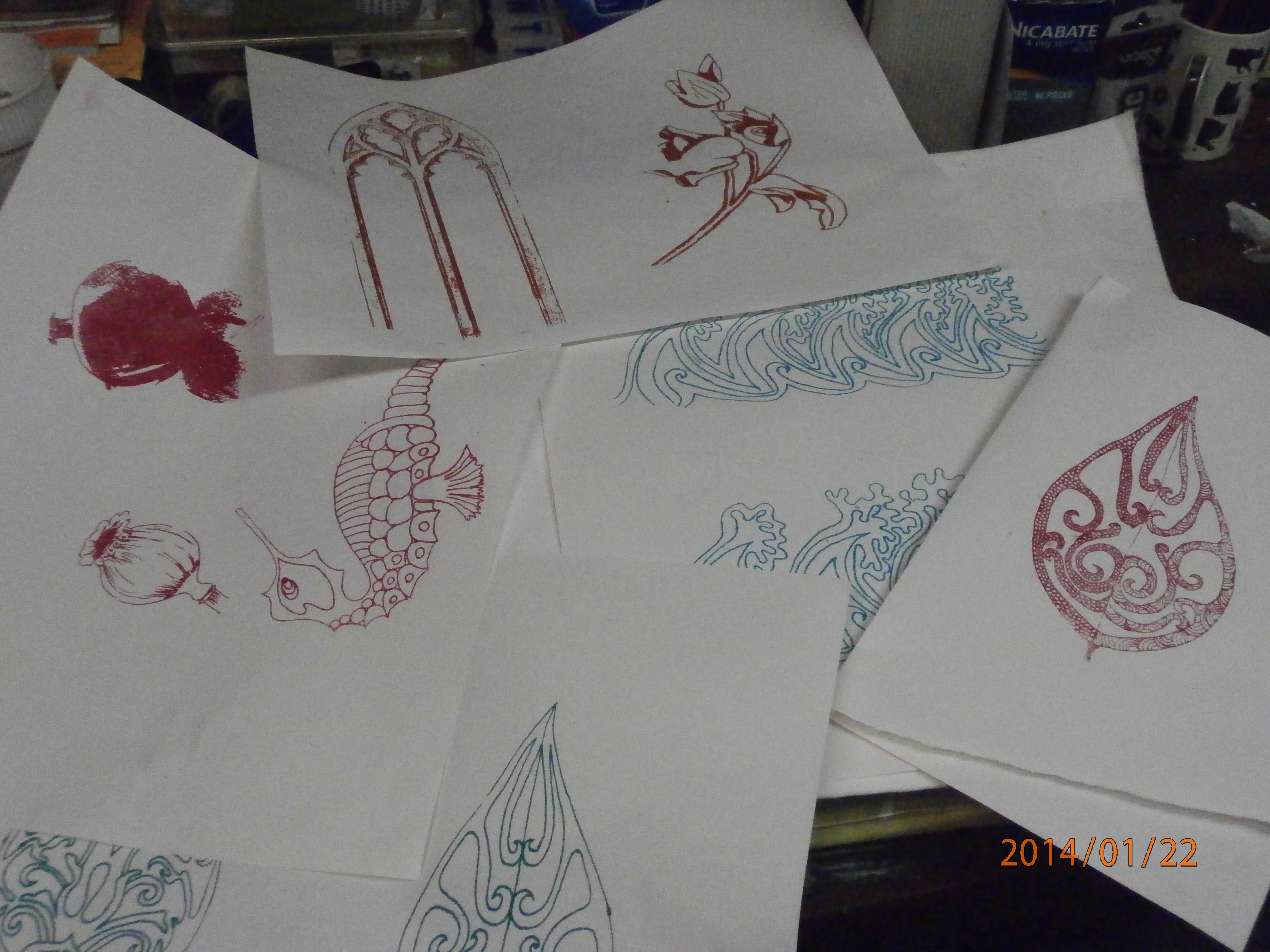
I made just a few more screens...
And tested them out...
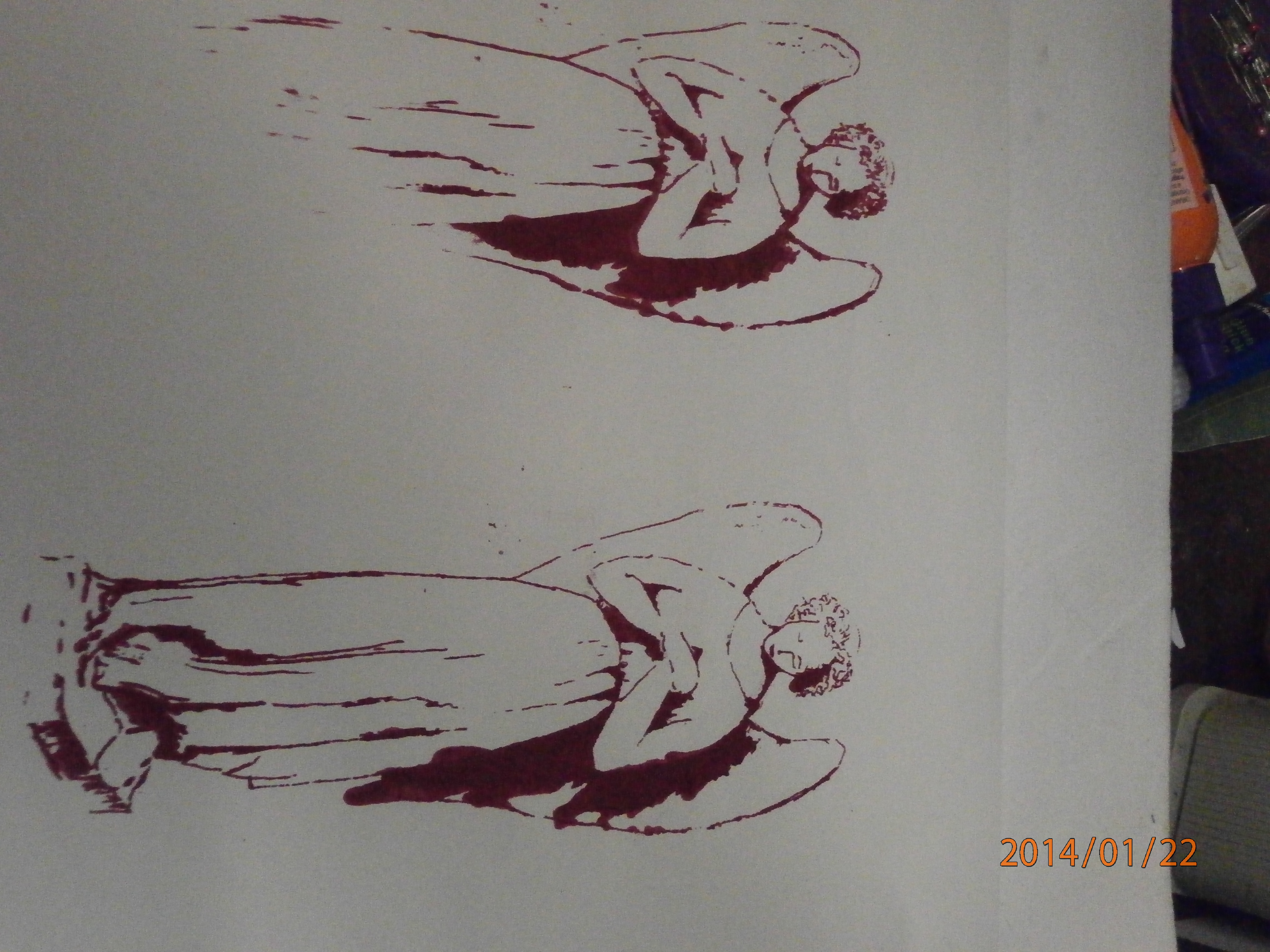
but of course some of them had their problems. The top one here (sorry about the angle) shows what happens when you don't have enough paint on your squeegee. I ran out of paint before the bottom of the angel and the bottom print shows what can happen when you push too hard over dark areas, The wing shadow has oozed!
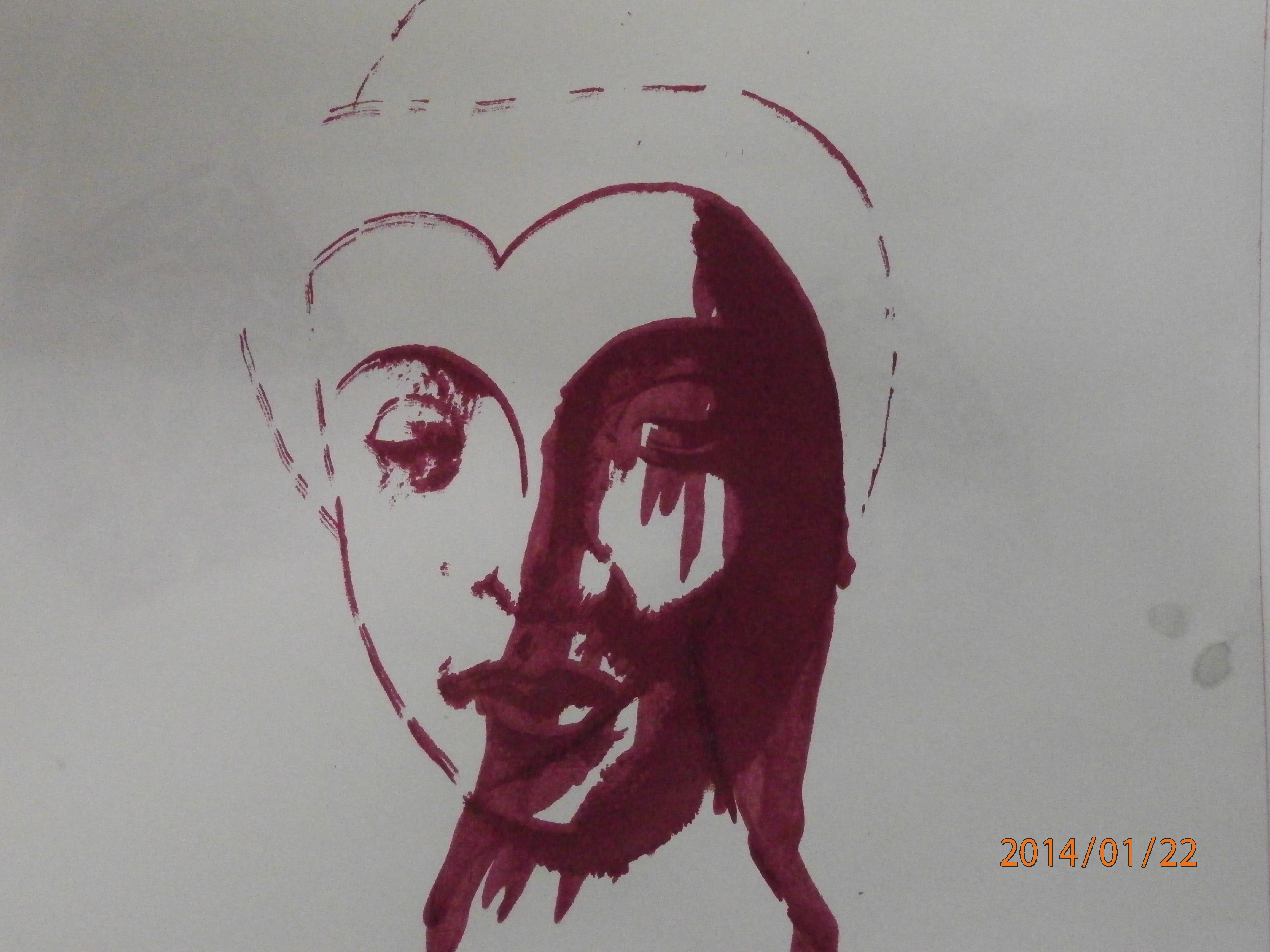
This print shows what happens when you have a very large screen. It was impossible to keep it flat with one hand while you squeegee the paint with the other, so the paint got under the screen. I think I have a solution for this one, though.
I think this is a great way to re use my own artwork in my sketchbooks and in my textile work and I think I am going to enjoy perfecting it.
Happy creating!
Saturday, January 11, 2014
Printing on synthetics
I was given some Idye poly dyes, which are for dyeing synthetics and have been wanting to try a new technique with them.
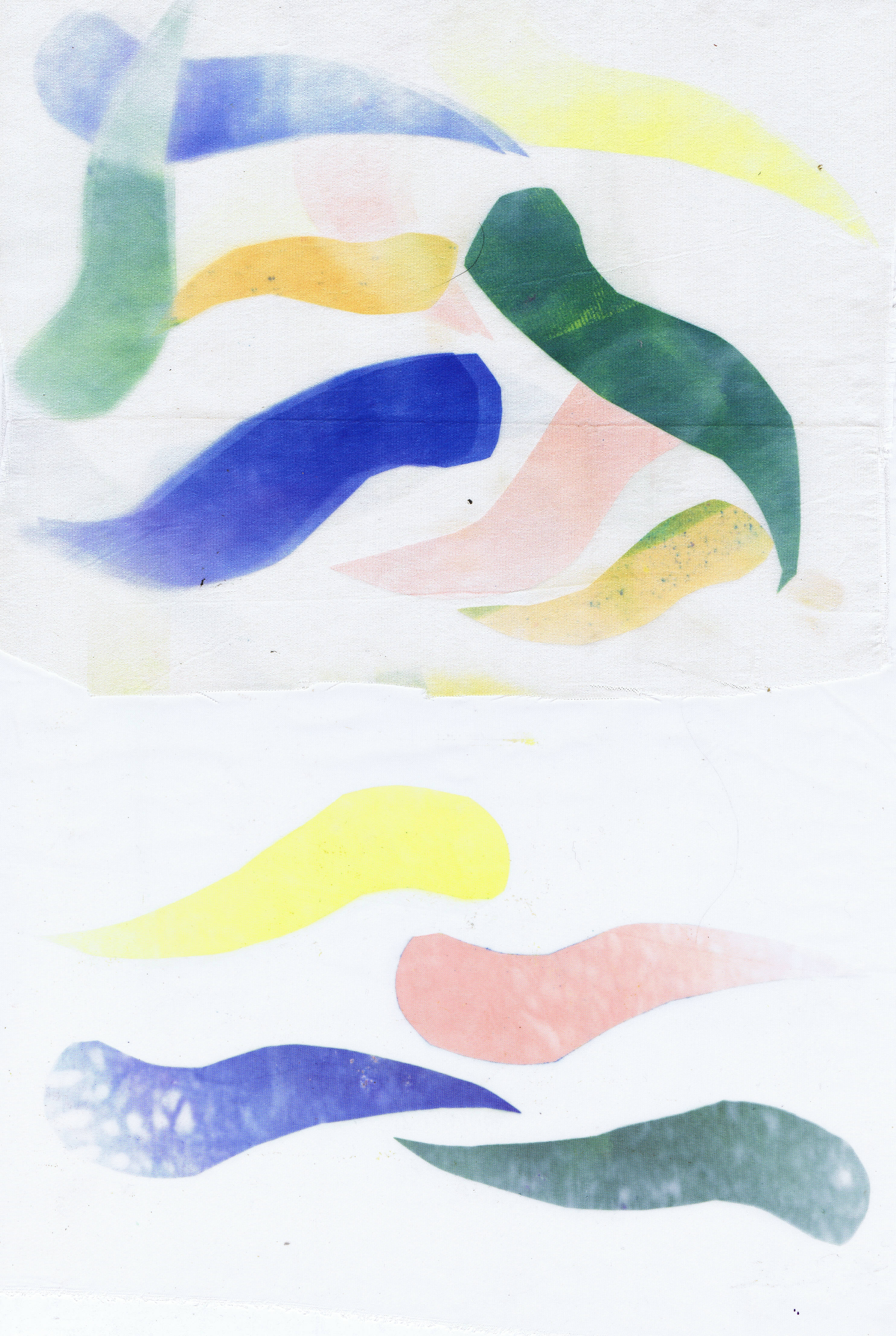
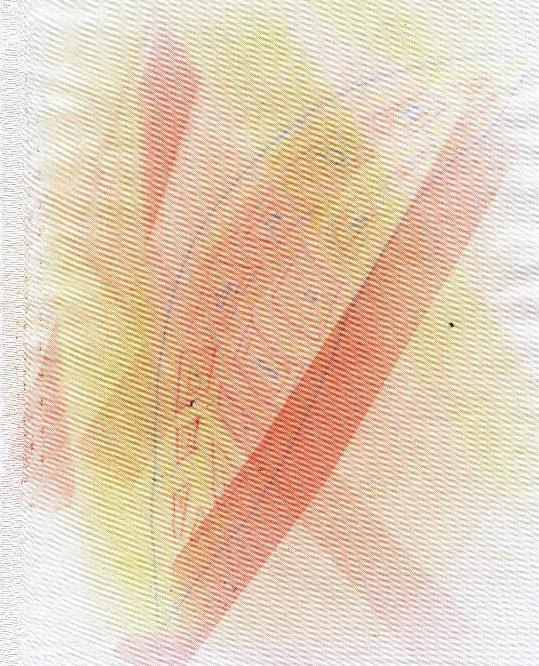
Transfer printing involves painting papers with a strong dye solution, allowing them to dry, then printing by ironing off the dye onto polyester fabric. You can cut shapes and print shapes onto the fabric as well.
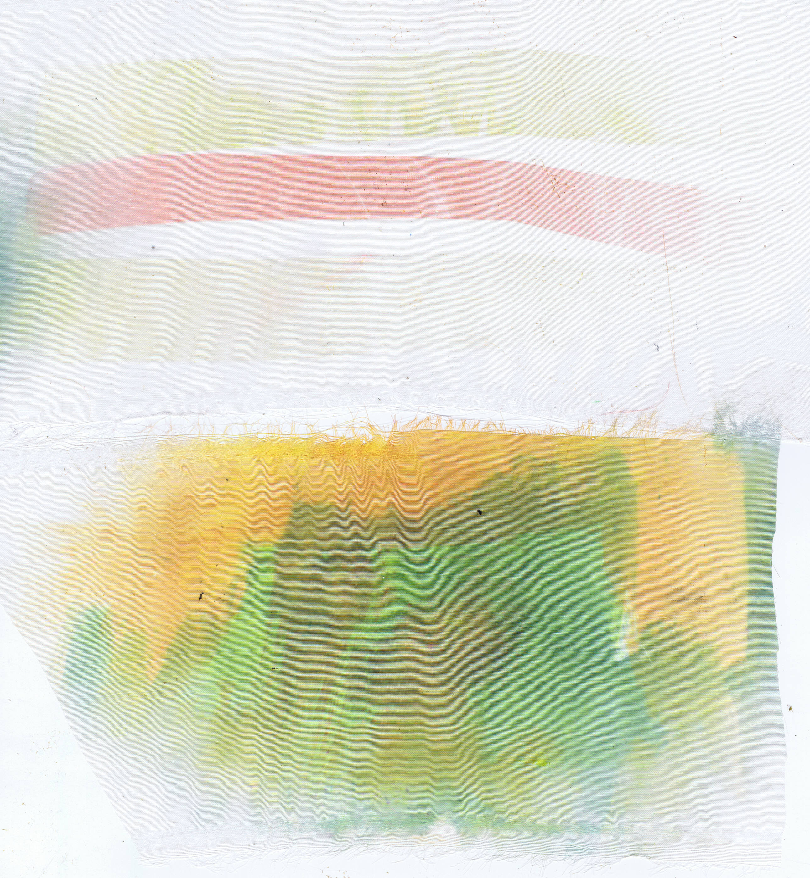
These two are both organza, which is why they look pale. On the top one, I printed some strips of the painted paper. The bottom one was printed with a paper that I cleaned my brush off on, so I got some green and yellow.
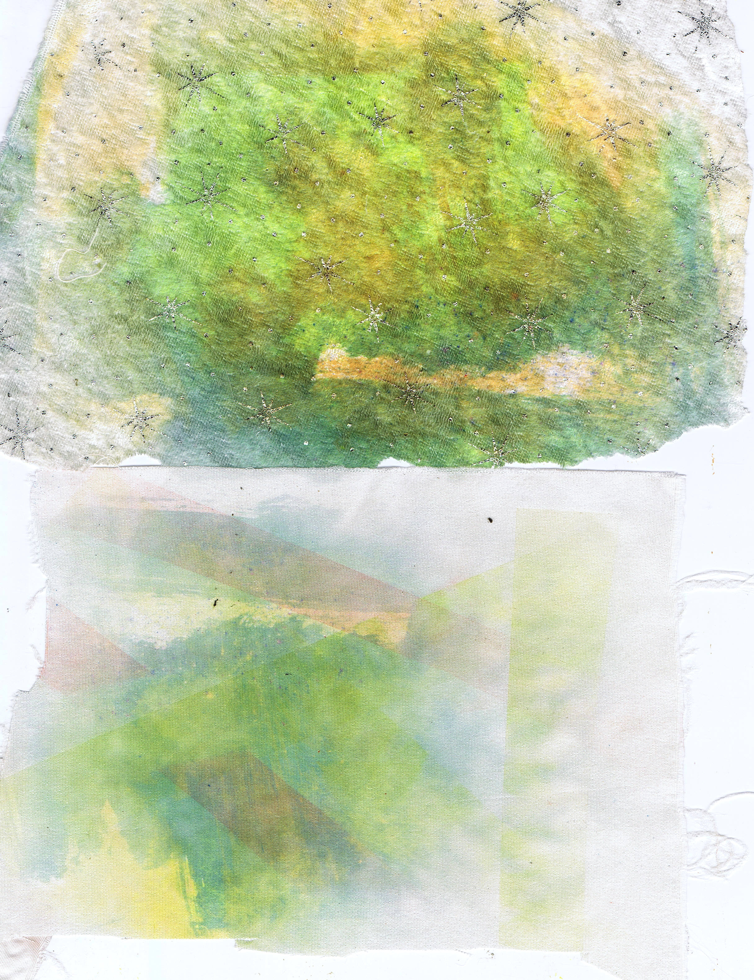
Again, with the waste paper (you can re use the paper many times), the top one is a piece of white velvet with little silver stars that I thought was ugly, but the transfer dye makes it look very gorgeous. The bottom one is a piece of satin.
After this I started using some gum leaf shapes.
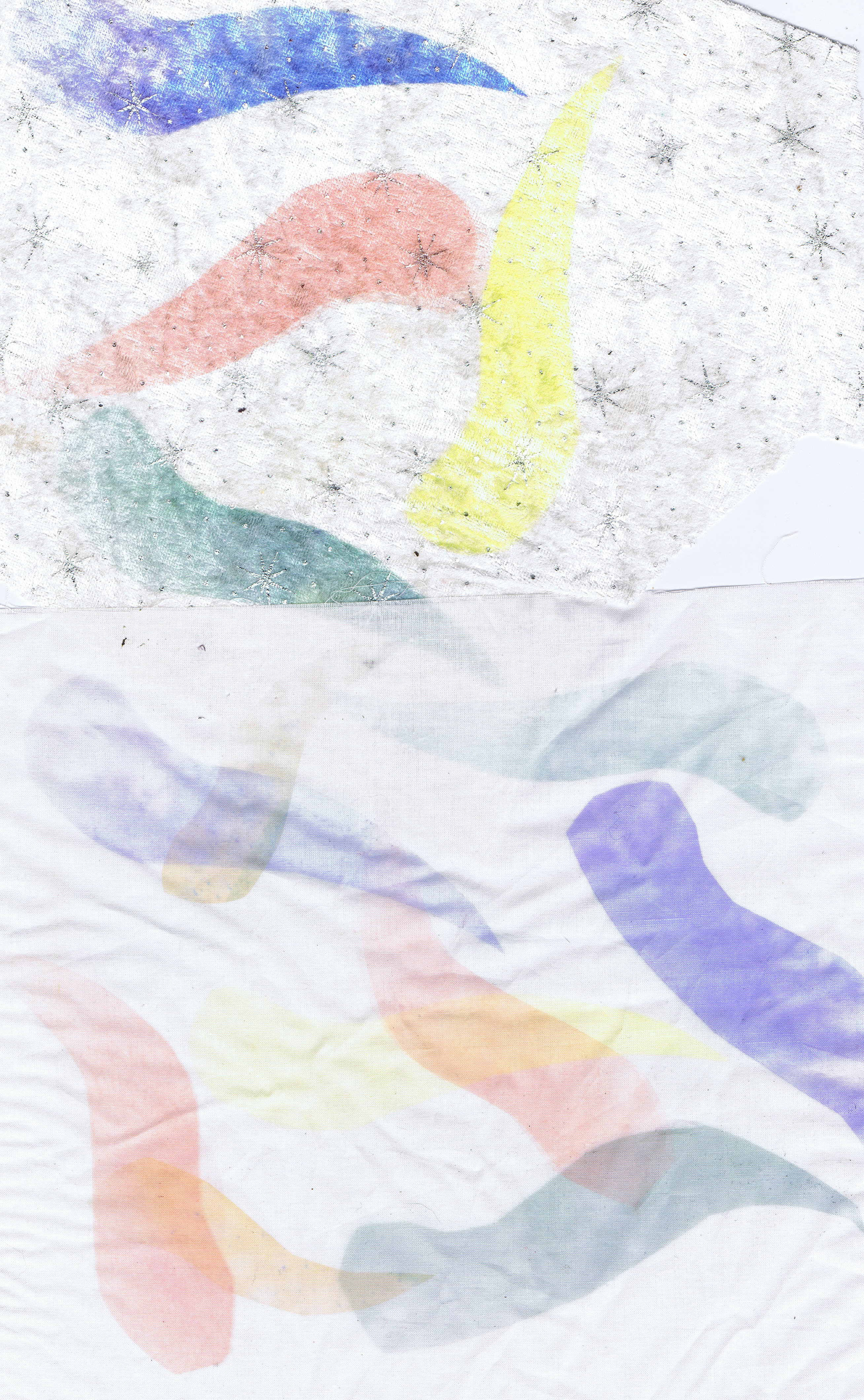
The top piece here is the white velvet again and the bottom is a very fine cotton like fabric, very filmy.
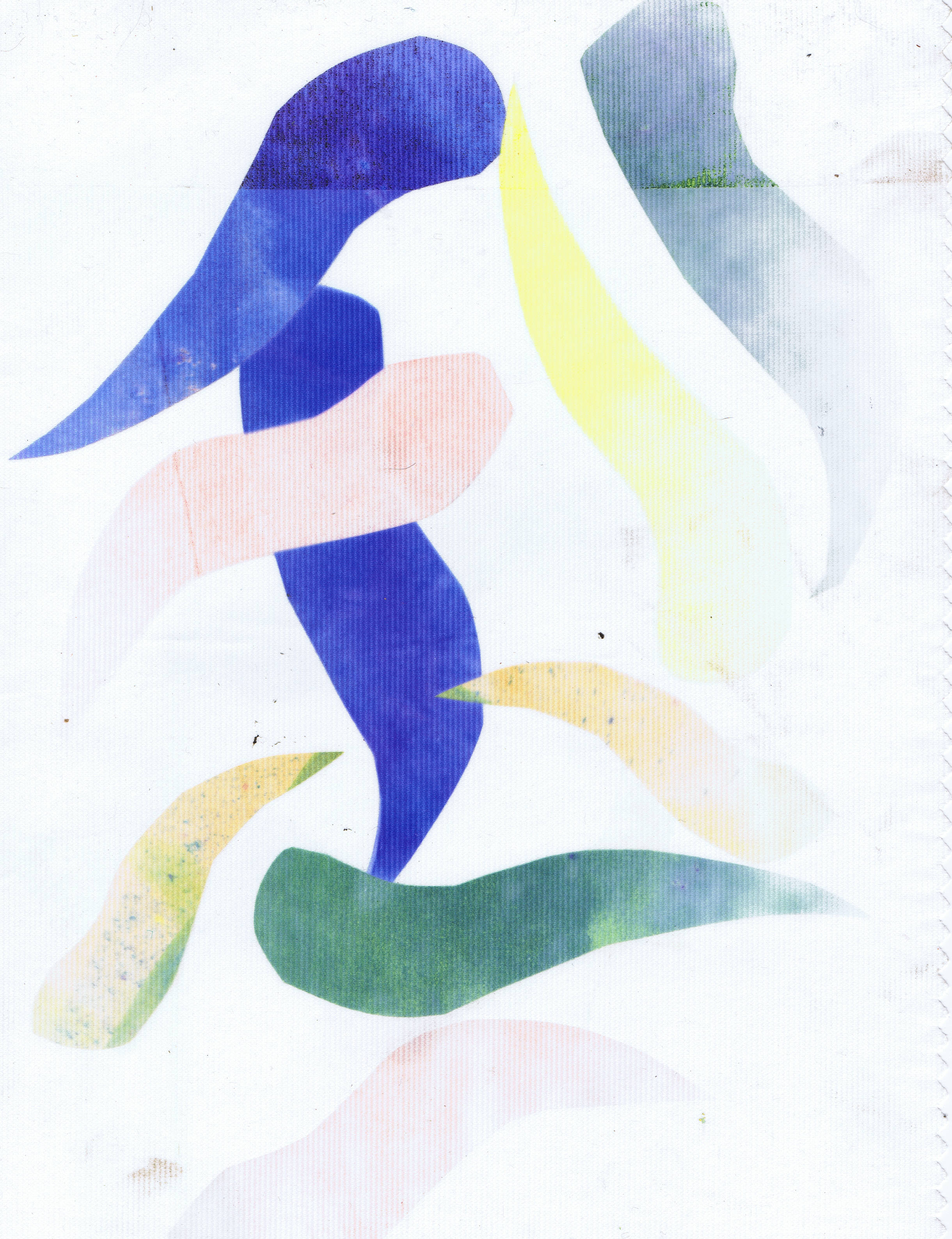
This is a piece of polyester that has textured lines on it, probably a curtain lining, but you can see it took the leaves really well.
This is another piece of satin at the top and chiffon at the bottom. One thing you can see in the chiffon, is that if the paint is put on the paper with texture, it transfers that texture to the fabric. I am looking forward to trying this with some texture painting techniques to see what I get.
This print is on satin and used strips of the painted papers, but also a leaf drawn using sulky transfer pens. I drew this onto the shiny side of freezer paper, because I find that the pens often give a pale print on plain paper. This paper had been used several times before.
Since I love using synthetics in my work, this technique is most definitely going to find a home in my studio.
Lastly, here is one of the transfer prints I put into one of my collage a day foundations
The print was on the polyester curtain lining and I teamed it with a few commercial batiks. I like how this one turned out and I am sure I will have great fun stitching on it.
I am very busy at present setting up an Etsy store (it isn't open yet, so don't go looking) and finishing my Tangled Textiles challenge which is due in a day or so. I am always a procrastinator, so I don't usually get my challenges finished until the last possible moment, but I will show you on monday or Tuesday.
Happy Creating!
Sunday, November 27, 2011
Snow gum bark
Sorry about yesterday, folks, the hubby came home from town with a nasty cough and headache, so I didn't get onto the net, but today has been a great day for creating!
I have been wanting to have a go at screen printing for a while and I decided today was just the day. I need some fabric for the bark on my snow gums in the landscape I am working on.
Remember this sketch? At present I am working on the leafy layer, but will be needing some tree bark soon.
Here's my stylised sketch of some snow gum bark. It's very bright, isn't it? But for anyone out there who has never seen a snow gum, here, here and here are a few links that will show you that my sketch is actually a little subdued.
I am not using a store bought screen, just a piece of organza stretched on a frame, then covered around the edges with duct tape. It worked really well for me. Kerr Grabowski, in Adventures in surface design, said it works ok for most things.
Here are my home made bits and pieces on my table wich has been lined with some old fabric..
The printing boards are made from polystyrene sheets cut from a box, with batting and fabric added on top.
I started out by laying a paper stencil down, and pulling some yellow and brown down it.
The result was interesting, but not quite what I wanted, but I could see some interesting streaks where the colours went together. (You will notice I am just using some scrap floral fabric), so I got rid of the stencil and went with lots of colours.
I think my textile paint really needed to be thinned a bit, as I had trouble getting it on as you can see.
But this was the result and I was really pleased with the textures created by the different colours streaking.
I made two of these (actually four, because the fabric was two screens long) and here are the final results
I was really quite pleased with these, and went on to make two more slightly different ones
This one had a colour range that is totally over the top, but I loved it and the streaky texture.
This one was more in keeping with my colour range for my tree, but a little toned down for the less bright parts of the tree.
The next thing I wanted to try was using pastels.
On this piece of fabric, I screened with the leftover paint from my waste (just because I liked the browny colour of it) and then put a texture plate underneath the fabric (simply made by drawing lines with hot glue on cardboard)
The lines that came up are from drawing a square pastel over the texture plate. I can see with a bit more fiddling, this technique might be useful for making lines. Next time, I will try it with string glued to the card to get more consistent lines.
The next thing I tried was drawing with the pastels on the screen. Above is a screen with lines drawn in pastel, It transferred well, when I squeegeed some extender across it, but I couldn't help but get my fingers dirty. As the fabric was wet, I just hoed in and added more pastel by hand.
After this I dispensed with the screen and did some playing around with pastels.
Here are two long skinny bits of fabric ironed onto freezer paper and then drawn on with pastels.
Then I just painted over them with diluted textile medium and a great big brush. Now that the fabric was wet, it fell off the freezer paper and needed to be pinned, but I found that the pastel really went on well, so I added some more.
This reminded me of when we were at kindergarten and we used those hard faber-castel chalks on wet cartridge paper, so...
I just wet some newspaper and had a go...and I really liked it. When the paper is wet, the pastel goes on quite thick and some colours are a little opaque (black and white), whilst others (bright red) are a little transparent.
The newspaper was very thin and fragile, but I liked the semi transparent texture. I think I might have to try this out with my next batch of fabric paper.
So all in all, It was a very productive day. I do find, that when I play around like this I am more likely to find things I like and will use again. Serendipity.
There's a lot more experimenting I need to do with the screen, but also with the wet fabric and dry media. I wonder if......
Wednesday, September 14, 2011
Monoprinting on fabric
I was inspired to do some monoprinting finally by a post on a friend's blog , I had been going to when I got around to it since I saw the article in Quilting arts no 40 by Frances Holliday Allford. That was three years ago!
So, I got around to it.
I am not going to go into the process here, because there are many ways of making a gelatin plate, or using alternatives such as acetate or plexiglass, and many more ways of using these to make monoprints. Check my friend's post for a step by step. Or try quilting arts or quilting arts tv
I will just show you my results. The eye candy.
This one used very dilute paints that I allowed to blend into each other.
On this one I started with the blue, then drew pink tadpoles and yellow tadpoles. lol
On this one I kept dropping bits of colour on top of the other colours and swirling with my finger.
This one was speckled with a toothbrush. If the paint is too dilute, the specks just spread.
This one used thicker paints (including a blue with globby bits) and I just used my finger to create a bit of a marbled effect.
Another one with the thicker paints.
This last one used some very dilute paint, but I liked the effect I created by dragging a rubber brush across it. I see potential there.
I only did a small experiment with limited colours and did not use a brayer or found objects or stamps, or stencils or any of the million other things you can use with this technique, so there will be more monoprinting for sure.
This was great fun and using my fingers was like being in kindergarten again!
Friday, September 9, 2011
A quick leaf collage
Today I felt the need for some instant gratification. I have been doing so much preliminary work that I wanted to make something that I could finish quite quickly. Not instant gratification, but nearly so for fibre art.
Here is the finished piece.
Obviously, I have not finished the edges, nor decided what I want to do in that respect, that would take a whole other afternoon (after a bit of looking and thinking of course).
Last night I was watching Quilting arts TV episode 613, and was inspired to make this collage by Julie Fei-Fan Balzer, who put together a srcap collage background for one of her lovely painted ladies.
I didn't quite use her method, but it inspired me. Here's what I did.
I started with a foundation of thick interfacing, which you can see under the white cotton. I mostly use this for my fibre work, because it saves using a hoop when I do free motion later. (I do not use a foot when doing free motion, and this requires very stiff foundations or a hoop. (I don't suggest this as a safe way to stitch, it's just the way I do it, because I can see quite clearly what I am doing)
At the top of my fabric, you can see some texture stamping. To save time, I decided to test out a set of stamps I made yesterday from sticky foam shapes stuck to perspex. I needed to test them out before I use them on an upcoming project.
Here's a close up of the texture. I want to use these stamps to create the texture of leaf litter under trees.
As you can see, there are three different sizes, as I want the print to recede into the distance.
Here I have added another layer in another colour over the top. This is how I want to use the stamps, layering the colours to create depth, but these two will do for this project.
OK, on to the collage part. I basically cut bits (Irregularly) of scraps into squareish pieces and arranged them randomly, allowing some of the background to show through. This was my first layer.
OOps, I missed a photo. Under the layer shown above, I scattered leaves cut from a variety of fabrics, from sheers, to velvet, ultra suede, knitted fabric, fleece, tyvek, etc.
Over this, I layered larger scraps of sheers, which had fusible on the back. (I got an awful mark right in the middle - from not using a baking parchment sheet, but you will see how I fix that later)
Here is a better shot of the sheer layer. You can see some of the leaves through the sheers.
Next, I outlined the leaves with free motion.
Then added some more over the top and stitched them down, ("randomly" covering the nasty mark) and voila' all done
A collage is born. I am quite pleased with my quick project and especially all the lovely shiny fabrics. I intend to do some "quilting as well around the leaves and it will reflect the leaf litter stamps underneath, just not sure which colour, grey, or brown, or.....
Decision, Decisions, Decisions....
Good decisions come from experience, and experience comes from bad decisions.
Author Unknown
Subscribe to:
Posts (Atom)


