Showing posts with label rocks. Show all posts

Wednesday, July 13, 2011

Creating silk paper and other fibre films Method 1 – Water method

Creating silk paper and other fibre films  
Method 1 – Traditional Water method

The first method I call the water method.  It is called silk paper making for silk, but the method is also basically used to make felt from wool and this is called wet felting. Some references, like trenway silks (12), call silk papermaking using this method 'felting' or fusion, but it is really easy felting.
Silk paper making with water relies on the presence of a natural glue called sericin in the silk fibre, so those lovely, shiny, lustrous silk rovings won’t work very well on their own.  You will need some gummy throwster’s waste, cocoon strippings, or rods are needed for the paper to bond as they still have the natural glue (sericin) in the fibres (these are described in my last post - here). 
Wet felting relies on the scales on wool fibres to entangle the fibres and hot water will also speed this up.
Both fabrics require the fibres to be agitated whilst wet.  Silk paper requires minimal agitation, whilst felting requires a lot more elbow grease. 
I wonder what you would get if mixed wool rovings with silk strippings?  Now that is an whole other blog entirely.
The water method used to be the most common method and is described in most fibre or textile art books.
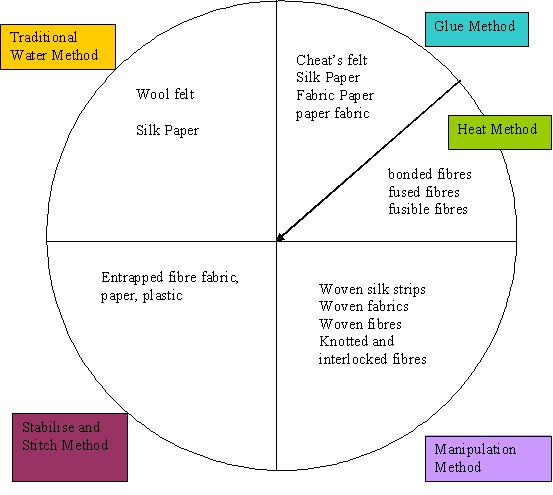
  • Basically, in this method (and in most of the other methods), you create a sandwich of the fibres, as shown in the diagram below.

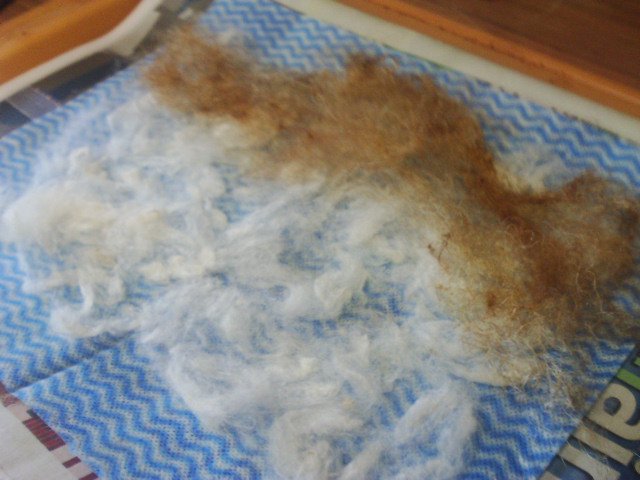
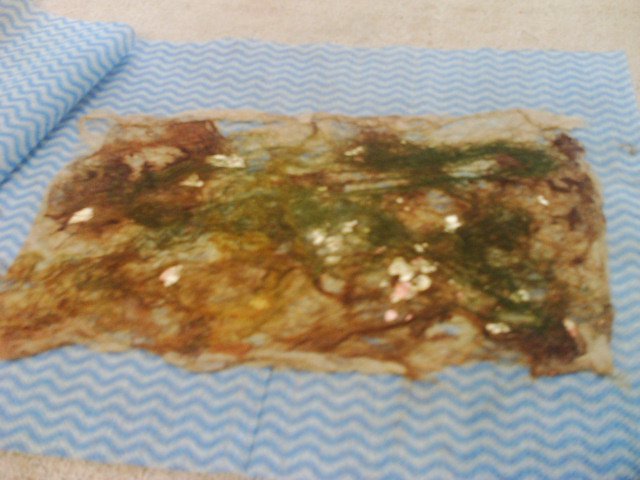
       Here, I have added my bottom layer to newspaper. Chux for this example.

      • The fibres are teased apart and placed in two layers which go in opposing directions if at all possible, but more layers can be added and holes can be encouraged for a lacy texture.  This is true for felt as well.
       Above, in my chux sample, I have added cocoon strippings (white) and then throwster's waste (brown) which is also spread about. Then I also added some chopped up and fuzzed bits of sericin fibre.
      • It is at this stage, usually between layers, that the wet variation options are added.  With both silk paper and with felt, it is best if additions are covered by a light layer of fibres to entrap them in the final fabric/paper.  Colourings can be added here before the water, or after, depending on the effect and density of colour you want.
      Above, I have added metallic flakes and a second layer of silk.

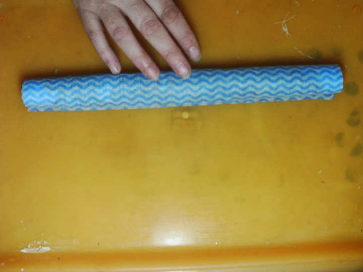
      • A small amount of  water is added for silk fibres, and agitation usually involves pressing and moving your fingers around the top surface to distribute the natural glue (sericin) on the fibres.  With wet felting, more agitation is required and usually the sandwich is rolled up and rolled over and over as well as rubbing with the hands (as for silk paper, but more vigorous) to tangle the fibres together.


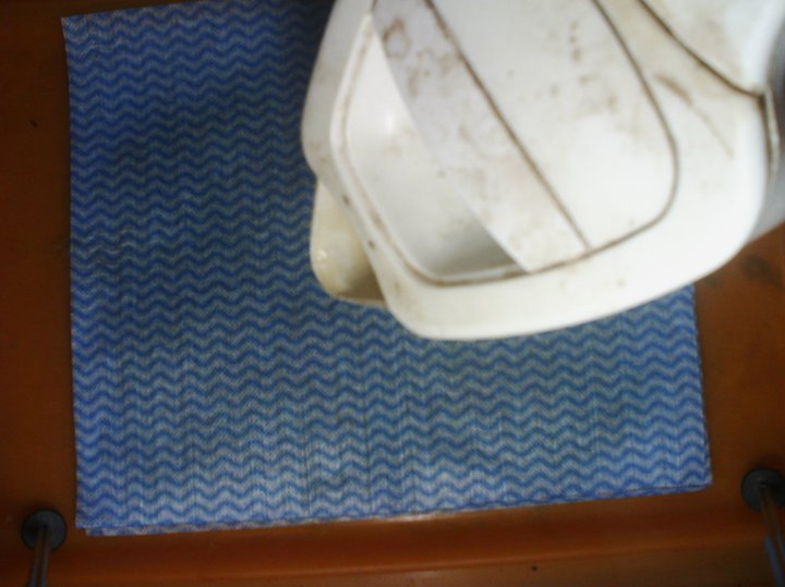
         Above, I added the top cloth, then used water and agitated.
        • Once the tangling is achieved in both cases, the sandwich is flattened and blotted dry. 
         With this sample, I ironed at a low heat at this stage, covering with a piece of baking parchment.
        The top and bottom cloth or net can removed before or after drying depending on the strength of the fabric (ie how many layers).

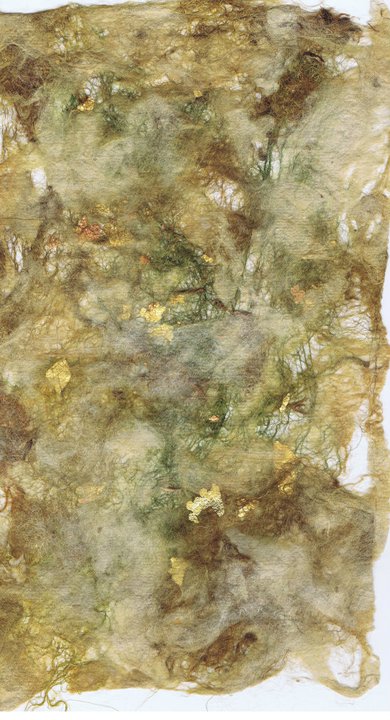
          Above is the ironed piece, with the back side (which I prefer) on the right. I think it will go nicely in some rock textures.  I especially like the metallic flakes and I will certainly use them again.
        • The fibre layer needs to be thoroughly dried, either flat on a surface, or hung up depending on the strength of the fabric (i.e. how many layers).

         Here is a shot of the piece hanging up in the window.  It is very translucent, which I love.


        • Silk paper can benefit from ironing at the dried stage, whilst felt probably will not want this step.
        In my second sample, I did a slightly different sequence, so you see there is more than one way to do it.
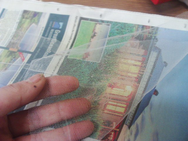
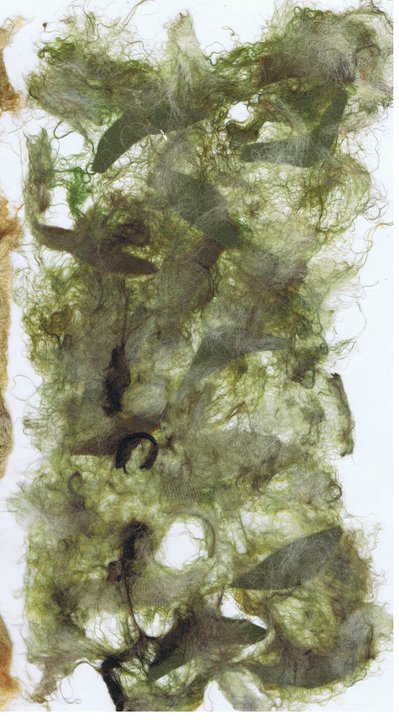
        This time I used tulle, or bridal net.
        I used a rod, which I stretched out and then pulled off in tufts.

        I added the tufts to the tulle, spreading them as evenly as I could.
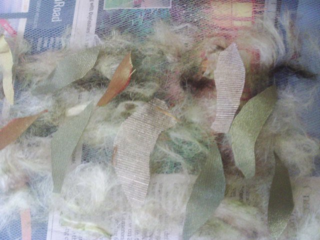
        Then I added scraps of fabric left over from needle felting.
        The top layer was some throwster's waste.
        I added the top layer of tulle and I used some boiling water.
        My first rubbing, I used some cloth as it was too hot, but it cooled quickly.
        I hung the piece to dry and I really liked the leaf silhouettes in it.

        Here are the front and back of this piece
        I liked the texture of this one and already have a plan to use it in a design I am working on as the background behind some leaves!.

        I hope you liked this experiment, as i will be doing some more!

          Tuesday, June 28, 2011

          Taking the design process back to front

          Today, I am going to talk about another WIP and how my initial design process there was the reverse in many ways of the one I began describing yesterday.
          Sometimes, I have an idea in my mind for a long time and I might look for reference photos or inspirations for a while before I even think to start and in this case, I did not even start with a sketch.
          I had been given some SWARF (this is metal filings, like steel wool, that comes off a lathe when turning metal), because I had commented that it reminded me of the froth on waves, so making a piece with it became a bit of an obsession and of course my love of all things watery came into it.
          The pictures above, (from geograph.org.uk via wiki media/creative commons) were my inspirations for this piece because I wanted waves crashing over rocks.
          Instead of sketching, this time I began with the fabric itself.
          In the picture above, I have simply pinned scrunched fabric to a board where I thought it might work.  Of course, I pinned and repinned added and took away and looked at it and went away and came back.  In reality, my composition bears no real resemblance to any of the pictures, but takes ideas from all of them.

          On my board, this does not look as balanced as it does in the picture.  This is an important point.  Sometimes, simply putting a frame around your work or cropping it can help to give it substance and depth.  See this recent blog here by Diane Perrin-Hock.  After looking at the photo, which is a crop of my collage, I opened it in Photoshop Elements (I am not going to go into detail about HOW I did it, only WHAT I did - How is an whole other blog) and decided that the sky needed a bit more room, because I felt there should be splashes of foam up higher. Below, I have extended the sky.
           Also, this collage does not have the metal filings on it yet, so there is another layer above the waves, which you will see as I make up a simplified colour map of my piece in the steps below.
          Here is a simple line drawing, made by tracing over the photo above, then saving the tracing as a new picture.  As you can see, I am not particularly precise when drawing on the computer, but IT DOES NOT MATTER - it is just some lines dividing the different areas of the picture.
           Here are the first two layers, the black and brown of the rocks (obviously, the black is below the brown, like a shadow, but still, no need for real accuracy).
           Next the dark and medium blues of the deeper water, both in the background and a little in the foreground.
           Pale blue in the foreground water and the white foam (slightly grey so you can see it)
          The final layer (also white) is where I intend to put the swarf to imitate froth.
          But there is still something missing.
          Here I have added a few highlights to the rocks, as it is a sunny day.
          Now, I have a basic diagram of where I want things to go in my piece, so I can take all the fabric off and cut and manipulate it to make the textures I want, and when I put it back, it will probably look a lot closer to the final piece than my original simple collage.
          Obviously, the colours I have used in the diagram are only a guide and are more values than actual colours.  They are areas where I might put several different pieces of fabric in the appropriate colour/value range.

          So this was a different way to design.  This way is more hands on and about playing with fabric to get the effects you want - in a general way, which can then be refined later.

          Don't forget to play with fabric - It's the best way to understand how it can go together.